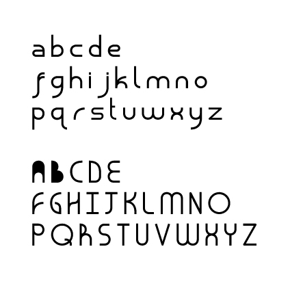
Hi all,
Thanks to all who've given me some contructive feedback on my typeface, so far.
I've draw the glyphs in Illustrator CS2. Then saved them down a Illustrator 8 EPS files to import into TypeTool. (All Mac OSX.)
Anyway, see the picture of how the figures have appeared so far. All are fine except uppercase A and B - you'll notice the glyphs are solid. The line/contour for the spaces are there but i don't know how to "knock out" the black. Any idea what i can do here?
I've double checked the paths in Illustrator, and there are definitely not solid, although they do consist of overlaying objects. I've been trying to use the Pathfinder/Shape Modes but I can't achieve anythign better. If I could fix the problem in Illustrator that would make my life much easier.
The other problem I have is spacing. If I install the font as is, each character sits right next to each other with no space. Ho do I create the spacing? Is it simply a case of moving the guides in TypeTool to the left and right ever so slightly?
Thanks in advance
Russ