
I'm designing a logo for a friend of mine, his name's Mateo.
It's meant to be printed on a t-shirt.
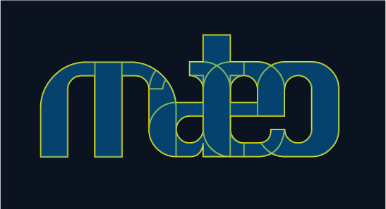
Do you think this works, with all letters outlined?
Or is this
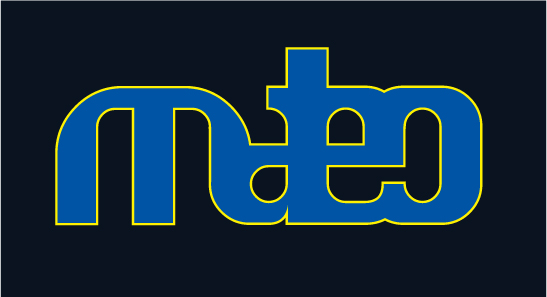
an improvement?
I'm curious about your comments..
I'm designing a logo for a friend of mine, his name's Mateo.
It's meant to be printed on a t-shirt.
Do you think this works, with all letters outlined?
Or is this
an improvement?
I'm curious about your comments..

I like the outlined better. I just wonder if there’s any logic to the breaking of the letters? And how are you going to print it?
I like the outlined better. I just wonder if there’s any logic to the breaking of the letters?
First I wanted to make some sort of autogram. I decided to take the whole name instead, and hook the letters onto each other. But then some characteristics would disappear: let say, the 't' for example, didn't function as a 't', could be an 'l' as well.
By deleting some pieces, that problem was resolved.
Anyway, I wanted to keep the autogram idea, it must be a fluent integration of letters, open and friendly.
And how are you going to print it?
Well, yeah, I still have to find out. ;-)

I think it loks strange, maybe you can work a little more. Spaces are not equilibrated. The M creates a wide black hole, while between the A, T and E there's no space. To me looks strange

I think I would introduce a curve between at the bottom of ate, move the curve at the bottom of eo to align with the centre of the vertical and slightly close up the counters of the m and maybe reduce the width of the central vertical of the m. How does it look without an outline?
Tim

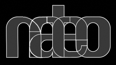
How about you do it this way? I think this has better balance compared to the original. It is still readable as "mateo" but looks more complex now. Does that reflect your friend's character - or is he not complex. Perhaps you should also try something that speaks about him. Just a suggestion :)

Denis, I can't read "mateo" in it at all anymore. It says "nateo" now to me. I know what you tried to do, and it was a good idea, but it doesn't work here :(
I think I would introduce a curve between at the bottom of ate, move the curve at the bottom of eo to align with the centre of the vertical and slightly close up the counters of the m and maybe reduce the width of the central vertical of the m.
Hm, I take that into consideration.
How does it look without an outline?
Something like this:

I like denis' version, but it does read nateo. There's probably a way around that though. Ringo's version looks cool, and the colours are much easier on the eyes. The letters still seem off though.
Captured from web.archive.org on 16 Apr 2015. view this capture