Typophile

Experiments with Silom.

Ringo

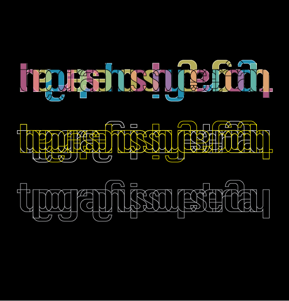
I think Silom is a quite useful font to build type images with. Here I made one, in some variations:
All critique is welcome.

btw: I tried to find some info on the Silom typeface, but I couldn't find too much. Only thing I know, is that it's standard on Mac, though not used too often. (Or am I completely wrong with that?)
Anyway, I like to play with it.

Interesting! will work well in the posters..
but whats written there?? "typographyissoyesterday"(inverted in first two)???

That it says, indeed.

Is it still quite readable?

yeah ..for me its readable but not legible though.
...keep experimenting...

satya

>Is it still quite readable?
No, I think searching for the first y shape in typography is hindering me.
Tim

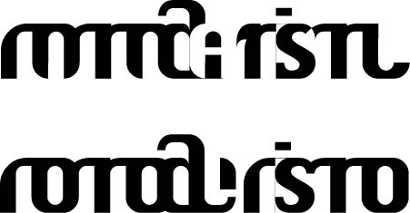
Thought it could be an idea to break the letters up, in order to get new ones:

I don't know if I'm getting somewhere, but I like it when new shapes arise just by changing and combining the chunks:

Captured from web.archive.org on 15 Apr 2015. view this capture