Typophile

Mono & Lino Together At Last

billtroop

The merger between Monotype and Linotype announced this morning makes me wonder how typographical history might have played out had the union occurred at several other key points over the last hundred years. It seems a very positive step to take at this point, very synergistic. I like the idea of a strong company that only does type.

CG Triumvirate => Arial => Helvetica

Link to the announcement.

Is this a sign of weakness or strength in the font industry? What does it mean?

*rolls thumbs, and continues to patiently wait for Linotype's FontExplorer X for Windows...

Weak or strength? - I dont know. But for the designers these merger is not a step forward.

noftus: Keep waiting, maybe in the next life...

--astype.de--

Is digital type following the ATF model in metal type? I hope not - but when biggies merge this is not a sign that everything is OK.

Their biggest challenge will be unifying their respective hot metal technologies - my guess is that Linotype casters will be retrofitted to cast one letter at a time - a "mono line" if you will.

LOL Si!

Weak or strength? - I dont know. But for the designers these merger is not a step forward.

why not? (i'm not saying i agree or disagree. i just want to know why you say it's bad for designers.)

Si! You are my HERO!

ChrisL

Now watch as those royalty agreements with independent designers get smaller and smaller.

James

James, not sure if that will happen but there's a quote from Bob Givens in this MacWorld UK article...

"Font people are tiny people."

Conjures up an interesting image. But there is a connection between little people and the world of type. Robert Norton's mum, Mary Norton wrote the book "The Borrowers" in which a family of miniature humans borrowed buttons etc., Aren't all type designers "borrowers" too, standing on the shoulders of giants?

“Font people are tiny people.”

That's not the only paradigm.
The tail is long -- 285 foundries at Myfonts.
Mergers & acquisitions is not the only way to acquire scale and synergy, so too is being distributed by Myfonts, Veer, Fontshop etc., -- these distributors are coming up with plenty of new retail marketing ideas.

I think the merger marks the paradigm shift. For years, when the font-output machinery drove the wagon, large companies were the only ones who could put it all together. Today everything is separated. Type design and distribution (and output is in the users hands). The overhead in having a large corporation having everything in-house is a cost issue that is hard to pass on unless there is constant new development to cover it. Today's smaller and more independent groups work in consort but handle only their own overhead. Yes, type people "are small people" but they need very small parking places and use less fuel.

ChrisL

Let us all pray for Akira.

Too bad it's been so long since ITC / MT published much of interest. No offense, but when little outfits like P22 can put out a dozen beautiful and well produced faces in six months and Monotype has, in 2006 so far, not a lot of note besides a Michael Harvey revival (which is quite nice) and an overdue Galliard pro (and, what - Julietrose? Morris Freestyle? :/) - well, I'm thinking this continued amalgamation is anything but a good thing.

It seems that the ITC and Monotype websites get worse and are less frequently updated the larger the company gets.

What does Mr. Haley have to say about it?

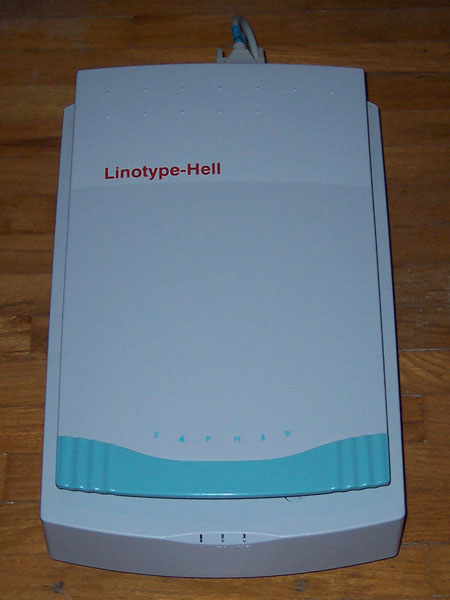
And a related question: what exactly is the relation of Bayer to Compugraphic, Monotype & Linotype? I see they own most of the CG faces, and my Linotype-Hell scanner and imagesetter came in Bayer-branded boxes, and I thought they owned at least part of LH, but ... I'm not sure.

I wonder if Monotype refunded the ITC sellout that M. Batty sold to Linotype with no regard to the agreement ITC had with its designers.

>what exactly is the relation of Bayer to Compugraphic, Monotype & Linotype?

There's a timeline here...
http://www.monotypeimaging.com/MK/Linotype/History.aspx

>Too bad it’s been so long since ITC / MT published much of interest.

To their credit over the past few years they've been OpenType Pro'ing a lot of gems from the Monotype and ITC library. Also seem to have been signing up a lot of smaller foundries on fonts.com

I am a little concerned about the way Bob Givens's quote has been taken out of context. In full, he said,

“We need to be a strong company to deliver products to the likes of Adobe and Microsoft. Font people are tiny people. We are tiny businesses in comparison to these big companies. We will be much stronger together than we are alone”.

Si of course meant the extract humorously, but it's getting a life of its own, and the fact is that there is nothing exceptionable in what Bob Givens actually said.

I also don't see why this should be bad for designers. During the press call, Steinert and Givens went out of their way to mention their commitment to the actual font designer, and they really didn't have to. The issue, in the end, is never what your royalty percentage is. The issue is how many copies the foundry can sell. Combined marketing + combined and better targeted advertising probably = more sales.

More compellingly, I think this stronger entity can better deal with font format problems, inconsistencies and new technologies, such as OT, Multiple Master (which I have persuasively heard - not for attribution - is due for a revival 'sometime'), etc. etc. In the past few years, the important decisions have been made exclusively by Adobe and Microsoft, and the results have not altogether been happy. I believe the combined Linotype Monotype entity will be able to change that paradigm and I couldn't be happier. Of course any merger can fail to work out well, or can fail to work out well in some particular area if not in others. But why expect the worst when there are so many potentially positive elements here?

I must say, too, that I know very well Bruno Steinert's passionate commitment to the font industry in general and to Linotype and its legacy in particular, and if there is anything I can be certain of, it is that he has made the best choice for Linotype. This experienced strategist knows very well that you sometimes have to make a daring sacrifice in order to gain a great and lasting success.

Thanks Sii. So Agfa is a division of Bayer, and Bayer seemed to already own some of Hell when it was combined with Linotype; so this new purchase really seems like Agfa simply condensing its varied holdings - is that right?

---

jlt : http://www.hewnandhammered.com : rnrmf!

i just want to know why you say it’s bad for designers

Well, I have found Agfa-Monotype-whatever to be--how shall I say it?--a little less than honest in their dealings with me...

>Agfa simply condensing its varied holdings - is that right?

No Agfa sold "Agfa Monotype" to the TA investment group and the name changed to "Monotype Imaging". Monotype Imaging is wholly owned by TA.

Also I find myself in agreement with most of Bill's comments. Out of context Bob's quote is humorous, but in context it's definitely on the mark.

Ah - I understand. I see that now in the timeline. Thanks.

---

jlt : http://www.hewnandhammered.com : rnrmf!

I should also mention that Fonts.com and Faces (which are part of Monotype Imaging and therfeore of the new merged company) also distribute a lot of small foundries, and do alright for them.

I don't think that's likely to change, as one of the advantages of being a large font distributor is that you have a lot of product on the shelf, with new product frequently, and search engines driving people to your site all the time.

Combined marketing + combined and better targeted advertising probably = more sales.

Bill, have you seen the marketing attempts from these two companies of late? 1 lame + 1 lame ≠ 2 good. They could learn a few lessons from MyFonts and Veer.

Poking aside, I'm hopeful that the retail arms of both companies will grow stronger from this. Monotype could gain from Linotype's content-rich and semi-navigable site. (Will we see a useful fonts.com? A larger FontExplorer X store?) And Linotype could get the resources it needs to churn out more than one retail family a year. (Akira could use some backup. Send in your resume, Bill!)

I can't say I'm surprised by this merge. The bigger gets bigger and the "Indies" keep on fighting! I can't really tell if it's for better or for worse. I've never been a fan of either of them. I respect them for sure, but I've always preferred the close contact you get with the smaller foundries. They become "part of the family"... that would hardly happen as part of the "Giants".

From a marketing point I think you might even have an advantage being small. As mentioned already the smaller foundries keep working harder and connect easier with the trendier designer. From my own experience things travel VERY fast over the Internet if you're able to get the right connections. The awareness of MAC Rhino Fonts have increased a lot with a very limited marketing budget.

Now let's hope this merge will have a good outcome for the whole type industry. I think we need both big and small players on this arena.

"I think we need both big and small players on this arena."
I don't think you have to worry about that, do you?

"I wonder if Monotype refunded the ITC sellout..."
I don't think you have to worry about that, do you?

"Today everything is separated."
I don't think you have to worry about that, do you?

I think, as with any merger, you have to watch for a while, I mean don't all mergers have "synergy". It's a lot like all the advanced buzz about a game, sports-wise, that's meaningless bla--bla-- until "the game" is actually played.

"“Font people are tiny people.”
... .. ..... .. . ............ . ..? .... ... ............. . ... .. .. ........
. . ... ..... . ......! ....... .. . . .......... ..... ......... . ....... .....,
.... .......... .. ..... . ...... ........... — ....... .. ......... ....!?

In general terms, the purchase of Linotype seems to be simply part of Monotype's acquisition policy of several years standing, beginning with ITC. But I agree with Nick that synergy in the font business doesn't necessarily reside in conglomeration of big foundries into one very big foundry, and that most of the creative development, especially in the retail font market, has been taking place outside of big foundries. Linotype realised this years ago, and got rid of most of their internal design staff, eventually settling for one creative director (Akira) working with individual designers outside the company, and this is a model that has worked very well for them.

Bob Givens' is quoted as saying: “We need to be a strong company to deliver products to the likes of Adobe and Microsoft. Font people are tiny people. We are tiny businesses in comparison to these big companies. We will be much stronger together than we are alone”.

As a very small foundry that delivers to both Adobe and Microsoft, I have to say that I disagree. What has been ably demonstrated in the past few years is that small foundries and independent designers can compete with the large companies for OEM contracts as well as they can compete in the retail font market, especially when what is desired by the client are new designs. The primary material advantage of the older and larger foundries is in what Peter Lofting at Apple calls 'the shoebox', i.e. the store of historical types which they can endlessly repurpose for new formats. Monotype's shoebox just got a whole lot bigger.

The secondary material advantage was technical savvy, which Monotype in particular has tried hard to maintain. But open access to decent manufacturing and QA tools has largely eradicated that advantage. It is interesting to note, in reference to Bob Givens' choice of Adobe and Microsoft as examples, that these two companies have been at the forefront of making font development tools freely available and, hence, of enabling small foundries and individual designers to compete in technical quality with larger companies. Since Adobe and Microsoft clearly have an interest in enabling such competition and in not becoming tied to a monopolistic megafoundry, I question the logic behind Bob's statement. Does making a company bigger really make it more attractive to clients who have demonstrated a desire to enable smaller companies to compete?

Occupying the middle ground, between the megafoundry and the boutique foundry, are the ex-Monotype folk at Ascender Corp., who have probably been the most aggressive OEM-based type business for the past couple of years. For the time being, that is probably where Monotype sees its biggest competition in its most important market. Perhaps this is the context in which the acquisition of Linotype should be seen.

I don't know what kind of a deal you got with Microsoft for ClearType, John, but I recall your lamenting the comparatively higher fees commanded by lawyers. Do you think you could have cut a better deal if you were the CEO of a large company? I expect so -- purchaser corporations like to match bodies, hierarchically speaking, with their suppliers, and if your company is flat, that's not possible. Neither Microsoft or Adobe mention type on their home page. Adobe leads with "Solutions". So I think Mr Givens talk of "delivering product" is a smokescreen -- the new company will be named "Font Solutions" :-)

> Is this a sign of weakness or strength in the font industry? What does it mean?

if they want to share the last-quarter profits -- we'll know. one of them is/was zombie , and see the quote: we need to be a strong comapny....

> Bob Givens’s quote has been taken out of context. In full, he said,

“We need to be a strong company to deliver products to the likes of Adobe and Microsoft. Font people are tiny people. We are tiny businesses in comparison to these big companies. We will be much stronger together than we are alone”.

Adobe isn't just -- strong company; MS isn't just -- strong company, but company with strong vision.

> What does it mean?

The Indies.... doing the job.

"As a very small foundry that delivers to both Adobe and Microsoft,[] I disagree. What has been ably demonstrated [] is that small foundries and independent designers can compete with the large companies for OEM contracts as well as they can compete in the retail font market,"

Say what? Because MS and Adobe have significant internal staffs of type folk, small foundries can compete when delivering "whatever" and leaving the rest to the internal folk and/or their contractors. There are other models. :-

Competition in the OEM market, and in the retail market, are completely different until the retail market can contain fonts as transparently installed to networked users as the bundled MS fonts. Then, you'll see lots of founders of all sizes who can "do it all" not as a "middle ground", but as the ground that it should be, up ahead. On the other side, I have no idea what Tiro's volume is, but I know the FB's volume in retail fonts is way below the Big Sites and none of us, not even FS actually compete with those big retail sites, unless we're on them ;)

The tools published by MS and Adobe, (and Apple once), were to aid in the competition of formats, not to make competition among their suppliers. Competition among their suppliers was ensured by the release of Fontographer.:-

"purchaser corporations like to match bodies, hierarchically speaking"
Geeze. That's not true Nick... :-

" Neither Microsoft or Adobe mention type on their home page. "
and? They have type on the home page, that's a good thing. When they talk about it, that is generally a bad thing.

>The tools published by MS and Adobe, (and Apple once), were to aid in the competition of formats, not to make competition among their suppliers.

I don't think this contradicts David's claim but in way of clarification. The reason that internally-produced tools like VTT, VOLT and Font Validator were released free of charge to anyone making fonts was to improve the technical quality of fonts being used on the Windows platform. The fact that these same fonts could be used on Macs, Linux, and other platforms was not a major concern. Likewise the fact that these tools might level the playing field is not a bad thing for companies like Monotype or Linotype, as it increases the available expertise of people they can hire or partner with.

I realize that I'm talking about type and I apologise if that is considered a bad thing.

Not to change the subject, but I've noticed that all the press generated by this announcement has been published on the other side of the pond - wonder why the story isn't of interest over here?

Allan Haley, who cannot seem to login, asked that I post the following:

"The acquisition of Linotype by Monotype Imaging was, indeed, momentous. Linotype could, however, have been acquired by a much larger company – a company that could have commoditized its wonderful typeface library. Monotype Imaging will never do that. As Bob Givens, the president and CEO of Monotype Imaging, said in several interviews, there will be no changes to Linotype’s culture, structure, or personnel. Bob is good to his word.

I am sure, however, that there are still many questions regarding the acquisition. I would be happy to try to answer any and all of them. Please feel free to write me at , include your phone number and I will call or write to you. I will also be at TypeCon next week and welcome the opportunity to talk to you about the acquisition and what it may mean to you or your business.

Bob Givens, Bruno Steinert and Akira Kobayashi will also be at TypeCon. I’m sure that they would also be happy to talk to you about the merging of Monotype Imaging and Linotype."

Allan

Why wasn't Monotype bought by Linotype?

The Heidelberger Druckmaschinen AG ("Heideldruck") is the world's largest prepress and printing maschine company with 3.5 billion Euro annual sales and 18,000 employees in the current fiscal year 2005/2006. Why should Heideldruck as the biggest company in this industry want to sell its small font department Linotype to Monotype? Why didn't Heideldruck buy the small Monotype outfit (although Heideldruck would have enough financial means to buy all font companies worldwide) ?

10 years ago, the former Linotype had debts to the amount of 300 million Deutschmark. Heideldruck's CEO Hartmut Mehdorn waited like a vulture until Linotype was on the brink of bankruptcy, and then he bought Linotype for the symbolic purchasing price of one Dollar and transformed Linotype into a font department of Heideldruck. See the extract from a report made by Joachim Peters at that time attached below in German language.

It is my guess that now, 10 years after, Linotype was again on the brink of bankruptcy, and Heideldruck decided that the font business is not lucrative enough and got rid of Linotype by selling it to Monotype, presumably again for the symbolic price of one Dollar.

-----------------------------------------------------------------

Wie Heidelberg Linotype-Hell für einen Dollar bekam
(How Heideldruck bought Linotype for one Dollar)

(Extract from a German article by Joachim Peters, 06/1997)

Als im Oktober 1995 Hartmut Mehdorn den Vorstandsvorsitz bei Heidelberg übernahm, befand sich die Linotype-Aktie schon im freien Fall. Für Heidelberg hat Mehdorn eine Einkaufsliste aufgestellt. Hinter Linotype-Hell stand darauf ein senkrechtes Kreuz: Abwarten, bis der Patient stirbt.

Die Nachricht moribundus kam telephonisch um Pfingsten 1996. Mehdorn hörte den Bittsteller Dr. Königs an und gab Order zu kaufen. Die Abwicklung erfolgte streng nach der Etikette der Großfinanz.

Der Bankier Dietrich-Kurt Frowein trat nach einem Jahrzehnt Amtszeit als Aufsichtsratsvorsitzender von Linotype-Hell zurück. Zugleich besann er sich auf zwei weitere Funktionen: Vorstandsmitglied der Commerzbank und Aufsichtsratsmitglied von Heidelberg. Die Commerzbank hielt über ihre Vermögensverwaltungsgesellschaft Frega rund 17 Prozent der Aktien von Linotype-Hell, weitere 33 Prozent lagen bei Siemens.

Heidelberg war bereit, Linotype-Hell zu übernehmen, wenn die Commerzbank 75 Prozent der Aktien im Paket anbietet. Siemens nickte. Es galt also noch, von den freien Aktionären ein Viertel des Stammkapitals einzusammeln. Zeit- und zielgerecht taumelte der Kurs noch einmal steil nach unten und erreichte den Tiefpunkt von 60 Mark pro Aktie. Die Commerzbank machte ein Übernahmeangebot zum Kurs von 95 Mark. 8000 freie Aktionäre stießen ihre Depots ab.

Heidelberg bekam das Gesamtpaket von 79 Prozent der Aktien rechnerisch für maximal 180 Millionen Mark. Praktisch war es der berühmte Kauf für einen Dollar. Linotype-Hell bringt 300 Millionen Verlustvortrag mit, der Heidelbergs Steuerlast etwa in Höhe des Kaufpreises mindert.

>Why should Heideldruck as the biggest company in this industry want to sell its small font department Linotype to Monotype? Why didn’t Heideldruck buy the small Monotype outfit (although Heideldruck would have enough financial means to buy all font companies worldwide) ?

If you want to play the numbers game you should consider that
TA, Monotype Imaging's owner has $10 billion of capital - so they could likely swallow up the entire Heidel-outfit and half of Belgium if they really wanted to.

Cheers, Si

PS. small e in euro please - you wouldn't want to get in trouble with the EU authorities. ;-)

purchaser corporations like to match bodies, hierarchically speaking”
Geeze. That’s not true Nick… :-

Well I suppose you're right in that the CEO of Microsoft doesn't have too many meetings with the CEOs of companies which supply him with typographic solutions, but that's my point.

Body, or job matching: the marketing manager of a corporate client deals with the CEO of a creative supplier; the product manager deals with the account executive.

I don’t know what kind of a deal you got with Microsoft for ClearType, John, but I recall your lamenting the comparatively higher fees commanded by lawyers. Do you think you could have cut a better deal if you were the CEO of a large company?

I'm very happy with the fee I received for the CT font work. My comment about lawyer fees wasn't a lament, merely an ironic comment on what MS pay for global trademark searches on typeface names.

I don't know how much Monotype charged for the Cambria development, so I don't know if it was significantly different from what the independent designers charged. But I'm pretty sure that what the Monotype designers got paid in salary from Monotype was less than the independent designers received as design fees. From the type designers' perspective, that is what matters. If independent designers can be competetive in pricing and quality with large foundries and still make more money than their colleagues who work for e.g. Monotype, that is obviously the better situation for type designers to be in. Some people, I suppose, like the regularity of a pay cheque and don't want to have to go looking for work, but it doesn't appeal to me.

David: Because MS and Adobe have significant internal staffs of type folk, small foundries can compete when delivering “whatever” and leaving the rest to the internal folk and/or their contractors.

Microsoft's quality requirements have become much higher in recent years. They don't like having to do much work on fonts; hence the free distribution of Font Validator and other tools to improve QA.

Tiro has been responsible for basically all manufacturing on every font I have delivered to Microsoft and Adobe in the past four years. Even if they do find bugs in testing, they get us to fix them and provide new sources, rather than touching the fonts themselves.

There's a name for this syndrome:

INFECTIOUS MONO

:-)

With the merger complete, do you think there's any chance they'll buy back my overpriced old-assed mere 1200ppi SCSI scanner?

"Tiro has been responsible for basically all manufacturing on every font I have delivered to Microsoft and Adobe in the past four years"

That may be true, John. Unfortunately the point was not responsibility, but completeness. And the fact is, though this is from the point of view of someone looking from the outside, (and at a seven-year development with no documentation ;), you did not, could not, and probably still cannot do it ALL (make CT products, e.g.) internally.

I'll throw in Apple 'cause you brought them up, they have old tired shoes and MS has custom shoes for "feet" that have not yet existed, could not have developed "naturally" and are not likley to last long, they are so "big". The requirements of these kind of fonts for the future is not clear, though I had a long conversation with MS about it. But smaller foundries are never going to be able to make much less distribute these fonts succesfully.

if that is even important to the commonwealth :) Do you think it is?

FB’s volume in retail fonts is way below the Big Sites and none of us, not even FS actually compete with those big retail sites, unless we’re on them

But FB has chosen not to compete -- its web site positions the company primarily as a supplier of fonts for periodicals to the trade, not Helvetica and scripts for the masses. Although scale it out a bit and change the g, and Bureau Grotesque could become Bureau Helvetica :-)

In theory, a reciprocal distributor-foundry arrangement may be possible, where FB could distribute, say, the fonts that Veer distributes, but that would get messy as FB would end up selling Shinntype fonts et al. And all those extra fonts would dilute its market position, if not actually compete with its own product. Another marketing option would be a "distributed retail co-op", where several foundries sell each others fonts as well as their own. That's something I'd like to do, if I ever get it together to add e-commerce to my site.

The big sites depend on representing a lot of foundries, fairly indiscriminately, to bottom trawl the end of the long tail, and in order to keep a constant stream of fresh product enlivening their sites, which no foundry can do at the same rate, although FB and House keep up a fair clip. FSI and Linotype maintain production rate by actively courting freelance designers. FB and Emigre publish both in-house and freelance designs.

But smaller foundries are never going to be able to make much less distribute these fonts succesfully.

It would be nice to think that the Internet levels the field, but the traditional retail distinctions of manufacturers, wholesalers, retailers, factory direct, and distributor house brands still apply, along with the conflicts they produce. Then mix in custom work done by individuals who work for or own one or more of those categories, or freelancers, and it gets messy. Nothing to do with technological capabilities.

Nick, what you are leaving out of your equation is the fact that resellers have found, again and again, that they must represent the maximum number of foundries for the simple reason that a substantial portion of their purchasers will have a purchase order that can only be spent in one place. So a corporate designer out on his let's say twice yearly shopping spree can't spend a little here and a little there, but must find the reseller who has the greatest number of his choices.

"But FB has chosen not to compete — "

Not exactly Nick. We've chosen to compete where our added services are often required, and we've chosen to license where added services are not often required. I think this is because we try hard to make sense.

"...a substantial portion of their purchasers will have a purchase order that can only be spent in one place."

And if that ONE place is MyFonts?

ChrisL

Myfonts.com sells fonts from most of the foundries, even the huge ones. If one stop shopping is the market driver, MyFonts is the "Big Box Store" of type--Instead of being a Walmart, it is more like a coop though.

ChrisL

I don't know what the figures are, but myfonts.com seems to have all of the mindshare and most of the marketshare. I would imagine that one hope in the Lino/Mono alliance is to be able to compete better online, but myfonts.com already seems to be to fonts what Google is to search engines.

However, it is always incredibly unlikely that real font income will primarily come from retail sales, and it is worth noting that Lino/Mono were much more interested in talking about fonts and mobile phones last week, than fonts and traditional printing.

Moving down the feeding chain, for a company like Font Bureau, retail sales have always been a minor focus. The major focus has been on identifying the few customers still willing to pay handsomely for very high quality fonts, and delivering a product that actually works for its intended use.

It's a much more difficult world for smaller foundries, which don't have the technical expertise to attract that calibre of customer. Smaller foundries are much more like to have to rely on impulse purchases, most likely of novelty, decorative fonts that don't require the expert construction of a successful newspaper or book font.

It's amazing how many things can go wrong with a text font. I was just looking at a luxurious catalogue set in Scala Serif, a font I've always thought highly of, and I noticed that the sidebearings of the left and right single quotes were disturbingly out of balance. I wondered if this was a problem with the font? With one of the many versions of the font? With a pirated version? Was the designer of the text using some special kerning that put the quote marks out of balance? Who knows! At least with Font Bureau fonts, you never have to worry that things like that will go wrong. The basic problem, of course, isn't the font, but the person who is using it. If people setting type today don't know, and don't care that quotation marks look correctly balanced, what's the point?

“I don’t know what the figures are, but myfonts.com seems to have all of the mindshare and most of the marketshare.”

I only know what our numbers are (shhh... it's a secret...) and the relative size of the marketplace. Based on that, I am comfortable in saying that MyFonts.com does not have “all of the mindshare and most of the marketshare”. Yes, they are a prime mover in the marketplace, but so are Veer and FontShop. I would argue that the majority of creative consumers purchase products from sources they like - more often than sources that simply have more to choose from. Selection and price are strong persuaders, but so are ease of use, site functionality, customer service, alternative product categories, voice and attitude, quality of marketing materials, affective use dead-tree media, etc. All of the above companies share many of these qualities, but they also differ drastically in how they implement them.

I dunno Grant, why not give us some numbers?

The funniest thing about the font industry is how close everybody is with their numbers. I can't see that these numbers are of any particular value to their competition anyway. But everyone seems to think so. So let me put a couple of more general questions to you, Grant.

1. Suppose that we all had an idea of what myfont.com's marketshare was. How could this knowledge possibly harm myfont.com and how could it possible help its competitors?

2. Same thing with your numbers. Suppose we knew you sold 38,000 units netting $x per month on average for the first quarter this year, x % from catalogue, x % from the web. To what extent is this knowledge really going to hurt you or help your competitors?

It sometimes seems that the font biz is the only biz in the world where people are afraid to come out with this info, and I have the theory that this might actually be harmful rather than helpful. One reason being that you can't really do any substantive economic forecasting about an industry if you don't have adequate factual information.

To what extent does this truly tiny industry benefit from secrecy?

Hey, if someone can establish that this probably somewhat holey veil of secrecy is actually beneficial for the industry, I'm all for it. Anything that helps the font industry is a good thing. But what if this secrecy is a self-defeating mechanism? Is that possible?

David:

Unfortunately the point was not responsibility, but completeness. And the fact is, though this is from the point of view of someone looking from the outside, (and at a seven-year development with no documentation ;), you did not, could not, and probably still cannot do it ALL (make CT products, e.g.) internally.

Sorry, but you're wrong on that one. MS gave us the tools, we made the fonts.

Ironically, considering Bob Given's comment that 'We need to be a strong company to deliver products to the likes of Adobe and Microsoft', one of the things I needed to do in mastering the CT fonts was to rebuild the Cambria OTL tables from VOLT because Monotype's own tools had generated GSUB table errors.

The requirements of these kind of fonts for the future is not clear...

This is true, although I'm not sure in which sense you mean. It is true in both senses:

The requirement to have this kind of font in the future is not clear (the same point that Matthew made to MS when they asked him to design Verdana and Georgia: a font optimised for a particular technology will be obsolete before too many years).

And the obverse of this coin:

The requirements of a font optimised for CT in the future is not clear, because CT itself is a moving target.

But smaller foundries are never going to be able to make much less distribute these fonts succesfully.

Who said anything about distributing? Bob Givens made a comment about delivering to Microsoft, suggesting that a company needs to be big and strong in order to deliver products to Microsoft. I made the observation, based on experience, that this is not the case. When Microsoft goes shopping for multiple font families to bundle with products, obviously a company like Monotype with a large library has an advantage. When Microsoft goes shopping for new, custom designs, small foundries and independent designers have a creative advantage, which they can leverage if they organise themselves in ways that maximise their ability to deliver. The CT font project was an interesting case because Monotype was the one corporate participant alongside a group of independent designers. Hinting was split between Monotype (Cambria, Candara, Meiryo), Tiro (Constantia, Corbel) and LucasFonts (Calibri, Consolas), and Tiro was responsible for final mastering of all the western fonts, including the Monotype submission. [Tiro was subsequently given the job of taking Cambria and making a math font out of it.]

In conclusion, there are many good reasons why a company like Monotype buys a company like Linotype. But you don't need to buy Linotype in order to be able to deliver fonts to Microsoft. That's just silly pressreleasesprache.

Monoype finally gets the US registration back for Times Roman!
Even funnier though, is, well a knockoff, like Palladin (Compugraphic), will it be discontinued because they got the real thing? What about Arial? Monotype now owns the font that they knocked off for MS, boy, fonts are a mess! CG pushed Lino way back when and it was good for the font business overall.
Business wise Heidelberg has been divesting itself from non core operations. Notice barely any prepress on their website (I think Screen actually builds the Platesetters for them). No scanners of any sort, they got rid of all the digital printing (toner based) and then all the Direct Imaging (DI) presses and they got rid of their web presses too.
I was way ahead on this merger, having had a Compugraphic front end and a Linotronic 202! Oh yeah, they blamed each other when things went wrong!
Library wise it makes a lot of sense and Monotype Imaging has a virtual stranglehold on the classic font libraries. Uhm can some one cough up Berthold?
If you have been around fonts long enough, you must admit that Bitstream won, becuase Linotype was the last big player from the font middle ages where typesetting machines and fonts were tied together. Personally, if I were Monotype systems, I would put all the fonts into one library and sell them as unified, assimilation is the way to go.

Rodi

The Truth shall set you free

John Hudson contributed:

"Ironically, considering Bob Given’s comment that ‘We need to be a strong company to deliver products to the likes of Adobe and Microsoft’, one of the things I needed to do in mastering the CT fonts was to rebuild the Cambria OTL tables from VOLT because Monotype’s own tools had generated GSUB table errors."

Well, did I get through all the trouble of producing a Volt version of Cambria, in comes John Hudson and does the work all over again (and he is not shy to let us all know). Maybe somebody lost the master source file?
The errors in the original GSUB tables were errors flagged by FontValidator which was confronted with a class based chained context lookup. The tool that created this font supports several formats of contextual lookups, as opposed to Volt and the Adobe tools, which support one format only, which is neither powerfull nor efficient. It is my bad luck to have created a tool that does all other formats and is thus confronted with having to explain that the font bugs that FontValidator reports are FontValidator bugs.

Uurg.

cheers ;-)

Jelle

No, Jelle, I didn't do your VOLT work over again, I made use of your VOLT work in order to rebuild the OTL tables after encountering the Font Validator error message generated in response to the lookups produced by your tool. Thanks for the explanation about the Font Validator limitation -- which surprises me, since I'd presumed FV to reflect the spec in this regard --, and I happily withdraw any hint of criticism about the way in which you'd built the fonts. I raised this example to make the point that one doesn't need to be a 'big, strong' company in order to deliver products to a company like Microsoft, and being such a company doesn't guarantee that you will deliver what a company like Microsoft wants (which in this case, for better or worse, happened to include OTL tables that would pass Font Validator).

No, I'm not shy about letting people know what kind of work I do, because there is one thing at which 'big, strong' companies like Monotype Imaging are currently more successful, and that is getting press releases noticed by the media. So those of us working independently need to blow our own horns, while Monotype gets blown by e.g. Macworld.

Philosophically, I must admit I am in agreement with Bob Givens and with Jelle. I have long thought that to produce even a wholly successful font with just a hundred basic characters usually requires a large-ish company. The reason is that so many skill sets go into a really good font, and no single person (other than Matthew Carter of course!) has them all. You really need other people working with you. And they need to have an economic stake in what you are doing. Critique from friends is no substitute.

I think the ClearType project showed clearly the kinds of things that go wrong when a corporate organization of professional type people is not involved in the production of an important typeface. To give but one example, after the initial criticisms of ClearType on this forum, John finally learnt that optical kerning in Adobe InDesign will always spoil a well-fitted typeface. But it took seven long years of enthusiastic use for that message to get across. What this reveals of course is that John doesn't understand typeface fitting, and probably never will. But that's OK! Lots of very fine technicians and designers don't understand it. However, they need to be working within a corporate group where there is someone who can be relied upon to sort these problems out. Each of us has only so much expertise, and only so much strength in any particular area of typeface design. That's why I think, that for most of us, and for most typefaces, the greatest chance of success is to working with the maximum number of highly qualified people, and this can only happen within a large organization dedicated to typeface manufacture.

For this reason, I think the Monotype/Linotype merger will ultimately have a beneficial effect on the industry, but only if the businessmen who run it are successful enough to ensure that real expertise is preserved and strengthened under the larger umbrella. There is every indication this will be the case, but only time will tell how the story unfolds.

Type in the end is primarily an industrial process which requires an industry around it. The paradox is that it still requires the individual artist/artisan to keep it on track. But the individual artist/artisan needs the corporation to keep on track as well. In type, everyone needs everyone else.

Bill, you underestimate the extent to which digital media has changed the game.
The brevity of the feedback loop is insane -- being able to make incremental and multiple changes to a font and immediately view a high res printout makes it possible to gain in months the experience that took our predecessors years.

On the one hand, it's nice to see a general professionalism spreading in a flourishing multi-foundry, font-using universe, but we should also beware of institutionalized conservatism, whether it comes in educational or corporate packages.

Type in the end is primarily an industrial process

History suggests an opposite trend. The Linotype put a miniature foundry at a publisher's disposal, for on-demand use; the Mac digitized the foundry's production processes and put them on a desktop. That changes the aesthetic, but what you're saying is it always need an orchestra and a recording studio to make a record, and only symphonies are worth listening to.

Bill,

1. I do not use InDesign's optical kerning other than in rare situations where glyphs from different fonts are adjacent, and of course if the results are not good I manually change them. I have never 'enthusiastically' used it. After some basic testing I made, as I recall, one comment about it once on some discussion list when InDesign first shipped, saying that I found the results surprisingly good and useful in certain circumstances. I've never understood why you generated, and continue to generate, such an extensive fantasy out of this.

2. You've seen Constantia in use. Do you really think it is spaced by someone who 'doesn’t understand typeface fitting'?

3. I agree entirely that the people involved in the production of type need to have an economic stake in it. What I question is whether a venture capital company needs to have an economic stake in it, whether shareholders of public companies need to have an economic stake in it, and why the profits of the making of type should go to people other than the people who make type. And I raise these questions precisely becase, as Bob Givens says, type people are little people. Or do you think big companies are the friends of little people?

If you compare it to the movie industry, you can see some possible parallels. The technology has made it such that the independent film maker can produce quality work without a mega-studio. The old hollywood corporate studios rarely make a film which is not a redo of an older film and are perhaps stifled by the long corporate line of decision making. The more creative films are the indifilms who do it as much out of love as money. The type industry is not as bad as that by any stretch because they have found outside design resources in the indie type design community and are more open to new ideas. There is no need for the huge infrastructure to make type anymore so even the big foundries have very few staff designers.

ChrisL

>to produce even a wholly successful font with just a hundred basic characters usually requires a large-ish company.

This just doesn't seem to correspond to current realities. Font Bureau I believe produces the most-used types for newspapers. And Hoefler and Frere Jones together with Font Bureau have produced very many of the new magazine faces now in use. Font Bureau has used contract designers such as Christian Schwartz, and Matthew Carter and only have four or five people who draw type in-house. Hoefler and Frere Jones are about the same size, or a bit smaller, I believe. And there are independents like John Hudson and James Montalbano who seem to be doing well producing text faces both as far as the quality of their work and its reception.

I think what distinguishes big foundries is that they can afford their own full-time marketing staff. As with any other product, the story you wrap around it and attention you get is at least as important as the product itself.

As I understood him, Bill's focus was not so much on type design competence but technical competence.
With exception of the two companies which set the digital type standards -- I doubt that bigger foundries have more technical competence than small ones. Of course big foundries want type designers belief that this is so; in fact this, plus their name and established distribution channels, is all they can offer. But as to expertise, the few real experts seem to be evenly distributed among in-house/big foundries (like Jelle Bosma) and external/independent (like Luc[as] de Groot). Concluding from 'big' to 'competent' is a mistake.

What is big? As far as I can see, Font Bureau is the minimum size to produce what to me is good work. But that wouldn't be possible without its exceptional personnel. But William, when you say 'This just doesn’t seem to correspond to current realities', I doubt that you are looking at typefaces the way I am. Let me give you one example, not taken from one of the rather too defensive bad spacers in this discussion. I pick up the catalogue for the NPG McBean exhibition, and look at the Director's Foreword. Immediately, several words and word combinations stand out:

Director's Foreword
'real'
McBean's
'Surrealised Portraits'
Pepper's

In each case, the left quote looks normal, but the right quote is much, much too close to the preceding character. Is the right quote not properly fitted? No, such a thing could not be possible with such a popular, admired typeface. Could the graphic designer have done some weird thing? Is this some odd effect of Adobe Optical Kerning?

I open the typeface. As I would expect, the left and right quote marks are reasonably well-fitted, in reasonable balance. Where is the problem coming from? As a last resort I look at the kerning. Here I find some astonishing values: n-quote right, -140, r-quote right -37, l-quote right, -100, and so on. I've never seen anything like it. It makes the typeface unusable with kerning -- in my eyes.

This is not the kind of thing that could happen with a Font Bureau font, an Adobe font, or any of the Lino/Mono fonts that have gone through the traditional quality control process.

As far as I know, nobody, in all these years in which there have been hundreds of thousands of publications using this attractive typeface, has ever commented on this obvious and frequently-occurring flaw.

It illustrates my point that by and large, most fonts produced today by individuals, have decisive flaws that could be avoided if the designers were working in cooperative environments.

By and large, the model of the single artist/artisan just doesn't cut it with type. There is too much to go wrong. A typeface is not an artwork whose possible flaws may subsequently have no functional effect. A typeface is a utilitarian tool and its flaws will multiply into any publication or application that uses it. Ego and art have their places in typeface design, but by and large I think they need to be balanced by the discipline of a cooperative, industrial environment.

To those who are defensive about their spacing, all I can say is, your spacing isn't going to get any better until you acknowledge you need help. I realize that every independent wants to market himself as an all-competent master. But that's too much to expect from any one person, with some rare exceptions. There are so many things that go into a fully functional, fully utilitarian, fully successful typeface. There is no need to be ashamed if one cannot master every facet.

I'm trying to think through John's point about venture capitalists. My first reaction is to ask, what's the matter with type being backed by venture capitalists? Isn't that vaguely how capitalism works? Isn't it normal for business enterprises to require some kind of financial backing?

An earlier version of Gill Sans had considerably over-kerned combinations of space--W space--V etc. In text this looked as if there were no space at all. It is a typeface by a big foundry. Moreover, a heavily used typeface. But obviously noone recognized ... (To my knowledge, this has been fixed.)
At university we could use a font library by a big foundry, and I remember that I looked very closely into what I considered essential text fonts -- and wasn't overwhelmingly impressed by their spacing and kerning.
This in mind, I don't see what your kerning example is supposed to prove.
At the same time, there are no 'objective' measures for 'good spacing'. Type designers A and B may use different methods and pay attention to different aspects, with different results. Yet both may produce 'good' results, by their measures. Just as typographers have different opinions about typography.

I do not know any independent who claims to be the know-it-all guy. There's happy cooperation among collegues many of whom are most generous with their time.

To those who are defensive about their spacing, all I can say is, your spacing isn’t going to get any better until you acknowledge you need help.

You are the defensive one Bill, a corporate apologist. Indie-envy?

>the traditional quality control process

I think you are missing something important here: the large companies ain't what they used to be.

I visited the Museum of Printing and Larry Oppenberg showed me some of the Merg. Linotype drawings (they have over 300 k) and told me about the design process. They had a room full of people drawing type in Brooklyn, with supervisors and at the top Chauncy Griffith. That was expertise and quality control. And I suppose something of the like was going on at Monotype.

The advent of photo type and then digital type seems to have been a one-two punch to the traditional large companies. In the first generation of digital the BIG companies made a lot of the classic types too light. This was not a model of competence, but a mess-up. Currently Linotype has I believe one person on staff who draws type as part of his job--Akira Kobayashi--and Adobe has one--Robert Slimbach.

Some of the mentors in the field now are those who went through the old drawing shops before they collapsed. But you also have some gathering of expertise at schools like Reading and KABK. And you have importantly the type conventions, typophile and just a wonderful generous spirit in the type world, a spirit that is hard to find elsewhere.

I think Karsten nailed it when he said type expertise is scattered among places of different sizes and independents.

"This is not the kind of thing that could happen with a Font Bureau font, an Adobe font, or any of the Lino/Mono fonts that have gone through the traditional quality control process."

This is untrue and simplistic.

A QA stage in font production still doesn't guarantee perfection in all details, and a small foundry staff doesn't preclude a thorough QA cycle. Since the start of PostScript (for a manageable example), there have been many classic types from large foundries which have needed re-versioning to fix issues of spacing, kerning, and other technical functionality, even leaving out the typical complaints about design. It's the nature of software. It's worth noting that type now is software as well as a tool. Previous technologies had their issues and limitations; bugs are part of the picture now. And bugs of the magnitude of the one you mention don't disable the typeface from working; there are degrees of functionality.

Bill, you might follow Karsten's example and dig a little deeper into the actual workings of a few more typefaces before sounding the alarm that independent type designers are unqualified to deliver reasonably functional typefaces. Shall we tell the UK Guardian, San Francisco Chronicle or Martha Stewart to dump all their proprietary type families, since they were made by mere independents? Think of Letterror, Underware, or House Industries, each with a small staff of highly competent designers and technicians, not only providing fonts of high quality, but innovating in the application of new technology.

I wonder what informs your pronouncements about other people's work. Are there typefaces you've released that we can examine for perfection in every aspect?

Carl - Amen. Though I'm not sure your example of the Guardian will ring true with Bill. He thinks Christian Schwartz's work is a copy of Swift. Yikes. Bill has made some valid and poignant pronouncements over the years -- this is not one of them.

Bill: It illustrates my point that by and large, most fonts produced today by individuals, have decisive flaws that could be avoided if the designers were working in cooperative environments.

On this point, we are to some extent in agreement. Much of my own work is cooperative, involving a team approach to development of fonts for complex scripts. Where I think you are wrong is in assuming that cooperative = corporate (in the capitalist sense). I see a lot of good work being done by small teams of people who are dedicated to both design and technical quality, and who can afford to be so dedicated because they are the recipients of the money that is paid for the work that they do. At the least, such dedication to quality is more difficult in a situation in which the bottom line is to provide a profit to someone who is not involved in that work, who is not familiar with that work, who has no stake in that work other than as a line item in an annual report.

Many of today's successful independent designers started working doing pretty much everything themselves, because that was the only financially viable way to operate, and I think that you are right, Bill, that this sometimes led to problems in the products. At the same time, we can also see the massive problems in whole lines of products that came out of the large type companies in their hasty efforts to convert historical libraries to new formats in order to be able to survive and compete. And both independent designers and large companies during that period suffered from lack of well developed QA procedures for the new formats, inadequate production and testing tools, insufficiently documented font formats, etc. Solutions to most of these problems have only come in recent years, with the advent of OpenType, and not only have these solutions benefited both large companies and independent designers, in many cases they have been driven by the needs of those independent and small font developers, actively involved in discussions with Microsoft and Adobe, actively involved in beta testing font production and testing tools and, crucially, sharing information cooperatively. An event like Linotype's Typotechnica is a good example of this -- and a great credit to Linotype --, and I don't think anyone attending these events, or even reviewing the programme of speakers, can be in any doubt about who is learning from whom. The speakers are almost all independent font developers.

As independent font developers become more successful and experienced, attracting bigger clients and being able to charge higher fees, they can afford to start hiring staff (as Hoefler and Frere-Jones have done, for example) or taking on collaborative projects with other designers (as I have done for the Adobe Arabic and Thai fonts, and am doing on other projects) or contracting technicians and programmers. What remains the same, though, is that the income generated by their work is going to the people who make the type and to the people who care about the quality of the work, which in the long run is a more stable financial basis for the type business to operate on. How many big type companies have gone bankrupt and disappeared in the past thirty years? How many times have the surviving ones been in receivership or have changed hands? How often have they been bought or sold by parent companies with no interest in or knowldge of type and typography? Do you really think this is a sensible, viable model conducive to the development and maintenance of high standards of design and manufacture?

>You are the defensive one Bill, a corporate apologist. Indie-envy?

You'd rather I be an apologist for Richler and the Shinn School of Fitting? You know I love your work, Nick, let's leave it at that.

William, I have discussed your point about the drawing offices until I was blue in the face. Of course I am aware of it. It is unquestionable that the types they produced, as printing types, are superior to most of what we see in print today. You just have to compare books printed in the 1930s, 40s, 50s, with books printed today. It's all there. What it comes down to in the end is size optimization. Size-specific masters have been available since the days of photo. There hasn't ever been much demand for them. However, I do think drawing-office style size optimization is the only way to produce type that is as good as ... drawing office type, and there is one man doing it the right way today, Sumner Stone. I wrote a drastically simplified article about what Sumner's been doing a couple of issues ago in MacDirectory; unfortunately, in the web edition, they never posted the most important part, the illustration page. I'm hoping I can get something workable together and post the url for anyone interested in reading this, although it is perhaps a bit simplistic for Typophile readers.

Of course it's unquestionable that this particular expertise is not where it once was.

My point about independents is that the kind of mistakes that are likely to be made by an independent would ideally be precluded in a more corporate environment, and I still really do think great type is a corporate (in the deepest sense of the word) endeavour.

I think Karsten's point about cooperation is overly optimistic. Your best friend may spend a few hours, at most, looking at your work and offering a few tips. But nobody is going to spend a month examining your font for problems unless you're both working for or with a foundry.

Carl writes, 'I wonder what informs your pronouncements about other people’s work.'

If I had to summarize, I'd say, paying attention to the drawing office model. Carl, I guess you weren't in the loop when Steve Matteson asked me to redraw Bembo for Monotype, in 1996. We got a nice draft of the 72 point going and then I decided to pull out of the project when I started working with Adobe.

He continues, 'Are there typefaces you’ve released that we can examine for perfection in every aspect?'

Well, the Adagio Didot family looks pretty good, but it hasn't had a distributor since Precision Type went out of business, and I've been too lazy to look for anyone else, and in any case, it's in need of drastic revision, at least in my opinion. It would be pointless to re-release it without doing something to make it better. My multiple master of News Gothic for Bitstream is also pretty good - that came out a few years ago on the first Type Odyssey CD - and it's really a competent piece of work if you consider it was done in two weeks and the production fonts were made in Fontographer. In both cases, I had some very expert helping hands, Jeff Level and Jim Lyles. I must have a dozen or so other fonts in the pipeline that I'm in no hurry whatsoever to release and if you send me a private email I'll be glad to send you some work to take apart. I would really like that. The project that is closest to getting released is probably my revival of Pilgrim for Lino, but if you want to know the probable timeline, you'll have to ask Bruno. We've been talking about it and exchanging views and looking at data since 1996, and for all I know it may be another ten years before it gets released to my satisfaction. Very little of what I choose to work on is particularly commercial, and things tend to happen slowly. But what's the rush?

I think I know what I'm interested in, as regards type, at this point. I asked Mac Directory magazine to let me do some articles on type designers, and they agreed. So I had to ask myself, who do I really admire? Whose work do I really want to think about and write about? And really, I suppose it's very boring, but I decided that at this point, though I usually find something to like in nearly every font I see, it came down to Zapf, Frutiger, Carter, Stone, and Berlow. These are all very great problem-solvers in type. I don't see others of that calibre around, and I'm not convinced that there are many developing that kind of calibre. And partly that's because of a real lack of rigour.

What's a lack of rigour? Well, for one thing, people going overboard the minute you make the slightest criticism of their work. You know Carl, a few months ago I was talking to Sumner about Cycles and I said I thought the fitting of the o shapes was too loose. He didn't get all snippy. One reason why is that Sumner really, really knows why he fits the way he does and is interested in discussing it. I learned a lot from it. And it was unthinkable that he would treat me as a pariah for bringing it up. I mentioned it to Matthew Carter a week or two later, and he had some insights into the possible underlying technological reason of different fitting systems, and so it goes on.

I've never had a discussion of that quality online, but I keep on trying. And aren't we straying rather far off topic? We should be celebrating what a miracle it is that Lino and Mono are still alive and well, and that their combination is probably going to make for even greater health. Around 1994, Ricky Schreiber at Linotype told me it was clear the American division of Linotype would have to close, and he didn't see how any part of the corporation could survive. The reason was that Linotype had determined that almost everyone who wanted an imagesetter had already bought one, and imagesetters were these companies' primary source of income. The other foundries were in the same boat. But somehow these amazing businessmen, Bob Givens, Bruno Steinert, and of course Ira Marachnik and Bill Davis (now of Ascender) kept their enterprises afloat after their legs had been cut off. Isn't that a really quite remarkable achievement? These people aren't ordinary businessmen, not least because their devotion to type is unquestionable. To have been so successful, for so many years, against such unbeatably bad odds -- that's something worth a word or two of unstinted praise.

John has made an excellent case. We started by wrongly contrasting corporation and independent, when what is probably the most interesting model for high quality type today is something in between, the small cooperative group. Font Bureau has long been the progenitor for that, but it is very interesting to consider also Ascender. When it started it was two designers (or technicians or whatever you want to call them) -- Steve Matteson and Tom Rickner -- and two businessmen to mind the store, Ira Marachnik and Bill Davis. It must be abundantly clear that the designers find it worthwhile to be in such an arrangement.

One footnote: Hoefler had assistants working for him as early as 1994. When I visited his studio then, there was already an anonymous drone, hard at work on proliferating the Didot, if I recall correctly. Jonathan was really nice to me and said, 'do you realize you are already one of the world's ten best designers?' Of course it wasn't true, and we haven't spoken since, a couple of years later, Jonathan had a fit with me for releasing a Didot under the name Didot (he said he had 'impeccably trademarked the name Didot'), but it was a generous gesture to make to a timid beginner and I have always been grateful for his encouragement.

But I digress. To John's last few questions:

'How many big type companies have gone bankrupt and disappeared in the past thirty years? How many times have the surviving ones been in receivership or have changed hands? How often have they been bought or sold by parent companies with no interest in or knowldge of type and typography? Do you really think this is a sensible, viable model conducive to the development and maintenance of high standards of design and manufacture?'

I don't have any ready answers. Except to say, ultimately, printers probably need the same basic library of 700 or so fonts they have always needed, and ultimately, the owners of those fonts may make some money selling them again, if there ever is any real progress in type technology and the old data finally obsolesces. And someone has to own the existing intellectual property and stay in business doing that. That the property is actually worth anything, still, touches significantly on William's point about drawing office expertise.

So: what is the point of Mono/Lino, other than to prove that adept and creative businessmen can create miracles? I suspect there are many, but as designers, we tend not to think about that end of the business. Designers are never interested in much beyond their fee, n'est-ce-pas? Or their wages. I am hoping to write an article on the merger for MD, and am hoping that Bruno will consent to an interview next week, and I expect I will learn something from that. In the meantime, John, I suspect that if you chose to argue against your point, you could probably come up with some interesting insights. I wonder if it's possible to do a sort of Keynesian analysis of the type industry?

In the meantime, John, I suspect that if you chose to argue against your point, you could probably come up with some interesting insights.

Perhaps, and I think your point about the remarkable achievement of keeping Monotype and Linotype alive is well made. At the same time, if you were to argue against your own point, you could start by simply repeating most of what you wrote in the Segoe thread: something that has been forgotten in the rosy glow of the press release. I wonder how Adrian Frutiger and Hermann Zapf feel about the Monotype purchase of Linotype?

[ Regarding fitting, I don't think I'm being defensive, even though there is a significant difference between telling Sumner in a private conversation that you find something a little odd in the spacing of his lowercase o and announcing in a public forum that you think I don't 'understand typeface fitting, and probably never will'. I fit and kern my types carefully and systematically, and I'd be happy to discuss my approach, although its the sort of thing that is easier to talk about when one is sitting next to someone looking at a FontLab metrics window. There are some discussions on Typophile on the subject to which I have contributed some thoughts, including an interesting and illustrated debate with David Berlow about the correct way to space italics.

I think a legitimate complaint can be made, by people who prefer a looser fit, that my fitting tends to be on the tight side. But optimum spacing is size-specific, and so we have this problem in one-size-fits-all scaleable type: how tight or loose should the default spacing be? The really good typesetters I know track almost every type they work with, hardly ever accepting the in-built spacing. In the absence of finely tuned optical sizes, I think ultimate spacing has to be performed by the typesetter, and will often make or break a piece of work. That said, I'm trying to space my current types a touch more loosely. But my approach to obtaining consistency in spacing remains the same. ]

John: "we have this problem in one-size-fits-all scaleable type"
We who?

We all have this problem that some have made one-size-fits-all the default, and claimed it is more than one-size-fits-all. I, and some others have managed to sell the ideas that one-size-fits-some, and one-size-fits-one, are good too, (better usually) and that one-size-fits-all "needs some work on the software side", starting with a proper report from all devices of the resolution, ending with a variety of contour transformations and filtering techniques — to "truly 'begin' to solve", if required, one-size-fits-all.

But the good news is, your spacing is fine. One-size-fits-all should work at the "master size", without the composer's intervention, and with predictable intervention otherwise, to taste over a range dependant on the design, (and in the presence of proportionally tracked kerning) One-size-fits-some "display range", and one-size-fits-some "text range" are not as hard to use, and one-size-fits-something "special" is the easiest, unless you don't use it "there". The basic fault with the master sizing of the one-size-fits-all design is, if there isn't one, it leads to a total disconnect between the master and optical size (monster-sizing for the lowest common denominator, e.g.).

Then, some hell breaks loose. I learned this at Merg, so, sorry, but it's vaguely not off the topic. ;)

John, you're in fine form. You have correctly identified why it is not possible to have useful typographic discussion on these blogs and the reason of course is that they are really public. I think the biggest difference between you and me is that you have always treated them as very public affairs, and I have always treated them as if they were entirely private, which is quite incorrect. I've had the transient pleasure of a bit of sport, but essentially these are tools for promoting business interests and probably should be respected as such.

To be perfectly fair about you and spacing, I have based too much of my opinion on two facts observed during those very painful but nonetheless productive threads that arose when ClearType was announced. The first was that you had provided a bad initial impression of all of the CT fonts by setting the one-line large examples in the book about them with InDesign Optical Kerning. This made me finally use this feature and identify some of its problems which I knew must exist but had never actually tested, and to you belongs the credit of subsequently discovering that this horrible device changes the spacing between all letter combinations except O and O. I think the other thing that was open to criticism was the general tightness of the spacing of your font, which was probably not ideal for small screen display sizes. From this it would be fair to deduce that your judgment is not always perfect, especially under pressure (and whose is?) but it isn't fair to go on to say that you know nothing about spacing, because there is also evidence on the other side that you do have a rational system and that you do carefully implement it, and the truth is that I have not looked at your recent work in sufficient depth to offer an opinion beyond the comparatively little I saw in 2004 or whenever it was. (We'll leave aside the issue of the non-overshooting C in Constantia which was revealed online ... due no doubt to momentary pressure, but also illustrating neatly the kinds of things that can go wrong in type even when every care is taken, also that every designer needs a gnome to look over his shoulder. It is the kind of mistake that is easy enough to make in a typeface of just 100 glyphs; it is that much easier to make when the font comprises a thousand or more.)

Your point about good typesetters tracking type according to size is also well-taken. Isn't it interesting how many of them still use PageMaker, still the only program to facilitate this process automatically according to the type size chosen?

If I may offer a small criticism, it is that while it is productive to work in a FontLab (or Fontographer) metrics window, the acid test is always print or whatever else the final application of type may be, and I think designers need to be encouraged not to rely on metrics windows too much.

As to your question about what Zapf thinks about the merger, I understand that he is enthusiastic for a number of reasons. He was extremely annoyed, however, by some of the things I said in my Sumner Stone article, which just goes to show that you can't please everyone, not that I tried.

David could you please amplify

'The basic fault with the master sizing of the one-size-fits-all design is, if there isn’t one, it leads to a total disconnect between the master and optical size (monster-sizing for the lowest common denominator, e.g.).

Then, some hell breaks loose. I learned this at Merg ....'

>Ira Marachnik

Close - Ira Mirochnick

http://www.ascendercorp.com/aboutascender.html

Cheers, Si

If I may offer a small criticism, it is that while it is productive to work in a FontLab (or Fontographer) metrics window, the acid test is always print or whatever else the final application of type may be

Agreed. I even wonder if a metrics window is the right tool for kerning.

[What was this thread about? Monotype-Linotype? Font QA? Kerning?]

:)

Re. optical sizes: David, I'm in total agreement.

Re. Constantia: Bill, just to clarify, the Constantia C does actually have an overshoot, the bug was in the hinting (the bottom of the C was linked to the wrong CVT value, I believe).

Re. Bill: The first was that you had provided a bad initial impression of all of the CT fonts by setting the one-line large examples in the book about them with InDesign Optical Kerning. Ah, yes. You see, I consider character set showings to be, inverting Mr Gill, pictures of letters, not type. I track them out a bit, so that people can easily examine the individual shapes, and I apply the optical kerning feature because such showings often involve combinations of letters that do not occur in text and which may not be accounted for in the kerning data in the font. The purpose of these showings is to give some idea of what is in the font and what the letterforms look like. To judge fitting, you need to look at type -- at text -- not at pictures of letters.

Re. Karsten: Agreed. I even wonder if a metrics window is the right tool for kerning. Somewhere in the Typophile archives is my specification for a kerning environment, which is a large room with a wide, curved cinema screen on which one pixel = one em unit, and a control console with dials to adjust interglyph spacing. :)

Seriously, though, I think the FontLab metrics window in FLS5 is a pretty good kerning environment. There is always going to be a disconnection between the tools for specifying spacing in digital fonts and the application of spacing at the target size and target medium, and that disconnection requires a human imagination to bridge it. Looking at kerning strings on screen, at the size at which it is practical to work with them optically -- i.e. large enough that pixel rounding errors do not obscure the results too much (they will always obscure the results to some degree, hence the desire for an evironment large enought for one pixel to equal one em unit) -- it is necessary to consistently imagine the desired spacing of the target size(s). The tendency, looking at glyphs at such large sizes, is to tighten the spacing too much, so of course the feedback from print tests at target sizes is essential.

A typesetter I know who did a lot of manual kerning in headlines in his long career would always print out the pseudo-word 'millioon' in the intended size and spacing, and tape it to the top of his screen while working on kerning, as a visual reference. This was the inspiration for the 'second preview' option in FontLab, which I asked Yuri add: a constant field below the current spacing/kerning preview in which one can put e.g. 'millioon' as a reference.

PageMaker, still the only program to facilitate this process automatically according to the type size chosen?

Quark had it as a utility since way back (right next to the kerning table edit), may still do in v.7. I used both a lot when I was an art director.

but essentially these [online forums] are tools for promoting business interests

Maybe, but I have also gotten a lot of mental stimulation from Typophile, as well as practical information. I even repurpose posts I make, for writing in other media.

What was this thread about?

Apparently, the relative merits of different business models for font development.

When I visited his studio then, there was already an anonymous drone, hard at work on proliferating the Didot

i think this is the why most here don't like large corporations. nobody wants to be a drone, especially not an anonymous one.

> nobody wants to be a drone, especially not an anonymous one.

How about being an "apprentice" or a "printer's devil"?

"David could you please amplify"
You mean all caps? Or do I need typophile radio? WTTF?

anonymous drone

Actually, H&FJ profile employees on their web site.
And when such as Joshua Darden or Jesse Ragan move out and set up shop on their own, their involvement with particular typefaces becomes apparent.

At the tour of the Printing Museum at TypeCon last week, we saw that each of the tens of thousands of Linotype character drawings has a signature of who drew it. Research will, I believe, give credit to some of those people as designers of those Linotype faces, rather than, as stands, the senior figures who art directed. More Lardent, less Morison.

Anyway, all workers are drones, e.g. Michelangelo doing the Sistine Ceiling, or Bach The Art of the Fugue.

Drone implies someone who works in a directed way such that he or she is not required or encouraged to make decisions. Hence the term, which refers to drones in an insect colony. Not all work is drone work.

Not all work is drone work.

If it's not dronish, it ain't work.
Whether the tedium is self-directed or by others.
But some of it can be quite pleasant, with the right soundtrack.

"Kern that funky music for me Nick boy" :-)

I may not be on the right track for Nick though.

ChrisL

Nick "each of the tens of thousands of Linotype [letter]drawings has a signature of who drew it. Research will, I believe, give credit to some of those people as designers of those Linotype faces,"

That's a leap Nick, sorry. You won't find the names of Lardent's Lino counterparts in those signatures. They represent the approval of -that letter- and every graphite molecule thereon, and not who designed the typeface, or the font(s) about to be represented in type from those drawings.

So, though it might be fun! the only thing you can say for almost certain, is that the signee drew the curves for certain approved the letter, and was in volved in the execution of the design.

Well, at the field trip talk, I'm afraid I didn't study the signature boxes in the bottom right corner of those drawings (looking at the glyphs instead), but I recall there were several, and I got the impression from at least one speaker that the draftsman had to sign off on each drawing -- with the example of one guy who spent four years on a typeface family doing thousands of drawings. Surely as part of Griffiths' meticulousness, he would have wanted to have consistency provided by using the same draftsman for a typeface, so that mean their names were recorded on the drawings? But you're saying the signatures represent the "art director" rather than the draftsman?

For the revivals that were made from photos of printed type, projected on the wall and "traced", I presume that those drawings would be an interim stage, over which the final "thin" (tracing) paper drawings were made.

"you’re saying the signatures represent the “art director” rather than the draftsman?"

What? I said "They [the signatures] represent the approval of -that letter- [...] and not who designed the typeface"

"[Griffith] would have wanted to have consistency provided by using the same draftsman for a typeface".

Actually, when he was boss, the letterdrawing process was an assembly line, so it did not matter who signed. Consistency was assured by a highly disciplined approach at the top that was projected all the way down to the straight-line drafters (i.e. the traineees who only drew straight lines and only exactly where they were told to).

>For the revivals that were made from photos of printed type, projected on the wall and “traced”, I presume that those drawings would be an interim stage, over which the final “thin” (tracing) paper drawings were made.

The drawings I looked at all had a signature of a single person who drew them at the bottom right, and a signature of the boss who signed off that they were satisfactory.

For the Caslon Old Face (1923) I looked at, I'm pretty sure the projectoscope was used to project the faces of metal types, not printed samples. Also there was latitude for the person drawing the type in following the tracing of the projectoscope tracing, as there were written instructions to "follow the style of the type." The same person--Dorothy Rickert--I think did all the 12 pt and many of the smaller sizes. (The boss was a 'T.W.') Some of the larger sizes were done by others. But this project was an immense labor as each point size was draw differently--i.e. not 3 or 4 masters, and adjustments of others through the pantographic punch cutter. The projectoscope was also used to check the final punch against the original drawing, as quality control.

>Research will, I believe, give credit to some of those people as designers of those Linotype faces, rather than, as stands, the senior figures who art directed. More Lardent, less Morison.

It is not good to assume that the lowly drawing office employee had any talent whatever, other than being able to draw very simple things accurately. David Saunders, who ran the Monotype Drawing Office for many years, told me that he would often hire applicants with no previous experience whatever. He would give them a circle to draw. If they could correct their drawing reasonably well, they'd have the job. This does not, of course, resolve certain mysteries, like who is really responsible for Bembo? Or, for that matter Times. But Lardent had nothing to do with it, so it seems. Either you believe the Giampa fantasy, or you look at Tracy's careful study of Plantin and Times, which completely explodes the myth of Lardent's involvement. I did not agree with Walter Tracy's later, positive assessment of the Giampa claim, and he was so frail at the time . . . though I must say he gave me some nice tips on Pilgrim.

>Anyway, all workers are drones, e.g. Michelangelo doing the Sistine Ceiling, or Bach The Art of the Fugue.

So drone = Bach = Michelangelo = Shinn?

In any case Papa Berlow is absolutely correct in stating that there were a lot of drawing office people who, for example, only drew straight lines and only drew them where they were told. On the other hand, there were, indeed, some more sophisticated drawing people, i.e. there was a spectrum. But it is nearly impossible at this point to make a case for any of them having any substantive input into the aesthetics of any of these typeface designs. Furthermore, heck, you have a drawing, and the drawing is great, and you make the punches. What if the testing then shows all kinds of defects in letters x y and z? Who is responsible for fixing them? Where does that show up? Yak yak. Let's face it, the interesting stuff at Lino is being done by Dwiggins, Griffith, Jones, Burke, etc. . . . not that anonymous drone. It is a little more difficult to work things out at Mono, given Morison's complex interactions there and his own interest in promulgating a picture that would do him the most good.

And Nick, in 1994, Hoefler's anonymous drones were not getting any credit for the work they did. I never saw HTF Didot being co-attributed to anyone else, did you?

BTW, Lardent's 'Times' was digitized by Matthew Carter and used to set at least one menu I have.

You know, if you look at a Talley of Type, it is above all about how Morison and his successors were always learning how to make type, it was always experimental, they were always making mistakes, there was always something new to learn. For all his self-serving spin, Morison is so very modest next to the people nowadays who claim they know all about type. There doesn't seem to be any type that Morison et al. write about where they don't say, 'this is what we did wrong.'

Speaking of rather interesting design errors that have proliferated into digital, can anyone tell me what is the obvious, unGillish error in the upper case italic of Joanna that needs to be fixed?

"it is above all about how Morison and his successors were always learning how to make type, it was always experimental, they were always making mistakes, there was always something new to learn. For all his self-serving spin, Morison is so very modest next to the people nowadays who claim they know all about type. There doesn’t seem to be any type that Morison et al. write about where they don’t say, ‘this is what we did wrong.’"

People today designing type are no different; they make mistakes, are experimental, there is always more to learn for them. I have never heard a soul say that they "Know it All" and would be curious how you got that impression?

The type design community seems to be a very giving group who help eachother and cheer eachother on. I have not spoken to a soul who has not been willing to help me. I just don't see the kind of arrogance here that is prevalent in the performing arts.

ChrisL

Bach = Michelangelo = Shinn

Well, the Art of the Fugue is the kind of generative stuff that Eno delegates to a computer, but JSB crunched his own minims. And Michaelangelo, he did all the toes and little willies on everybody on the Sistine ceiling himself. Me, I personally hand-kern all the fonts in my mom and pop shop.

Design attribution in collaborative production environments is a bit of a football. You've got your auteur theorists vs your socialists, trying to decide who deserves most props. The brutes hired to render the sublime ideas of the great men don't get much credit, which makes it a little easier for the boss of the monopoly to be self-effacing.

But I think there are enough people who began in production work who later set out on their own and achieved success, to discredit the notion that their contributions as drafstmen were rote. Drawing is drawing so worthy of reverence, drafting is drafting, the fundamental skill of type post Benton punch-cutter, and when doing a revival in particular it's just as important in the long run (if not more so) than concept and art direction. Face it Bill, it's the drawing of Monotype Bembo that makes it sublime. That's a combination of freehand and french curve, not just drawing a circle, although even that has its merit, as in the old Giotto saw.

I never saw HTF Didot being co-attributed to anyone else, did you?

Not specifically. I was pointing out that H&FJ profile their staff on their web site, which is an admirable practice. In general, people who are not the "designer" of a typeface are not credited by the publisher. However, when an employee first sets up their business (eg Darden, Ragan), they may list their involvement in particular typefaces, to establish credentials. So in the multi-foundry internet era, that information is more readily available than in the heyday of Linotype.

David Saunders, who ran the Monotype Drawing Office for many years, told me that he would often hire applicants with no previous experience whatever. He would give them a circle to draw. If they could correct their drawing reasonably well, they’d have the job.

The more sophisticated Linotype equivalent was the infamous S test, in which prospective drawing office staff would be required to copy a drawing of a letter S. Matthew Carter told me of a particularly devious variant, in which the original S would be in a rectangle, and the objective was to draw an extrapolated S in a rectangle of different proportions.

When I was helping Gerry Leonidas and Fiona Ross sort and pack the Linotype non-Latin archives for shipment to Reading, we came across a file of S test results from Fiona's department at Linotype Paul in the 1980s. She could still pick out who had drawn each one.

>Face it Bill, it’s the drawing of Monotype Bembo that makes it sublime.

I wonder. First of all, nobody really knows who is responsible for Bembo, and I have posited that one of the drawing office ladies may have had some hand in it, and am conducting some research into this very tenuous hypothesis, if it can even be called such. But no, the drawing is not what makes it great. There have been dozens of marvellous drawings of Bembo in modern times, in photo and digital. And none of them can hold a candle to the metal Bembo. What is the secret of metal Bembo? It's in the punches, not the drawings, that's for sure. A lot of very, very, very talented people have worked on post-metal Bembo, and they have all failed. As for the rest, it is difficult to argue with someone who does not distinguish between art on the highest level and mere craft.

One thing I find so funny about all these discussions of master drawings is the assumption that the master drawing came fresh from the Master's hand and that was that. Of course that is not the case. It was tested and corrected dozens, hundreds, thousands of times until the person actually responsible for the type _in print_ (and therefore responsible for a huge capital investment) was satisfied.

Back to Bembo, off topic as it is, I think it's wrong to say that what makes it work is even in the punches. It's the way it comes out on the printed page when everything is done right. To get anywhere close to duplicating that at text sizes today would require the very reverse of 'good' drawing, because good drawing is not the same thing as fidelity to the necessarily flawed letterpress impression. It also requires individual optical sizes of course, particularly below 12 points where the variations are large. The kind of 'drawing' that is necessary to get this kind of effect has very little to do with the kind of drawing necessary for display type. Until you stop thinking about curves and start thinking about bits of typographic density, you can't really understand text type - - in my view, which admittedly is absolutely personal and which I don't seek to impose on anyone else. I am hoping Lino will continue to go with my approach on Pilgrim, but who knows? There are not many digital types that employ it -- offhand I can only think of Slimbach's Jenson and Carter's Monticello.

>The type design community seems to be a very giving group who help each other and cheer each other on.

If you know anyone, Chris, who will spend a hundred or so hours per weight helping me really come to grips with a typeface, please tell me their names. People in the type community are very nice and will often spend a few minutes or even let us say half an hour looking over something one has done and give some help.

But to get the kind of help that really is needed, there has to be a common economic interest in the success of the work. And that requires an organization of at least Font Bureau size, to get back to the topic. The only times I have ever had the kind of attention I seek, working in painstaking detail over countless hours, was in 1993-4 with Jeff Level and 1997-8 with Robert Slimbach. Relationships like that aren't easy to find, and I did not succeed in keeping either of them going though I tried for all I was worth.

Speaking of Font Bureau, David, I still don't understand what you said:

"The basic fault with the master sizing of the one-size-fits-all design is, if there isn’t one,"

one what? if I knew that, then perhaps I would understand

"it leads to a total disconnect between the master and optical size (monster-sizing for the lowest common denominator, e.g.)."

and then I would like to know more about what was observed in this respect at Mergenthaler.

sorry to be so dense!

I have posited that one of the drawing office ladies may have had some hand in it,

Wait a minute, I thought I was the one suggesting that the drafstmen might get more credit for design?

Robin Kinross, in Modern Typoraphy, attributes much of Imprint's success to the drawing office.

Someone who does not distinguish between art on the highest level and mere craft

Moi? I don't think reviving an old typeface is art. (And certainly not the highest level of design.) That's why I would give credit to the drawing office, not the overseers, in such circumstances.

One thing I find so funny about all these discussions of master drawings is the assumption that the master drawing came fresh from the Master’s hand and that was that.

I find it funny that you assume other people made that assumption. Most people are thinking master as in Multiple Master. Or would Multiple Master be a supergroup, like Twombly and Slimbach tag-teaming on Myriad?

The kind of ‘drawing’ that is necessary to get this kind of effect has very little to do with the kind of drawing necessary for display type.

Not so. It's true that as you say, design drawing has to be appropriate to the task for which it is intended--whether that is text or display. But it also true that irrespective of design, a good type drawing is a thing of beauty in its own right, with a quality of line that has vigour, grace, balance, proportion. This attention to quality is part of the synergy.

>Wait a minute, I thought I was the one suggesting that the drafstmen might get more credit for design?

You have, without any basis in known historical fact, suggested that simple technical draughtsmen should get more credit for designs, not realizing that most of them knew virtually nothing about type -- and didn't care. The decisive insight for me on this issue was when Saunders told me that the drawing office girls never saw the finished type.

I have, with extremely little basis in known historical fact, begun to explore whether in the case of one particular typeface, where the history is a little foggy, it might be possible that one particular drawing office lady (there is only one possible candidate) might have had a hand in Bembo. This guess of mine is admittedly naive and is unlikely to yield any results.

It is significant that in the golden era of typographical research, there was never any suggestion of this. Just as there was not, in most cases, any reason to suppose that the punchcutter, in the pre-Pantographic, pre-Master Drawing era, had any substantive input into the process (i.e., except in the rare cases when the punchcutter was not working under someone else's direction). Does anyone seriously suppose that Rädisch deserved design credit for van Krimpen's typefaces? (A question a little worth asking but unlikely to yield anything of interest.) Or, to give another example, take the punchcutter Vafflard, who I had always felt certain was the 'auteur' of his typefaces. But Unger has seriously demolished this cherished belief of mine in his essay a few years ago on Vafflard. He has even gone so far as make a most persuasive case that Vafflard's types are merely largely faithful recuttings of Garamond's. I could, and would, argue these points, but my position, after Unger's careful research, is very weak.

'I find it funny that you assume other people made that assumption. Most people are thinking master as in Multiple Master. Or would Multiple Master be a supergroup, like Twombly and Slimbach tag-teaming on Myriad?'

Nick, the drawings for metal typefaces are always referred to as master drawings. Masters for the pantograph, masters for manufacturing, etc. etc. This is the conventional vocabulary. Ever since there have been drawings for typefaces, they have been referred to as Master Drawings. I realize it's a little confusing, with the additional burden of the concept of the Multiple Master and its new vocabulary.

'Not so. It’s true that as you say, design drawing has to be appropriate to the task for which it is intended—whether that is text or display. But it also true that irrespective of design, a good type drawing is a thing of beauty in its own right, with a quality of line that has vigour, grace, balance, proportion. This attention to quality is part of the synergy.'

Lovely. Vigor, grace, balance, proportion, synergy. Beautiful words. Like a distillation of one of Dwiggins's ads. And it misses the essential industrial point. What we need in text type is first and foremost an industrial product that maximally enables the customer to perform the act of reading on some final manufactured object such as a book or a screen.

Now let's put it all into practical terms: if we know what 'quality of line' is, and aren't just using fancy words (to impress an imaginary public), we ought to be able to tell which is the erroneous character in the caps of Joanna Italic. Have you had a go?

You have, without any basis in known historical fact, suggested that simple technical draughtsmen should get more credit for designs,

Bill, the idea of historical fact, expecially with regards to the notion of giving credit, is dubious. Women's contributions, for instance, are being written into a lot of histories where they didn't use to figure as known facts.

Masters for the pantograph, masters for manufacturing, etc. etc. This is the conventional vocabulary.

Duh. I was cracking back at your "fresh from the Master’s hand" comment. Perhaps I should use more emoticons to telegraph the subtlty of my wit, for those of a literal disposition?

And it misses the essential industrial point.

You're not reading what I'm saying, even when dutifully copying and pasting it for refutal. Let me try again. There are two aspects of design drawing. One is the drafting aspect, which "has to be appropriate to the task for which it is intended, and I'm obviously in agreement with you on this. The other is the pure artistry of drawing (which you dismiss as a cissy non-essential). This can be appreciated in its own right, as artists' sketches for paintings are. I believe that, once the drafting has been taken care of, a drawing that also looks nice has some benefit, hence my use of the term "synergy".

...we ought to be able to tell which is the erroneous character in the caps of Joanna Italic. Have you had a go?

We ought to know what "synergy" means. Can anyone tell me why it's relevant to this discussion? Will you have a go Bill?

Come on, Nick, I'm still waiting for you or anyone to tell me which is the inauthentic character in the Joanna italic caps. What makes it so interesting is that the error was made by a very skilled draughtsman who only realized the mistake years later. What's interesting about that is that it shows how very difficult it is for someone else to get inside a designer's head. Only Eric Gill knew, at once, how he was going to draw a given character. The draughtsman/drone is quite unlikely to be able to understand why a line is here rather than there or a curve goes this way instead of that way. A quite separate issue is that Gill's drawings were not capable of being made into literal type (his proposed g in Aries is the most spectacular example I can think of). Considerable interpretation was needed by the punchcutter or 'art director' as the case may be. All of that aside the wrong character in Joanna really does stick out once your attention has been drawn to it.

Your proposal that the drawing of a text character should have aesthetic value in and of itself I still find unconvincing. Let us say that you are trying to reproduce Bodoni's types as precisely as possible, as Sumner Stone was trying to do in the ITC Bodoni project. What you will notice, in examining a character as simple as the o, is that to reproduce in digital what Bodoni did in metal, you must produce a drawing that mimics the myriad little o within o curves that are characteristic of the tools Bodoni used and the way he used them. The resultant drawing of this character, with its complex and painstakingly comprehended irrationalities, is not something that anyone with skill in drawing would naturally draw, and is never likely to be of any independent aesthetic interest. But it makes a good typeface. It is merely a means to an end. I have no objection whatever if it so happens that the drawing has aesthetic value. But that can never be the goal. For this reason, Stone insisted that the executants on the Bodoni project could proof characters only at the sizes they were intended to be used at. They weren't used to this, and it was a struggle to get them to do it.

You get a completely different perspective on what type means when you stop looking at the character on the screen or on the drawing board, and stop trying to make it more beautiful, but instead, look at the type, tiny, on the page, and try to figure out where, and why, it needs a smidgin more here, and a smidgin less there. Now you go back to the drawing, and you try to do what it takes to get that smidgin corrected. Your drawing is now no longer a drawing independently conceived. It is merely a tool, merely a vehicle, part of a process that has one goal uppermost: to produce the printed character on the page (or screen or whatever), just as it is intended to be used.

I don't expect a display typeface designer ever to be able to understand this process intuitively. Text people are text people; display people are display people; very seldom do the twain happily meet, and there is no reason why they should. One cannot be all things.

>which is the inauthentic character in the Joanna italic caps.

Ok, I'll play. I see these candidates: The A leans maybe too far. The bottom hook on the C perhaps sticks out too far. The bowl of the P is too small. The U has equal weight arms, but maybe that's deliberate. The waist on the Y is a bit too high. Given the general narrowness, I would guess the C is the best candidate.

The resultant drawing of this character, with its complex and painstakingly comprehended irrationalities, is not something that anyone with skill in drawing would naturally draw, and is never likely to be of any independent aesthetic interest. But it makes a good typeface

Perhaps. I certainly agree with proofing at the intended size. But I don't believe that ITC Bodoni 12, for instance, is well drawn, or that it works as well as it could if it had been taken a step further. There is a final stage missing, which is the sytematic design rationalization, the one-medium-to-another transformation "algorithm" if you will, that produces a nice text impression, but also has its own rationale and makes a drawing attractive in its own right, rather than an approximation. Dwiggins mentioned the "M" principle (for marionette), meaning just enough detail to pull off the effect, but I'm sure he also meant that it would be expressed in a succint vocabulary of elegant shapes.

Your drawing is now no longer a drawing independently conceived.

Yeah yeah yeah I heard ya the first time and agreed. Haven't most type designers been working like that for the last 15 years?

I don’t expect a display typeface designer ever to be able to understand this process intuitively.

Bill, I don't agree with your pigeon-holes of text and display designers, bosses and drones.

Does anyone seriously suppose that Rädisch deserved design credit for van Krimpen’s typefaces?

Yeah, I do. Rädisch's skills made the execution of Van Krimpen's ideas possible. Don't forget that the distinction between designer and craftsman is a quite modern one (late nineteenth century). I remember reading somewhere that Van Krimpen gave credit to R for his abilities and went sofar as to state that he took into account these abilities when designing typefaces.

>Rädisch’s skills

Let me second that. If you look at the drawings and the dramatic optical scaling that Rädisch did, you can see that they are an important part of the design process. Certainly there is more originality in Van Krimpen, but Rädisch made an important contribution. A comparison is in 'Printers Type in the Twentieth Century'. I have also seen specimen or display books from van Krimpen with Romulus, and Dreyfus's book. I assume these, or at least van Krimpen's are in foundry type. (The monotype was also based on Rädisch's foundry type.) They are among the most beautiful books I have ever laid eyes on.

I remember reading somewhere that Van Krimpen gave credit to R for his abilities and went sofar as to state that he took into account these abilities when designing typefaces.

Hermann Zapf made the observation that when Rosenberger was cutting punches for his types by hand, it wasn't necessary to produce highly finished drawings, because he could rely on Rosenberger to correctly interpret the designs. This is the nature of collaboration between artists and craftsmen, something one may see in other fields too, whether in fine or applied arts. The creative genius is rightly associated with the artist, i.e. with the originator of the idea, of the particular combination of forms, their associations and their application. The artist is usually a master in at least one medium -- Zapf of course is both a first class calligrapher and a fine draughtsman --, and the craftsman's job is to translate into a different medium, in Rosenberger's case steel. The key to this collaboration is that the media are all media of the human hand and the hand tool: a process of translation from hand drawn letters to hand cut letters.

The question of who gets credit for 'design' in such a collaboration depends on whether you identify the design process with the creative genius of invention or with the complete process of defining the finished form. Since the nature of this kind of collaboration precedes and exists parallel to industrial models of design and manufacture, the application of the term design is in some ways inappropriate or, at least, a difficult fit.

My very great admiration goes to William for being the only one with the courage to go out on this frightening limb. However, all of his first guesses are wrong. There is nothing easy about this, and I am sure I could not have solved the riddle unaided. The only reward I can offer is a slight hint. Careful comparison with the Perpetua italic caps should reveal the problem. I can't guarantee that Perpetua digital will show this, although it probably will. The metal certainly will.

I hesitate to wade into the Gill tangent, but this thread seems already far afield from the original Lino/Mono merger topic.

I will hazard a guess about your Joanna Italic challenge, Bill. The cap D strikes me as unGillish. The relation of outside curve to inside is such that the counter shape seems to bulge more at the top, giving the whole character a much higher center of gravity than seems appropriate for the design. By comparison, the Ds in Joanna Roman and the Perpetuas seem to sag a little lower.

If we're talking about errors that need to be corrected, however, I personally would have liked to see the extra weight in the crossbar of the T fixed in both Roman and Italic. But this characteristic is not unGillish (it's part of his original), and so doesn't fit the criteria of your initial query.

-- K.

Kent's back!!!

Or perhaps it's the way the top of the stems are thicker than the bottom?
(This from Linotype's site.)

Nick, that's weird. It isn't that way on the MyFonts or the FontShop sites.

Don't look at Linotype's samples. Put you off your type purchase, it will.


Joanna Italic at FontShop.

Nick, that’s weird.

Great idea for a typeface, though. Shades of Unibody, Tyfa.

I don't know the clue (the slant of the M?) on Joanna caps but I like the U. Maybe this photo of both type faces, a 20 or 24 point version will help.
--astype.de--

Back to the monolino merger. Mr. Siebert from fontblog announced in his breaking news that Mr. Steinert will left Linotype on September the first.

--astype.de--

Wow. Steinert said at TypeCon, if I remember rightly, that "Everything will remain the same. We just have a new parent company." Apparently not. What is happening?

I hope Bruno stays in the font biz. There's a good track record of people doing their most interesting work after leaving larger font companies - Ascender being a recent example.

Yes, Bruno should stay in the font biz. Yes, yes, yes.

And Kent is right, for the reasons he stated. Very good! Most impressive.

>Most impressive.

I agree. Kent does have a teeny bit of an edge in this game as his wonderful font Whitman is an imaginative synthesis of Joanna and Caledonia. So he has done a thorough study of Joanna, as well as Dwiggins' faces. Not that I'm a sore loser or anything :)

". There’s a good track record of people doing their most interesting work after leaving larger font companies"

oh good! When are you all leavin' MS? ;)

Oh, this is very good, thank you David, that must surely be the funniest thing anything has ever said on Typophile. Much better than my 'Zweet dreams, Zuzana' on an entertaining typographica thread that has evidently been 'suppressed' -- perhaps under threat of legal action from 'someone'?

This reminds me of an incident on the OpenType list in 2000, when I more or less innocently pointed out that ATM 4.6.1 suddenly did not support GX fonts anymore.

Harold Grey, from Adobe, whos loves self-promotion more than he loves veracity, piped up to say it happened 'After consulting with Apple, who informed us that GX under Mac OS 9 was essentially a "dead technology" '.

This was all news to Apple. The redoubtable Dave Opstad, evidently too furious to realize he was addressing the list rather than Mr Grey wrote,

'Harold, I'm curious...whom did you consult with here? Neither Peter Lofting, John Jenkins nor myself have spoken with you or anyone else from Adobe about this.'

Dead shocked silence on the list, as it dawns on everyone that Adobe has been exposed in the dissemination of a nearly unforgivable fib to Apple. The unbearable pressure is finally relieved by David Berlow, who quipped,

'I hate it when daddy and mommy fight, so this can go off line?'

Now if Apple is Daddy, Adobe is Mommy, and David is Junior, where does this put Mono and Lino? Grannie?

And this, to try and sashay back into the topic, raises the question what that genius, Dave Opstad, is doing for Agfa/Mono, where he has apparently been employed for a couple of years or so? Dave is the genius (no exaggeration here) whose GX team, back in the mid-90s, gave us just about all the functionality of OpenType, transparency for any program that wanted it, and a thousand other even more brilliant features, in under 4MB of RAM, on both Windows and Mac. Of all the brilliant technology projects that went nowhere, this was the most brilliant I am aware of. So what's he doing for Agfa/Mono? It must be something really interesting . . . .

Dave had been working on various tools and research projects most of which MTI wanted to keep under wraps. However, I did manage to book him for the ATypI tech forum last year and he gave a talk and demo on a couple of projects. I hope I can bring him up for TypeCon next year.

>oh good! When are you all leavin’ MS? ;)

Although maybe you're the only person who would define MS as 'a large font company' there are a few projects I want to see through, I'd give myself another ten to fifteen years*.

Cheers, Si

*insert Vista joke here :-)

Much better than my ‘Zweet dreams, Zuzana’ on an entertaining typographica thread that has evidently been ‘suppressed’

Bill - As much as I'd like to provide a stage for drama, the reasons for thread malfunction at Typographica are never that intriguing. The post of which you speak was broken due to incompatibilities with the software that runs the blog. As soon as we upgrade we'll bring it all back so everyone can enjoy your punnery.

ChrisL

>Kent does have a teeny bit of an edge in this game as his wonderful font Whitman is an imaginative synthesis of Joanna and Caledonia. So he has done a thorough study of Joanna, as well as Dwiggins’[s] faces.

Precisely. David Saunders (for it was he who drew the Johanna Italic caps for which there was no artwork as Gill intended the Roman caps to be used with it) tells this story against himself to illustrate the kind of subtle thing that can go wrong when you go into a project like this without researching it properly. The Joanna Italic caps was one of his first projects at Monotype; he only realized his error when later studying the Perpetua caps. Now consider that there was then nobody there who knew any better, and that nobody thought the defect worth fixing, and you get a sense of the loneliness of typographical insight and the rare miracle of typographical perfection. Kent has really been able to get inside Gill's head, I am full of admiration for that. To understand what is and isn't Gillish isn't a small imaginative achievement.

Word from Germany is that Bruno is officially retiring, but will stay on as a paid consultant through the end of the calendar year. Hopefully that's good news for the Lino-employees.

Of course no one expects him to remain "retired" for long, so there will be plenty of opportunities for obscure Bruce Willis related jokes at some point in the future.

Cheers, Si

>Gill intended the Roman caps to be used with it

Ah ha! So another right answer as to which one is wrong is: all of them.

I thought the angles on the caps--difficult because they are so slight--somehow don't quite work together. That they were made by a different hand, and not originally intended, might explain it.

"you’re the only person who would define MS as ‘a large font company"
What universe do you live in? ;-) I did not define MS as a font company. It is a software company. But, MS are nonetheless the biggest font company, by far. MS designs directly of by proxy, manufactures and distributes more fonts than anyone else (or is it more fonts than everyone else?). MS might be an OS and app and game and hardware and content and more, company, but MS are in Fact a large font company too. . . the biggest. Another way of looking at it: there are font products included in some of MS' product range that are not MS property, but not many.

It makes sense that Joanna Italic was one of David Saunders first projects at Monotype, because it has several sore thumbs (as William observed). Nonetheless, the idiosyncracies do give it a quaint charm, which is perhaps why no one was particularly bothered -- not that they didn't know any better. Gill's type designs have much "bad" drawing, so perhaps one should sympathize with Mr Saunders and the folks at Monotype.

Consider the cap D italic in Perpetua -- it would be standard practice -- then as now -- to base its curve on a rotation of the curve in C or O, but this was not done, so the D we've been living with all these years is "bad". I've done a "correction" (centre character) showing how such a thing might be standardized, by matching the D's curve to that of C. But bear in mind the tenor of the times when Goudy, Cooper, and Gill were dealing with the straightjacket of the drawing office ("because they've always done it that way," as Goudy moaned about having the "a" in his Garamond plumbed up), and that the foundries must have been prepared to give some ground.

or is it more fonts than everyone else?

Yes, I think that would be the case. At ATypI Helsinki, Bas from Underware was asking Laurence Penney to help him diagram the font business, estimating the different pie sections of various foundries and resellers. It was all guess work, of course, but probably reasonably accurate. Then Bas said 'What about Microsoft?' To which I recall Laurence's response as something like 'Oh, you want to include them? Okay, we need to redraw the pie.'

>But, MS are nonetheless the biggest font company

When you put it that way, you're right.

>Okay, we need to redraw the pie.

mmmm, Pie - time for lunch.

When you put it that way...

If you're going to include bundling, don't forget, Nokia, Samsung etc.

"don’t forget, Nokia, Samsung etc."
You mean the companies that don't use CE phones? Well, how many fonts can you stuff into a phone? I think the answer is "less" :)

"Okay, we need to redraw the pie.’"
;) actually, I think "that pie", despite being spoilt, is all claimed. If you want, as it's been suggested, you can bake a whole new pie if you want something fresh.

>Gill’s type designs have much “bad” drawing, so perhaps one should sympathize with Mr Saunders and the folks at Monotype.

Are you talking about Gill's actual drawings for the fonts, or are you talking about how they were transformed by MT and others?

>Consider the cap D italic in Perpetua — it would be standard practice — then as now — to base its curve on a rotation of the curve in C or O,

It would? What's your authority for this rule?

>so the D we’ve been living with all these years is “bad”.

it is?

>I’ve done a “correction” (centre character) showing how such a thing might be standardized, by matching the D’s curve to that of C. But bear in mind the tenor of the times when Goudy, Cooper, and Gill were dealing with the straightjacket of the drawing office (“because they’ve always done it that way,” as Goudy moaned about having the “a” in his Garamond plumbed up), and that the foundries must have been prepared to give some ground.

Nick, the point about the 'wrong' Perpetua D is that it is exactly the way Gill liked his D's and MT respected that. But - - you're so far off what Gill and Morison were trying to do with Perpetua. For heaven's sake, they had it hand cut by Malin first, specifically to get it away from looking like the drawings - - why not have a look at what Morison wrote about the development of the typeface in Talley of Types? You have a misconception about the process if you think that any of these people wanted to transfer an exact miniaturized replica of a perfect drawing to the printed page. That is not what they were trying to achieve, with Perpetua, with Gill's other typefaces. You'll get a clearer picture of this after you've looked at the book(s). The drawings were not a desired end product, merely an approximate guide to an end result. Drawings such as these cannot be taken as intended representations of the final type, and were never meant to be. That's why they can't be used as the basis for a digital implementation. You're still thinking like a lettering artist -- which is fine.

Kent could probably elucidate this better, but does he think it worth the bandwidth?

With regard to the pie, David is absolutely right. When the Microsoft Windows 95 Font Pack came out, and sold in the 8 or even 9 figures, InfoWorld estimated that Microsoft had made more money from that one product than all type foundries put together since the beginning of time. Nobody has ever disputed this assertion (maybe they should have), and that would have put MS as history's most successful font company a good ten years ago. One wonders how much MS expected this success? After all, they productized it, and that's not something they undertake lightly. It's equally interested to note that they haven't productized anything like that since. Smart company. But I guess that isn't news.

that it is exactly the way Gill liked his D’s and MT respected that ... they had it hand cut by Malin first, specifically to get it away from looking like the drawings

So I guess they read his mind, if they didn't go by his drawings.

But seriously, the genesis of Perpetua italic is extremely convoluted and difficult, and the final drawings are missing, according to Tiffany Wardle's essay "The Story of Perpetua", from which it appears that Charles Malin had nothing to do with the italic. Ultimately, I don't believe that MT and Gill were able to satisfactorily resolve issues such as the curve of the D, but I don't think it detracts from the face, gives it personality in fact.

Well, how many fonts can you stuff into a phone? I think the answer is “less”

31 million handsets sold in the 3rd quarter of 2006.

>So I guess they read his mind, if they didn’t go by his drawings.

That must be it! All this time I thought they transmitted their ideas to one other via ordinary speech, but you know how naive I am.

When will I ever learn to distrust whatever Morison writes?

Well, the fire in Morison's apartment keeps us from knowing a lot of the truth. ;^)

The droopy D is in this hand engraving by Gill, so he thought it was ok in at least one design. A more traditional D is here in stone-cut letters by Gill.

Perhaps it has something to do with the order and direction which he carved the letters. Was he a lefty?

Referring to David Peace's Eric Gill: the inscriptions, the first sign of what I'll call the sagging D appears in the stonecut work in the Stations of the Cross for Westminster Cathedral, carved during the First World War. Prior to that, all the Ds I've seen have a higher centre of gravity. The sag in these stonecut letters is not so pronounced as in the Felicity D, but then they are also upright. But in almost all of Gill's postwar stonecut lettering the D seems to sag somewhat, whether upright or italic.

Since I can always be relied upon to make reference to Mr Gill's 'other interests', I'll remind everyone of the advice he gave to Will Carter regarding the lower bowl of the uppercase B: it should be 'like a young girl's buttock -- the way it hangs gently'. Perhaps the same can be said for the D.

Here is one of my favourite Gill inscriptions, showcasing the sagging D in SEDENTES just a few years after its first appearance. This was carved in 1922. I stumbled across it entirely by chance in Amiens cathedral, but knew immediately that it was a Gill.

"...the way it hangs gently"

Tragic Mr. Gill's mind was not as pure as his letterforms.

ChrisL

I take it you're not, then, an adherent of the Arianna Stassinopolous Huffington school of art history (which I probably do not grasp any better than the likely incorrect spelling of her fabulous name) which I think declares that the man is the work, the work is the man? That theory, obviously not so crudely stated, is implicit in a great deal of, say, Nietzsche Contra Wagner and Der Fall Wagner, and it must have plenty of earlier precedent. Does anyone know anything about those earlier precedents? I like to think that man's handiwork reveals his inner secrets more fully than anything else. And I always have a little difficulty giving unqualified credence to allegations of unparalleled parental abuse when the allegator is lining his pockets with the disclosure, as seems to have been the case with Gill's unfortunate (whichever way you look at it) daughter.

"Tragic Mr. Gill’s mind was not as pure as his letterforms."
Are you kidding? Indecency does not go as far in type design as in most other visual arts, but without an occasional buttock in the way, what's left? Sex Pixels?

That was vicious Sid :-)

ChrisL

After all the blah-blah-blah- I'm sorry- dialog that has taken place in this thread, the end-result of the union of Lino & Mono makes me less than pleased.

Linotype Standard postscript fonts went up from 21.00 to 24.00- and for what? To pay for the merger?

That may seem small but it still makes someone like myself on a limited budget for everything- not just including fonts- not too happy.

Also I think they removed a program where the more you buy you save.

1 = 21
3= 19

something like that and now its gone.

But at least OpenType prices have not gone up.

Mikey :-/

Coles... just curious who mandated that FontShop had to do the same?

Was it internal- "our main competitor altered the market rate and we have to follow suit" or was that apart of the agreement with FontShop and Monopoly- I mean Monotype- that when prices changed from the OEM (Mono) you had change the pricing with them?

Mike Diaz

Captured from web.archive.org on 24 Jan 2015. view this capture