
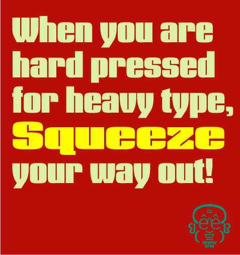
I have added a PDF poster with the z changed as per Eben's good idea.
Here is an early look at a display family I started that will be multiple widths of very heaqvytype with italics to come later.
ChrisL
| Attachment | Size |
|---|---|
| DezSqueeze3a.pdf | 186.45 KB |
I have added a PDF poster with the z changed as per Eben's good idea.
Here is an early look at a display family I started that will be multiple widths of very heaqvytype with italics to come later.
ChrisL
| Attachment | Size |
|---|---|
| DezSqueeze3a.pdf | 186.45 KB |
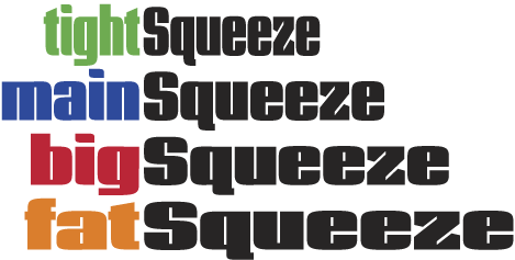
Here is a small peek at the 4 weights:
ChrisL

I like, I guess you're going to use it only in big size, aren't you? You could design one even thinner.
tonicastro
Thanks Toni, Yes, large sizes only.
I think I will make a narrower one as well. Perhaps I should call it "Charmin Squeeze" :-)
ChrisL

I like it. I wish this had come out a year and a half ago - I might have used it instead of Compacta for a rebranding I did.
You should also make a unicase version if you have time. I find that these sort of fonts look great in unicase.
- Lex
Thanks Lex!
I'll try the unicase as well.
ChrisL
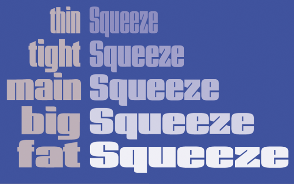
Here is another take on it with an added weight and deQued tail (detailedQ)
ChrisL

That q is a great hybrid solution. You keep the curves you like without having to resort to a tail.
It was the tail wagging the dog Dan :-)
ChrisL

Some of the spacing is not quite right. Look at the t's in Tight. But in general it's quite strong. There is something about the cuts in the Z that catch my eye too strongly. Maybe they could use a different angle. Or find a way to use the horizontal by making the cut less deep. That what I see so far.
Thanks Eben! I see that "ti" and "fa" as being too loose as well. Regarding the z, I have to give it more time in absence before I can judge it properly. I was thinking about making thenarrow wedges flat horizontalto line up with the horizontal of the "e".
ChrisL

I think that letter "q" without tail makes it cleaner. Regarding the small cuts in letter "z", I think they give more personality to the font.
—
Carlos Fabián Camargo G.
Thanks Carlos!
ChrisL
Looking again I wonder if the curves I see in some of the others letters should be in the z too. Maybe here:

What do you think?
That might make sense! It is the only letter witthout a softness and that would bring it in to the fold. I'll give it a try! Thanks Eben.
ChrisL
Your welcome! Will you be posting PDF later? I Really like the slight rise in the Main squeeze q btw. Cheers!

the dot on the i seems to be going the wrong direction. or is it just me?
You know, I think you might be right.... Chris, can we see it the other way?

Hi Chris.
Very nice work you have done there.
Could it be that the faucet/water tap of the r isn't straight, it looks a bit slanted.
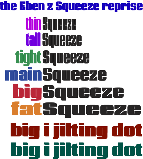
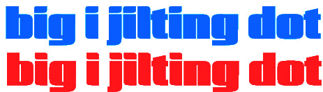
OK, here is a PNG with the Eben Z and the i dot at bottom both ways:
ChrisL
The line in brown at bottom which says:
"big i jilting dot" has the dot flipped as per Paul's suggestion. The one below it in green is the original way.
ChrisL
Eben,
I just added a PDF poster at the top of the thread.
ChrisL
looking at it now, i think i was wrong about the tittle. sorry, dez. :P
Paul, no sweat, it was worth a quick try. The dot the original way (in green) matches the "l" and looks better in a string like "jil".
I like Eben's suggestion for the curve on the z though; that is a keeper! Thanks Eben!
ChrisL
I have an idea about the dot. I bet you could go either way ( with the curved side orientation) if the space between the dot the rest of the letter was tighter as the letters get fatter. I should say that the narrower faces' dot looks fine to me. But I think the dots on the heavier weights are maybe breaking away from their letters - sort of breaking the grammer of the design. I am attaching an example but keep in mind I am working in whole pixel increments which are unsubtle. There is a big difference between the top & bottom & it's a sub pixel difference. I think I like the top one better at this weight. Let me know what you think.
The top one still gives me a problem next to the lower case L. It makes the il combination look too complete, almost like one glyph.
ChrisL
Your right. The direction does matter.
The more I look the more I get ideas. I will mention them but obviously take them with a grain of salt.
- I noticed ( or think I did) that you have the bottom part of the join of the bottom of the bowl in the q for Big squeeze cutting upward slightly. That looks good. I think the other q's would look better with it too. And other letters too. Like the d. The lc a in main has alternative form that is like the top of the q. It sticks out a little. I might like that even better. The top of the bowl in lc b could maybe use it too. Or be cut in & down at the top join. And I am running on here... but, what about the z? What if it had a rise like you have in the lc a at the far upper left & far bottom right corners? Also I wonder if the crossbar on the t needs to get slightly thicker as the face gets heavier.
Many of these suggestions are a bit chirographic in nature. But the type is somewhat constructed looking. What kind of balance or impression are you going for? I don't have a very clear picture of your intentions with this face and my suggestions are comming from too many guesses about that I bet. There are probably other more abstract ways of making a balance you could be choosing too. Would you tell us about your intention a bit? What faces would it compete with do you think? Does that matter?
Captured from web.archive.org on 19 Oct 2013. view this capture