
I'm looking for *digitally successful*, closely matching alternatives to the following:
Electra
Fairfield
Fournier
Granjon
Thank you
I'm looking for *digitally successful*, closely matching alternatives to the following:
Electra
Fairfield
Fournier
Granjon
Thank you

You might consider Prensa as a replacement for Electra. Cyrus took cues from Electra for its design.

CG Elante is an alternative digitization from the same source as Electra. It's a tad heavier and the ascend/descenders are shorter. It doesn't have all the Display styles, but I actually really prefer it to Electra for text.
Elegant Garamond is Bitstream's version of Granjon.

In my opinion, you can go two ways with Granjon, both are unconventional:
1. Poliphilus, along with Blado as its accompanying italic will produce a more 'rustic' look. They don't have the best kerning table or the tidiest outline, though.
2. Dante, a more contemporary reinterpretation of Bembo. Charles Malin definitely infused his spirit when he cut this type (it hasn't lost with the digital conversion, too, in my opinion), producing a face that, perhaps comparable to how Jan Tschischold reinterpreted Garamond, is contemporary yet classic.
I imagine that you wouldn't want to use something common like Sabon or Adobe Garamond.
Oh, and the new Garamond Premier Pro might work too, if your budget permits.

Maybe Jean Lochu's Loire for Fournier. I have not used it.

For Fournier, check out Joshua Darden's gorgeous Corundum Text over at Village. It comes in Book, Semibold and Bold, with Small Caps all around as well as two Pi fonts.
According to the site:
"Named for the base substance of rubies and sapphires, Corundum Text celebrates the durable and resplendent types of Pierre-Simon Fournier's 1742 type specimen.
"The twelve text styles are complemented by two fonts of pictographic symbols in keeping with Corundum's Neoclassic grandeur, including lunar, planetary, zodiac, and indication symbols (fists et al.)"

I recently read a novel what I believe was (digital Linotype) Granjon, and found it quite nice. It is, I believe, actually based on a Garamond model. The one based on the real Granjon is Matthew Carter's Galliard, which is much admired.
(I love Galliard, but not for laser printing, which I believe is Palatine's intent.)
Perhaps Plantin should be mentioned?
Thanka for all the replies. You've all been very helpful. Corundum and Plantin look particularly good . . .

I've set Fournier quite a few times and have always been pleased with the result, but thanks for posting the suggested Corundum Text as it looks to be a nice alternative; if it was available in a fully featured OT version I'd go for it. As for Loire, yeesh. The entire set seems clumsy, but the ascender serifs and diacritics are just nasty.
What about Dino Dos Santos' (DSType) Esta? It was, to my knowledge, modeled along the same line with Fournier's type.

I selected Fournier MT Std (got it from Adobe) for a magazine/book design, and a corporate identity, and I too have been very pleased with it. It has quite a different look to it than any other roman. It is supposedly two unmatched roman and italic designs. The only real drawbacks are the lack of italic small caps, the lack of Tall Caps (which were in the PS version), and the mismatched italic, though this last part is surpeisingly not so important. The italic is really pretty weird looking.
If I remember correctly, Plantin has some strangely short extenders.
Loire appears to be a copy of a late 19th – early 20th century interpretation of Napoleonic typography,

NiceTry:
Are you using an OpenType savvy programme? I think you'll find the Tall Caps are included in Fournier Std as Titling Caps (chose "Titling Alternates" in InD CS2)
No love for Loire I hear.
I had discovered it while reading John Coltz's blog I believe. It struck me as lively and calligraphic, although you might tie the dot over the "i" down with a string to keep it from floating away.
But then I just set my business cards in Tyfa. What do I know?
Cheers.

I used Esta recently for a newsletter prototype that went unpublished. It had a femininity that worked well for the intended audience, but I probably wouldn't use it for something aimed at the general populace.
Oh yes, I am a freak for OpenType.
Hey – WOW! There they are. Thanks a lot! The old one-body-size type 3-way is now possible! Now if only the kerning was decent:
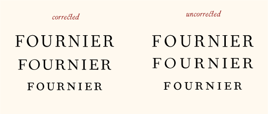
NiceTry:
Don't you find Fournier a bit too light on the page? I'm trying to set it at text sizes, using a hi-res inkjet. Or is the Adobe version (std) meant to look like that? Perhaps I'm too taken by the deep black that metal type achieves on the page.
Yes, Fournier does have a lighter color when set on the page -- rather lively, too, like Galliard. Kilgour's The Evolution of the Book is one good example.
I think Adobe just open type'd the Monotype version, maybe updated the kerning table too, but I'm not sure.

I've been having this idea (for long) of making a revival/interpretation of Fournier. So far it's only in the sketch stage, but I would definitely make it more "inky" if so. Probably regular, medium and bold with almost the same kerning to prevent the copy from changing. I've done the same with Delicato, wish gives you the freedom to choose degree of "metal type feeling".
Go, Stefan, and godspeed!
Yes, the Adobe OT is the same design as the Monotype PS. Just with the handy OT features.
Captured from commoncrawl.org on 18 Apr 2015. original URL