Hi fellow Type nerds.
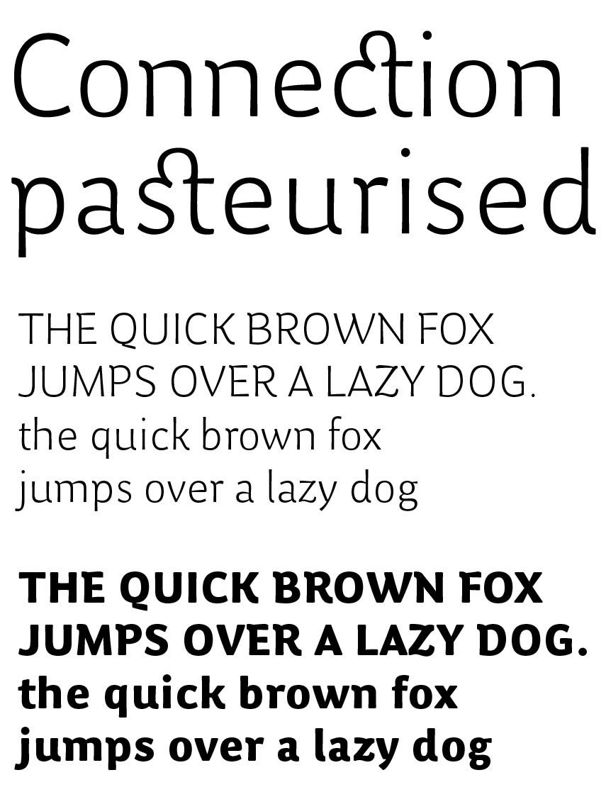
I've been working on these 2 weights of a new family called 'Avocet'.
As I've been slaving away in my artist's garret with no feedback, I was just wondering if I'm heading in the right direction. I think the ligated characters could look pretty good if used sparingly. I find that I get slightly irritated if I'm reading long text passages with lots of these. Does anybody feel the same?
The caps are a bit quirky, but I think they look unified nonetheless.
Any (positive) comments gratefully appreciated.
Thanks
Nick Cooke | G-Type