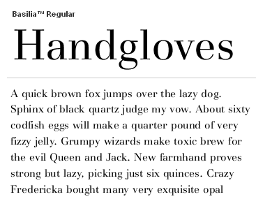
In one of the sessions during Thursday's "Type and Design Education Forum" at TypeCon, I will be sharing an exercise aimed at improving design students' awareness of and sensitivity to type color.
One of the many components that effect the 'color' of text blocks is texture.
Most of the terms used in describing text texture that I am aware of sound closer to the expressions used in classifying the varying sensations of wine tasting -- fruity, dirty, hearty, nutty, rustic, woody, etc.
Of the texture "expressions" I have used, here are a few of the key ones:
- Sparkle, Dazzle, Spikey, Flowing, Weak, Thin, Heavy, Staccato, Contrast, Even, Flat...
(Some of these expressions I learned from "old type composers" during my formative years.)
Questions --
Is anyone aware of a resource (like a Wine Terminology glossary) that ellaborates on actual type texture terminology/descriptions.