Typophile

Indesign CS2 / Easy and efficient way to do underlines in forms?

Headjam

Hi,
I am relatively new to InDesign and I have always hand drawn underlines for forms etc.
I know there would be a much more efficient and simple way of doing this, I just don't
know what to search for in help? Is it in paragraph rules, do you have to make a table?

Any help with this would be greatly appreciated. Attached is a screen shot of a form
that I am doing at the moment (pretty rough).

THANKS

You can set a right-aligned tab with an underscore (shift-hyphen) as a leader, like so:

Thanks Mark. Is there another way of doing this, so the line thickness may be adjusted?

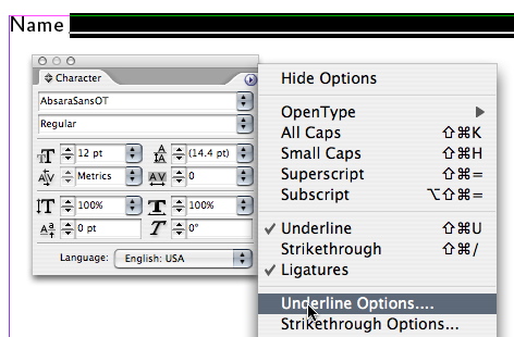
Mark's is an elegant solution. If you want more control over the weight and style of the rule, scrap the Leader and style your tabbed text with an Underline which can be fine-tuned via the "Underline Options" in the Character Palette's popup menu.


Thank you both so much for your help with this .
Can any character be added to the leader of a tab?

Also when working with forms is there anything else that you guys stand by
when creating them, to make them easily read?

The most common mistake I see are fields that aren't large enough for handwritten responses. Run your form through a few tests with realistic responses before going to press.

Thanks again. You guys are seriously the best!

I use Mark Simonson's tab method, but adjust the weight of the underscore by changing the font used -- after setting the tab, the underscores can be selected and the font changed like any other text character. In your example, you could use Futura Light, for instance.

You can also paste rules into the text and adjust the length and weight and the baseline it sits on, you can also use word space to separate the rule from the text.

btw in your sample there are some spacing issues between colon and rule and text and colon, from a personal aesthetic I would remove the colons and use a word space to separate.

Does the underscore method survive ripping etc? I would have guessed that a slight gap could appear in some fonts if they weren't drawn precisely

Tim

Whenever I use underscores in forms (either keyed directly or placed as leaders with tabs), I like to apply a lot of negative tracking to the underscores themselves to avoid any gaps that might appear with normal spacing.

Captured from web.archive.org on 15 Feb 2015. view this capture