This entire font, to say it quite honestly, is actually back-engineered from the italic g. However, as that has quite a bit of character, the font itself ended up with quite a bit of character, and it can stand on its own and not just as something to put around the italic g. It's a recent sketch, which means I'm still neglecting some older ones, but I've decided I'm not going to do anything with any fonts other than this one this summer, being as how I need to do other things too, and fonts have an interesting way of swallowing all available time. I came up with the name Salamander, but to my horror discovered that that name is already taken, so I'll have to come up with something else, I guess. In fact, any ideas would be welcome, though they will probably have to be inspiration for one that I think of, because I could never bear releasing a font under a name someone else had come up with. (How did Zapf do that with Optima?) I have a few concerns I'll preliminarily voice:
a: too annoying?
b: spike unattractive?
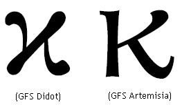
K: odd?
italic p: remove nub?
Other stuff: haven't done kerning on italic yet. The story is the beginning of one I came up with on the fly; originally I hadn't thought of anything and I started out not knowing where I was going to go from the sentence about going barefoot. I know the italic seems kind of too formal, but the roman I came up with was the only one I could think of to be its counterpart, and I've grown to like its rustic sort of charm as well as the italic's seeming formality.
| Attachment | Size |
|---|---|
| Sal.pdf | 55.07 KB |
| Sal2.pdf | 71.29 KB |
| Sal3.pdf | 171.97 KB |
| Sal4.pdf | 91.14 KB |
| GrecianFormula.pdf | 34.81 KB |
| Sal5prime.pdf | 320.68 KB |