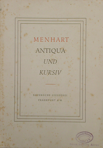
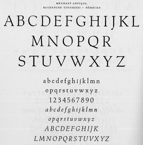
Ever since reading about Menhart's Manuscript years ago in Bringhurst's The Elements of Typographic Style I've wanted to do a digital version... but i wanted a super-cleaned up version. After getting to know Menhart's work a bit better, i decided a synthesis of his designs would be even more interesting for me. I want to make a text face that preserves what Brinhurst calls the "abrasiveness" of Menharts work. I finally broke down last week and started on it.
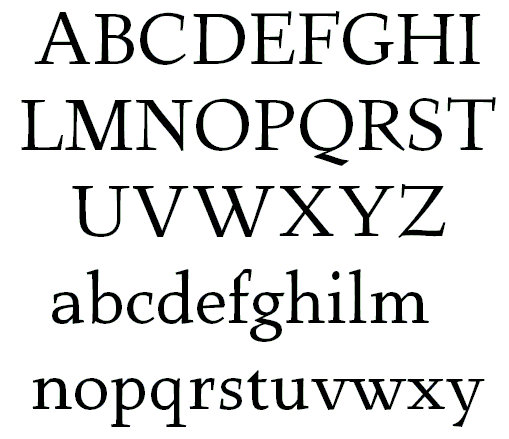
I started with the capitals and really liked how they turned out. Miss Tiff says that the diagonals feel too stiff compared to the elegant swoop of the diagonal stroke on the Z -- I haven't figured out the best way to fix this yet. I think the lower portion of the Z needs to be a bit heavier so that it doesn't just look like a mistake. The lower case follows the lc of Menhart's Parlament quite closely, but i'm less pleased with it than the capitals. I'm still in the process of tweaking the lc quite a bit. the a feels too wide to me. the bowls on bdpq feel squooshed a bit. the mid part of the g is a bit congested. the s is just wrong and need some serious attention. i'm not quite sure yet if i like the f or not... I like this best at 9-10 pts, but i only have a lazer printer to test this out on, so i'm not sure if i'm looking at the best printed samples to be judging. Anyhow, i thought i'd go ahead and throw this out there and get some feedback while i'm working on it too see if there are otherthings i overlooked/hadn't noticed. Thnx for taking the time to read this!
| Attachment | Size |
|---|---|
| chutzpah.pdf | 26.21 KB |
| jsmplpdh0717006.pdf | 31.01 KB |