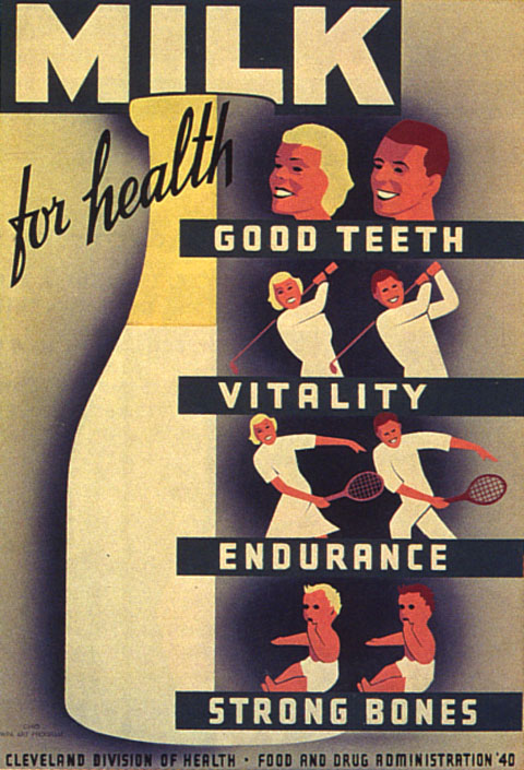
Client changed things up on me. Anybody have an idea of a good match for the “Good Teeth,” “Vitality,” etc. type on this one?
| Attachment | Size |
|---|---|
| milk.jpg | 109 KB |
Client changed things up on me. Anybody have an idea of a good match for the “Good Teeth,” “Vitality,” etc. type on this one?
| Attachment | Size |
|---|---|
| milk.jpg | 109 KB |
Actually, while we’re at it…a good match for that jaunty script would be nice as well if anyone know one.
I swear we get requests for fonts like this all the time and there are so few. they’re either too tech or too… square… wonder nobody has stepped up to the plate.
Refrigerator (Mark Simonson)
Hamburger (Font Diner)
Gala (Canada Type)
are a few but nothing that close.
anybody?
Ah! I had something right on the tip of my tongue and couldn’t drag it out, but your mention of Font Diner jogged my memory. They have a face called Milwaukee that’s a good fit.
> they’re either too tech or too… square…
Patty, do you think it’s because it was easier for lettering artists and sign painters to produce squared gothics with more consistency than circular ones? Also, scripts always seem to be part of the repertoire.
You may be right. I’m just surprised there aren’t more like that out there. Milwaukee is nice -albeit more rounded than the sample - hate the S tho - and you can’t beat FontDiner’s prices.
I remember that recent thread about the Daniel Clowes lettering for Art School Confidential.
Also, Font Diner has a typeface called Featured Item on their Free Silverware page.
It’s fairly similar, very free, and almost pefectly matches the “Cleveland Division of Health” text at the bottom.
I’m using it in a project as we speak…
—-
There’s also Venus Envy Black from Typeart (and the s-factor variant has the squared ‘E’.
For the script, see Chank’s Brimley.
With some tweaking, Amboy (by Jim Parkinson) might work.
What about Borgstrand? (Also the Core Industrial Fontpak)
Also FF World One.
Too techy?
Borgstrand
Edit: Argh!
Captured from web.archive.org on 4 Jul 2006. view this capture