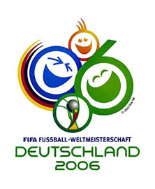
I like the ink spray one (#8)...but I don’t hate the final.
I believe the intent was to make Germany feel more friendly and affable.
If giant happy faces aren’t friendly, I don’t know what is!

Luke, I think you mean number 9 the Hesse design one, I agree on that one, the others don’t seem that much better than the final logo.
Tim
Yes, #9, Thanks Tim!
I agree, for an intenational event of this calibre I would some more resolved work.

>>What Germany Got:
>I believe the intent was to make Germany feel more friendly and affable.
Making s.th. “looking friendly” - take some acid pills, smilies and a childish font and throw that in a bucket and call it a logo - a shame ;)
btw. Wir fahren nach Berlin :)
Wow how can most of those be so bad? 1 & 7 aren’t even logos they just use pictures.. 2, 4, and 11 are useless. #10 Would look good for your under 5 yr olds...Bah #3 is the only half decent one but the composition looks too large to be used well.

If those are supposed to be the contendors for the final logo, then I am sad for Germany in general.
+
Ryan Ford

The ink-spatter Rorschach grass-stains are fun.
Does anyone know what is going on in the center of the official logo? (beneath the drug-induced smilies)
That’s a representation of the world cup.
If I was feeling more confident I would say it’s the one David Beckham will be lifting, but more realistically it will return to South America:)
Tim
Does anyone know what is going on in the center of the official logo?
That would be an abstract of the World Cup trophy. But don’t worry, you’ll get a better look of it on the photos of Wayne Rooney holding it aloft in the press midway through next month ;)
Nice one Tim, beat me to it!
Great minds think alike! ;)
Fingers crossed the cup will come home!
Is it full of pies?
Like your confidence though.
Tim
There’s also an interview with Spiekermann (English) about this.
Is it full of pies?
No, he’ll just nick it off the Brazilians when no-one’s watching.
Is it wrong that I actually think Owen Hargreaves is our best player at the moment?
Also, can’t help thinking Spiekermann’s right on the money with those comments. Their mascot makes less sense than the 2002 mascot/s - if that’s possible!
That article is awesome. I would quote it but there are too many things to quote.
I think you are right about Hargreaves, I read that Neville has recovered, personally I think he should stay on the bench.
The comparison to the Munich Olympics reveals just how weak the chosen mascot is, it looks like it was designed by someone relying on a garbled description of a lion:)
Tim
Tim - Hmmm... I think one (of the hundreds) of reasons that we’ve been mediocre (at best) is that we’re missing Neville, he understands and links up really well with Beckham, is a solid defender (not so prone to mistakes as Rio), and has the longest throw-in range I’ve seen. Plus Hargreaves can then play in central midfield where he plays for Bayern, he’s playing out of position at right back (and put Carrick back on the bench).
Right, got that off my chest, I’m off for a spot of Robot Dancing!
Si
P.S. Sorry it’s all got a bit off-topic, but World Cups are only once every 4 years (as I keep telling my ’world cup widow’ fiancée!), my next post will be design-related, I promise!

The 11 Designers designs weren’t options for the World Cup logo. They were all designed AFTER the official logo was announced, as a protest. So actually, Germany never could have really had these logos, at least in one sense… they were never options that were on the table.

I like the ink splatters. But that would be Copenhagen, not Germany. “Ve do not make mistakes in CHermany.”
What im/de-presses me is the use of Flash on some of the animated logos. Very grade 12 graphics class.

frankly, most of those are far worse than what they are using. the only one that comes remotely close to a level where it could actually have worked is the ninth design, though i can’t really understand what they mean by the splatter.
I like the logo they chose. Its not for design reasons but world political reasons. It makes world cup look like fun for the fans and not like American Football (War). In a world where fans can go crazy (English hooligans) and the potential for terriorism a whimisical logo isn’t a bad idea.

Hey Dan R, thanks for the clarification. I wonder if babelfish can make heads or tails of Speikermann....
I agree with Dan Weaver too. Probably it’s easier for the public to register a cliched ’smiley face’ than some ink splatters. Furthermore spleatters might be associated with violence & blood spilling! But I like option 7#.
Eben, did you perchance see the option to choose between 30 different languages?
Heres the english link, which has now also been posted above:
http://www.dw-world.de/dw/article/0,2144,2049898,00.html

I like number 5.
ChrisL
Thanks Jesse!
Captured from web.archive.org on 2 Jan 2008. view this capture