Typophile

Help?

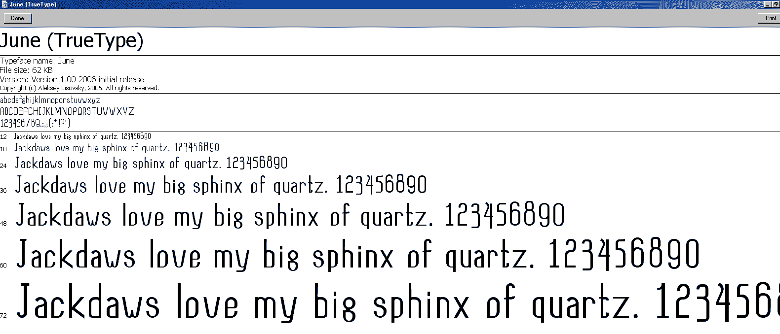
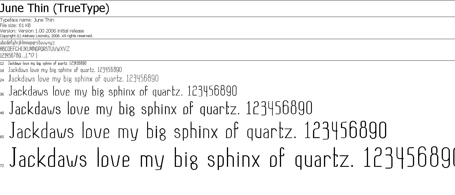
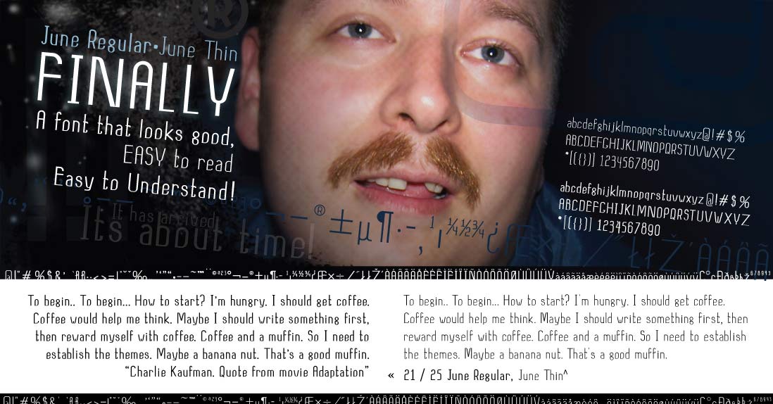
Hi all, I have recently designed my 2nd typeface, and was looking for some feed back, and any suggestions on issues to watch out for in the future… I know that my characters in both fonts have too thin of a stroke, and I’m heaving kerning issues, it takes me as much time to kern as it does to do everything else, is that normal?

AttachmentSize
june.gif31.68 KB
june_thin.gif27.01 KB
promo_small.jpg101.79 KB
promo.pdf784.33 KB

Just checking: did you finalize the SPACING of the font before starting the kerning process? That's the way to do it. Even if you did, kerning is a time-consuming process. It's not easy to think of every possible combination. It helps to have text files handy so you can test everything visually (like in InDesign).

Crossgrove, you were right, i didnt spend enoughf time on spaceing, and thats why kerning killed me, ill keep that in mynd for next time for sure.
thanks for your input, good luck.

Captured from commoncrawl.org on 26 Apr 2015. original URL