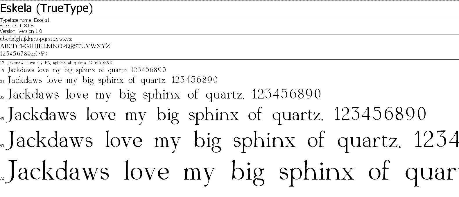
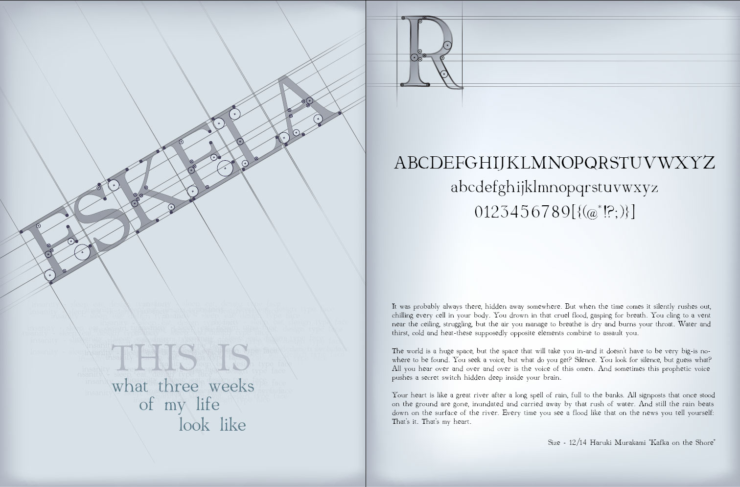
hi, this is a serife’d display font, it became such after I realized that there is too many curves in this font to be readable in smaller size, I was just looking for some feedback, and suggestions for the future…
thanks
| Attachment | Size |
|---|---|
| eskela.gif | 31.64 KB |
| eskela_promo.jpg | 184.39 KB |
| Eskela_light.pdf | 204.73 KB |