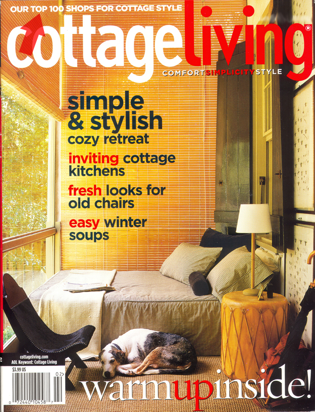
Sorry I don't have an image to show yet, but the machine attached to the scanner is archiving, and likely will be all day. So this will prove a good test of my ability to describe, and your ability to put these disparate clues together. And while I enjoy flipping through my books and catalogs to do the detective work, other work beckons at the moment. And I couldn't find the face on What the Font.
The serif font used in Cottage Living magazine has these qualities:
Overall, a very similar feel to Centaur; the LC y terminates very much the same, but the horizontal stroke on the LC e is horizontal, not at an angle
LC p: lower part of the bowl stroke follows through the down stroke for a unique letter. Not calligraphic, but not a serif, either. I don't know the technical term for that type of termination, if there is one.
LC t looks more like that of Galliard than Centaur
LC g looks more like that of ITC Garamond than that of Centaur
*Is that enough to go on?