Typophile

Prime and double-prime

The prime and double-prime (U+2032, U+2033 respectively) are supposed to be different from the acute accent (U+00B4), but not a single one of the several hundred expensive fonts I checked out has those two glyphs. I was wondering what other people do when they need primes or double-primes — do you go with one or two acute accents, do you create the glyphs yourself, or what?

if true prime marks are not available, i'd say that the singlequote (U+0027) and the double quote (U+0022) are your best approximations.

if true prime marks are not available, i’d say that the singlequote (U+0027) and the double quote (U+0022) are your best approximations.

So long as you disable automatic substitution of typographers curly quotes in your application.

exactly.

In bookwork, prime and double prime are historically slanted characters; for this reason, generic single and double quote marks in roman fonts are incorrect. Because these characters are not ordinarily represented in text fonts, compositors correctly use characters from pi fonts, typically math pi fonts, for them. If you're including them in a text font, you should draw them at a slant, as if italic. Acute accents should never be used for these characters.

I agree, but the best solution I find is usually to use the italic versions of the "typewriter quotes." The main problem with using a math pi font is that the weight may not match very well.

That being said, these should definitely be in more fonts. I've got them in the typeface I'm working on right now, fwiw.

T

Thanks a lot for your input, guys.

Acute accents should never be used for these characters.

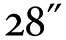
Have a look at the experiment below (Minion Regular, kerned acute accents). Is this terrible?

what they said

just a bit ago (obviously): http://typophile.com/node/20825

Captured from commoncrawl.org on 19 Apr 2015. original URL