
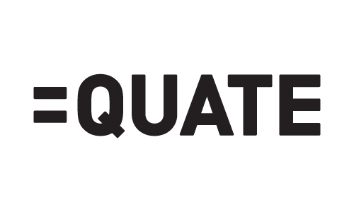
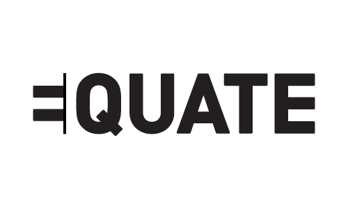
I've just finished this logo and some people don't seem to get it! I thought it was easy enough but would like to be sure.
This thread ran to 2 pages of replies and only one was recovered, so replies are missing.
I've just finished this logo and some people don't seem to get it! I thought it was easy enough but would like to be sure.

It would be better if the word wasn't in the title. Having seen the word before opening, it was what I saw.
cheers I'll try and change it

I read 'EQUATE'. Is that it?

even as a non-native english speaker i instantly got the idea and found it easy to read, and i think that it is a clever concept. just think about the fedex-logo, after you've once found out the trick you'll never forget the brand.

i don't find that confusing in the least. i feel it is a clear and smart visual message. don't change it.

Totally agree with Thierry and I think it's brilliant.

I understand it and like it (for the simplicity and strong message). While I DO understand it, I can imagine how/why people don't.
I guess it depends on what it's for and how visually literate the audience are.
What is it for?

I got it right away and think it's very cool. But this audience is not made up of civilians.
ER

Very simple and clever. Good work!
yeah thats right it just gets worrying sometmes when someone asks what is Equals Quate!
Thanks for the feedback so far. it seems 95% of people get it. Thats a relief as I really like the concept. By the way its for an accountancy company

I like it very much. I hope you don't mind I had a break on your logo, I was thinking that a vertical bar on the left might work for your reification concept (the constructive or generative aspect of perception), and also it creates a mark which can be use separately from the logotype.
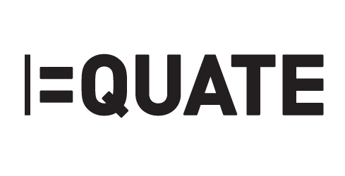
thanks Alessandro, I'd already tried that during the development process but thought it detracted from the = part of the logo although it does let you see the E easier. I thought this was important for the link to accountancy. I know what you mean though!
the vertical bar does not help the recognition of an E shape. IMO
Along similar lines, perhaps this is something worth exploring ...
----------
Paul Ducco
Solid Creative
Communication Design, Melbourne

I saw it straight away. I like it. The vertical bar actually
makes the E harder to see imo.
Phil

I really like it, but I had to think to get it…
peace

Jerome, I understood it immediately. I have the same question as Paul, though, who is the intended audience?
My training is in electrical and electronics engineering, not graphics, and it's crystal clear to me, and I like it.
I don't like the vertical bar because it means "NOT" in many programming languages ("!=" means "NOT EQUAL").
Hi Andi
The company is an accountancy firm so the audience is business managers small and large, financial directors etc.
hmm, the fact that it's an accounting firm causes a bit of concern for me given that the source of peoples confusion is most likely the visual redundancy and phoenetic overlap between the symbol and first three letters...i certainly wouldn't want an accountant who unwittingly repeats and isn't precise to such a degree. petty and splitting hairs, but thats waht you want an accountant to do.
so, although i find it clever, i believe it's too 'cute' and fussy to be appropriate. it's one of those ones to be proud of discovering, but better off not pushing if there is an uncomfortability.

First glance got it. No problem.

What about adding a solid vertical bar immediately to the right side of the equals sign? (To define the right edges of the three legs of the first E?)
(Hope that made sense...)
--Michael.
------------------------------------------------------
// love what you do or do something else. //
Michael Ebert -- graphic designer, jazz saxophonist, horror movie devotee
http://homepage.mac.com/mwebert
mwebert@mac.com
--------------

a bit late (and a bit rough) but what about this?


This is one of those things that is meant to be read in layers. Some people will get it right away, but if they don't it isn't a bad thing. Jerome, stick to what you have. I think most people enjoy things with an "aha" moment in them.

Dear Jerome Iveson!
Your first version was the best!!!
Readable & understandable for the first sight.
So don't change it! :)
I got it at first glance – reminded me of the logo of a Swiss internet provider, though (upper left corner – excuse the messy homepage).

I get it & like it!
My only thought is to maybe add a little weight to the '='.

I like your original conception to use an Equal Sign as the letter E. But... I can understand the confusion of people not understanding it.
The Equate seems to come through to those that are educated. Unfortunately, that is not so true of the masses. Fifth grade educations only get a person so far in this world.
Perhaps you'd consider using the three bars to get the idea of the E across - and then one of the bars as an equal sign. Does that work for you?
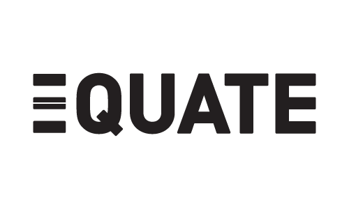
I think the original version is best. I got it at once, albeit with a tiny "tick" of having to think about it, which is surely a good thing for a logo.

hope this one geths through...

You know Tim, I'm thinking that looks more like "= Quate".
quote - The Equate seems to come through to those that are educated.
A very interesting elitist observation based on?
The original logo is the best…
peace
>A very interesting elitist observation based on?
tsk, tsk, tsk, we don't use the word elitist around here, we're all esoteric, remember?
This last one by Ahrens is interesting but the original one is still the most forward looking in terms of style. Very basic and cool. And making them think just a little bit is a good thing, they'll feel all smart when they get it, and they will.
ER
Based on comments i think I'll leave it as it is. I wasn't expecting this amount of comments. Thanks to everyone who has posted so far

It might be my screen (or my eyes) but the open counters of your E look sharper on the inside than the outside corners, it might be worth trying that on the equals symbol to reinforce the origins of the letter, then again it might be too subtle to bother with.
I did read your logo first off and it's a nice wordplay, I wonder if the kerning between =Q needs to be tightened a bit (or QU needs loosening a touch).
Tim
I like your original conception to use an Equal Sign as the letter E. But… I can understand the confusion of people not understanding it.
The Equate seems to come through to those that are educated. Unfortunately, that is not so true of the masses. Fifth grade educations only get a person so far in this world.
People with 5th grade educations are rarely in a position to choose an accounting firm. The extra bars make it more confusing while taking away the simple cleverness of the original.
What about
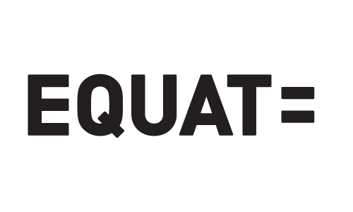
The initial ideas are all still there, and it might be more "readable" for the general audience...
(In addition, the stem of the 'T' provides the extra help to form the subliminal 'E')
Stick with your original. It works.
i'd say stick with your origional but i felt like messing around also:

Here's a visual for my previously convoluted explanation...
--Michael.
------------------------------------------------------
// love what you do or do something else. //
Michael Ebert -- graphic designer, jazz saxophonist, horror movie devotee
http://homepage.mac.com/mwebert
mwebert@mac.com
--------------
Overall, I prefer Miguel's solution to the original for legibility's sake. Nobody is going to read that as a logo for "EQUAT" while there is some chance that he or she could read the original as "QUATE."
Hope that makes sense...
--Michael.
------------------------------------------------------
// love what you do or do something else. //
Michael Ebert -- graphic designer, jazz saxophonist, horror movie devotee
http://homepage.mac.com/mwebert
mwebert@mac.com
--------------
Miguel's solution has something to it. In many ways it does what the original does while avoid all of the outlining, shadowing and/or other tricks which should be the goal. IMHO

Just the first one. It works.
I saw it and my first thought was: What's this?
It struck me by its simple and powerful looks.
After a split second, I got the meaning of it.
It's quite a blunt design. I like it. :-)
Still like the original. Miguel's solution is insightful, but has its own, potentially worse, problem:
An intelligent person notices that "Quate" isn't a word, finds the "=" and says "Oh, it's "EQUATE."
But, in a world with companies like "Compaq," "Equat" (pronounced "equate" or rhymes with "squat") is a potentially valid company name. In fact, www.equat.com is a Web design page.
They might google for "equat accounting."
Don't change your original idea. It's clever so don't mess it up.
> An intelligent person notices that “Quate” isn’t a word, finds the “=” and says “Oh, it’s “EQUATE.”
And a (less) intelligent person notices that “Equat” isn’t a word, finds...
> But [...] “Equat” [...] is a potentially valid company name. In fact, www.equat.com is a Web design page.
That also doesn't hold as an argument. Google for 'quate' and see what you get...
Funny thing

doesn't seem to work (sorry, done in a hurry).
It occurred to me because I just saw the campaign for the II week of sexual diversity on TV (in Brazil) and they used the unequal sign as a logo to represent diversity. Unequal=diverse, get it?

You're going to find that we designers love the idea because visually and symbolically it's simple but clever-as-hell.
You mentioned, though, that it's for an accounting agency of some sort, which causes a problem. Have they seen this concept yet? My worry simply stems from the fact that accountants are less likely to appreciate a clever logo and more likely to want some pretty typography with serifs and a few little swashes here and there.
You will also continue to find that some people get the word and some people don't. If this were a night club, it'd be one thing. But since it's an accounting firm, you'll have to make sure their title is clear and 100% obvious so people can take them seriously.
> An intelligent person notices that “Quate” isn’t a word, finds the “=” and says “Oh, it’s “EQUATE.”
And a (less) intelligent person notices that “Equat” isn’t a word, finds…
> But […] “Equat” […] is a potentially valid company name. In fact, www.equat.com is a Web design page.
That also doesn’t hold as an argument. Google for ‘quate’ and see what you get…
Miguel,
I apologize if it sounded like I was sharply criticizing your design. Your idea was a very clever solution, and I liked it. It was certianly (in my opinion) the best alternative submitted. You are correct that "quate" gets more Google hits than "equat."
My intent was to point out that your alternative is also not idiot-proof. I don't see either design as a problem, but it is fair to say that each alternative has some possibility of confusion.
[liquisoft]
“My worry simply stems from the fact that accountants are less likely to appreciate a clever logo and more likely to want some pretty typography with serifs and a few little swashes here and there.”
I’m only posting in this thread because it discusses the perspective of non-designers.
My background is electrical engineering, and engineers are considered to be almost as aesthetically retarded as accountants. I LOVE THE ORIGINAL DESIGN. I’m a bit offended at your patronizing stereotypes of non-designers.
“But since it’s an accounting firm, you’ll have to make sure their title is clear and 100% obvious so people can take them seriously.”
As an entrepreneur (from the Old French for “person who hires accountants”) I would take a firm with this simple and brutally clever name and logo far, far, far more seriously than I would a swashy “Mary’s Olde Tyme Accounting” or a brain-dead firm that called itself “CPAs Plus” (in Arial or Cooper Black with a big “+” sign).
Captured from commoncrawl.org on 27 Apr 2015. original URL