
I can't put my finger on it, but I recognise the R ...
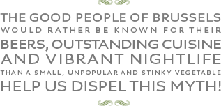
I can't put my finger on it, but I recognise the R ...

That R looks like Priori but that's not your font.

Looks like Jeremy Tankard to me
Maybe Aspect?

Yes, Aspect without all the quirky goodness of the lowercase or swash alternates. Still looks nice though.

You can see it used intensively on their website.
Excellent Paul. Many thanks!
Captured from commoncrawl.org on 26 Apr 2015. original URL