
Hi there,
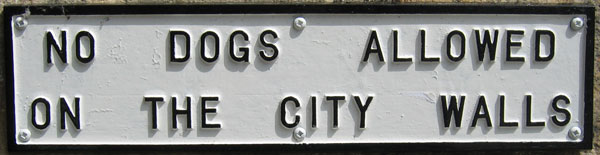
Can anyone help me with this one, please? How about that wacky-do spacing?! They could have used a super-expanded and still had room to spare. Maybe they think dog owners need to be spoken to slowly? :-)
Cheers,
/stephen
Hi there,
Can anyone help me with this one, please? How about that wacky-do spacing?! They could have used a super-expanded and still had room to spare. Maybe they think dog owners need to be spoken to slowly? :-)
Cheers,
/stephen

Does that even make sense in Australia? You have anti-gravity dogs when you get down under?
No anti-grav dogs, alas. Just kangaroos that we use to ride to work. :-)
As for the sign, a friend took it for me somewhere in her travels, but I can't remember where. This is the full image. Perhaps that board in the bottom-right is a clue, but it's not enough of one for me.


Cut'n'pasting from another thread:
You have to realise that this kind of lettering is output device-specific: it is a set of characters that is produced specifically for a certain type of sign making machine. This means it has no equivalent in what we know as digital fonts.
Other examples are alphabets available for the stamping machines that produce automobile license plates, for sowing and embroidery machines, for stone engraving et al. It just is a different world. In some rare cases you’ll find alphabets that have digital font counterparts, but more often than not they will be unique to that reproduction system.
Goodo, that makes sense. But can anyone suggest a digital typeface that comes close?
So does that mean the people making the machines start from scratch each time? Or is there a set of non-digital sets that they'll call on?

To add some useless – and completely OT – words, on the board there seems to be a Richard Coeur De Lion/Lion-Heart coat of arms (the red one with three golden lions passing). I can't see the top one who could be the city emblem (or anything else, of course, as well as the one in the very corner).
Just because I'm terribly curious, could you please post that detail a bit bigger?
> So does that mean the people making the machines start from scratch each time? Or is there a set of non-digital sets that they’ll call on?
I suppose they must have their "type" manufacturers as well, but this probably is a parallel circuit with little to no overlaps with the digital world.
As for similar typefaces, what about H&FJ's Knockout No. 32: Junior Cruiserweight or Jim Parkinson's Balboa Light? YouWorkForThem's Ultramagnetic is more condensed but has the rounded corners.
I love curiosity. Here's the detail at full size for you. Does that help?

Thanks for your suggestions, Yves. Ultramagnetic is just what I'm after.
Stephen,
Thanks a lot!
Just the few things I could find out using the little memories I have of heraldry. The half crest on the top is an early Plantagenets and the half near the "M" is a late for the same bloodline, probably taken from the Tudor coat of arms. Just below the "M" there's what looks like the city of York's crest, but the color of the cross should be red not black, so it could be something completely different.
The only thing that makes me link again the place with that county is the Yorkshire White Rose below the Lion-Heart and the (maybe)York crests.
I couldn't figure out the three at the bottom.
I had some serious geek-fun with this :)
Another candidate -- the absolutely gorgeous FF Hydra Text.
Jacopo,
I thought you might be interersted? A friend of mine did some googling, A9ing, Flikring, etc, etc and found these links:
http://www.flickr.com/photos/chyleung/160796547/
http://www.york24.org/tye/thingstodo/krich/pages/Dcp_2550.htm
Quite an impressive bit of web-sleuthing, I think. :-)

Gravur Condensed at www.lineto.com has a similar feel,
although it is slightly more rounded. It is supposedly
based on the standardised alphabet seen in Switzerland
on signs/rubbish bags etc, which is not drastically
different to the genric output device typeface used on
this sign.

Stephen – impressive (verging on obsessive, especially blaming it on a "friend":)
Tim
Stephen,
Shame your friend is not registered here, otherwise he could have be posted the links himself telling that you found them :p
Thanks a lot for sharing, at least I know that even if I'm nothing in type ID I have some hope in heraldry... anyone looking for a jester?
Phil - Thanks for the link.
Tim - Hehe. I wish it had been me. I was so impressed when James* emailed me the links. It's not enough just having the tools to look, you also need to know how to look: knowing that that 'gate-thingy' is actually a portcullis, for example.
*(What? Am I making up names as well now?) :-)
BlueJ - Thanks for your contribution. "Geek-fun" is the best sort of fun. Well, one of the best, anyway. :-)
Captured from web.archive.org on 17 Oct 2013. view this capture