
Basic question: Is text on a curved path considered a major "type crime"?
Perhaps it's just an issue on a font like Futura Extra Bold... see the attached pic for an example.
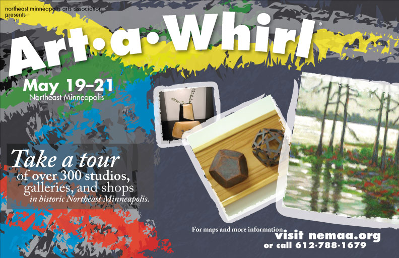
Specifically regarding the large "Art-a-Whirl" in the upper left. For example, the baselines of the 'A' and 'r' are at different angles. Do graphic designers hang in hell for these kinds of problems?
I'm open to any other comments regarding colors/layout/whatever.
Keep in mind this poster is far from done... yes, I'm well aware of the major kerning issues :)
FWIW, the instructor and other students seem to like the "curved" version, but since it's not a type class they may not know any better.
PDF, if you want a closer look: http://udesign.org/poster/aawposter.pdf


