
Ok ABC networks, what kind of font game are you playing?
For those who have been tracking typefaces and icons on the ABC tv series LOST, we now have a new entity to decipher: The Hanso Foundation
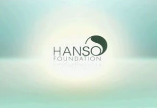
Seems that a series of seemingly inoccuous short tv spots running lately delivering somewhat half "New Age" healthy spirit and beneficial corporate foundation will help the word messages, pointing you to a phone number where no one answers... is just part of ABC's marketing scheme to build greater interest in the show LOST!
Not only are they playing with the general tv viewers, but they're playing with nerdy typophiles like you and me!
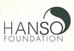
Why mix weights of Helvetica with Helvetica Condensed and Futura all in the same logo? To confuse and intrigue us into watching more episodes of LOST!
Please correct me if I'm wrong about the typefaces (that's why you're reading this in the Type ID section).


