Typophile

The best fonts you can't have...

This thread ran to 3 pages of replies and only 2 were recovered, so replies are missing.

Mike Diaz

Okay folks! Here are three of my favorites that you can't have. These are unreleased- and most likely, will never be released- fonts that rock my little typographic socks.

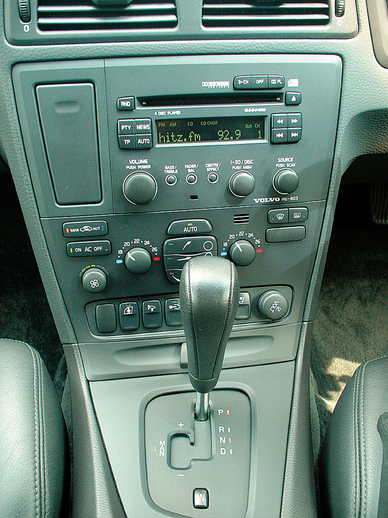
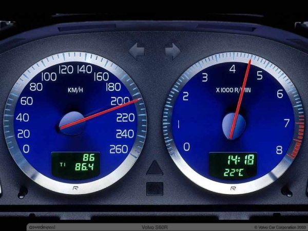
Volvo Sans... used on all Volvo controls and switches. Its like Handel Gothic only more swedish-er.
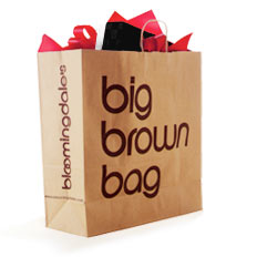
Bloomindales... This swanky typeface has been strutting its stuff while the folks who made Chalet were not even born yet. [And no, Horatio doesn't cut the mustard]
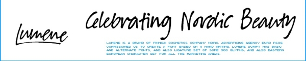
Lumene Script from Suomi... This is my favorite handwriting font ever! Perhaps when Lumene Cosmetics will change campaigns will then we have access to this genius face. Think of it as Emma Script with less caffeine. Plz Script is a significantly less refined alternative however the up-and-coming Suomi Script would be fascinating.
But good news in 2011 we get access to Dereon... a luscious scotch face and in 2008 Parisine Office from Porchez. :-)
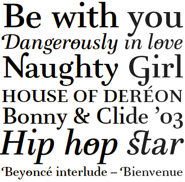
Do you have exclusive fonts that you wish you could have... post images, names, and foundries.

Mikey

Very cool thread. Too bad I have nothing to add yet. If something comes to mind I'll be sure to post it here.

http://www.guggenheim.org/

it's similar to FB Nobel which I can't have either because I can't afford it.

Patty> I know what you mean... there are so many wonderful fonts out there begging for us to buy them. Our bank accounts will never match up with desire.

Your Guggenheim choice is telling as well. These institutions often commission excellent typefaces from the world's top designers [ much to our dismay ].

Mikey

What about a really good font you used to
be able to have but no longer can? Unica. :-(

hhp

Hrant>

I don't remember Unica. Do you have a sample or a website? I would love to see it.

As far as the font I wish could have, but they don't sell it any more: Antikva Margaret.
Zoltan Nagy's organic tour de force. I hope someone [talented enough- too many lousy/sloppy remakes these days] decides to digitize this genius face... I'll be waiting too.

Mikey
kesh> Dereon almost makes me want to take up fashion design so I can get a hold of it.

;-)

Mikey

The Bloomingdales face is just a 'topped and tailed' Avant Garde - went to Vignellis lecture in London last week. The rounded 'w' is differnt though.

Elliot> This I did not know. Vignellis lecture?

http://www.klingspor-museum.de/KlingsporKuenstler/Schriftdesigner/Guertl...

Haas Unica – very limited sample on page 2 of this pdf
and there have been typophile mentions, try the search (or google)
http://www.typophile.com/node/18387

Tim

>Vignellis lecture
D&AD President's lecture (www.dandad.org) couldn't go work too late

Mike, it's hard to come up with good samples of Unica, especially since its
relevance is subtle with respect to its two sources: Helvetica and Univers.

BTW, Massimo "What's a font for?" Vignelli bothers to use speech?!

hhp

Sorry that was maybe a little cryptic. I went to a lecture by the husband and wife team, Massimo and Lella Vignelli, who did the Bloomingdales identity (in 1972) among their wide range of projects over the last 40+ years; Massimo Vignelli described the Bloomingdales logo as a simply customised Avant Garde. (In general they tend to use unadorned, tried and trusted classic and modern typefaces for identity and logo treatments - see also American Airlines, NYC subway signage, Knoll logo etc but occcasionally customise - they did their own Bodoni for example)

I didn't think you were being cryptic.
I just think Vignelli doesn't adequately grasp communication.

hhp

I was just explaining my link between the logo and mention of a lecture to S U Fabulous.

Hrant, I do understand that typographers don't necessarily have a high opinion of M Vignelli - especially given his comments about there being too many fonts in the world, none he regards as useful produced in the last 30 years, etc. I can see how he could be acccused of not understanding, ignoring or even dismissing typography. Seems pretty good at communicating though.

I don't know if it was on here or another design forum, and correct me if I'm wrong, but isn't Volvo Sans just a modified/renamed version of another font?

Also, if you work on Volvo stuff you get a copy of their Volvo family of fonts.

hrant> Unica is very interesting. I like the fat counter to the lowercase 'a'.

Elliot> Thanks for the info on the Bloomingdales font. I did not know he made that. I actually thought that was Bengiaut's work.

FontPlayer> Axis can be yours for the low low price of just $1100. If you want to fork over that kind of cash, Akira himself, better autograph the cd for you.

Jselig> You might be referring to this post:

http://typophile.com/node/3875

That post deals with Volvo Broad and some others. The font I love is the one actually used inside the cars. Its very different and still very much avant-garde.

Mikey ;-)

FontPlayer> Axis can be yours for the low low price of just $1100. If you want to fork over that kind of cash, Akira himself, better autograph the cd for you.

If he throws in an all expense paid trip to Japan to pick it up (you wouldn't want to send something that expensive through regular shipping channels), we've got a deal. After seeing some of Gia's reviews of Japan in another topic, I'm ready.
; )

Alway's liked this, by Porchez Typofounderie. Dereon for Beyoncé fashion line, House of Dereon.

http://www.typofonderie.com/alphabets/view/Dereon

K1RK> Yes! We love Beyonce's sexy voice. Now we love her sexy fonts too!

Mikey

Another one guys...

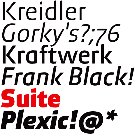
Textaxis fonts- as of this moment- are still exclusively for the magazine Suite. In an email I received, they informed me: 'In the future we going to sell part of the Textaxis catalogue."
I respect the publications 'need' for exclusivity but part of me says 'ahh com'on guys, give the fonts'.


;-)

Mikey

PS... Textaxis's Suite family received a TDC award in 2002.

started my own blog of motorized fonts.. thing you inspired

http://typophile.com/blog/7029

I like the DB Type for the german railway company "Deutsche Bahn" by Erik Spiekermann

http://www.spiekermann.com/iblog/C61720386/E20051013130639/Media/DBType_...

That's sick about Volvo! I always wondered about it. Have to say that Porchez is the shit! Matthew Carter's was the shit last year. Is Porchez gonna be the shit this year @ Typecon?

Oh that's gay! It edited out my cursing! Sorry if I offended anyone!

I was thinking about Sem Hartz' Juliana, but it seems it's in the pipeline now.

ƒ

I'm thinking Archer for Martha Stewart Living.
I love how Frere-Jones was able to merge a soft and feminine look with a rigid slab serif face.

As far as the font I wish could have, but they don’t sell it any more: Antikva Margaret.
Zoltan Nagy’s organic tour de force. I hope someone [talented enough- too many lousy/sloppy remakes these days] decides to digitize this genius face… I’ll be waiting too.
Mikey

I've wanted to do Nagy's work for some time. Antikva Margeret has always been one of my favorites for a long time. I've never run across good samples of all of his work though. All I have is an old VGC specimen from the 70s. Anybody know of any really good sources? And is there any possible contact info for relatives, heirs, etc?

George
I felt bad because I had no shoes, until I met a man who had no Bodoni

gthompson> Are you kidding!!! (your gonna pee your pants) I have ACTUAL pressure transfer sheets of Antikva Margaret sitting in my house in a box. NO JOKE!. THEY ARE IN PERFECT CONDITION! I pull them out gently and stare through them sometimes...and think how is it some people come up with brilliant ideas, whereas others like myself, can only appreciate them.

I also have samples of York by Georg Sultan another genius european. You can get a lousy phony version of York called Jorvik Antikva on dafont.com
The forger has the nerve to "want to know what you'll do with it"
Its bad but you can get an good idea.

Back to Margaret... My scanner is dead... contact me through my profile if you need too. I'm so pumped I can't type!

Mikey

Ps... I love all these unusual squarish Melior-like display faces from the 70's and 60's. They make me want to drink tea or garden or something... I love organics!!!!!!!!!!!!!

Let's not forget those Fontographer fonts which have disappeared into the ether. Some seem to have been rescued by other foundries but lots of them are still not available.

I wish I could have 'Luxury', but I fear I am just not wealthy enough. :)

( Ooh, And most of the other custom, exclusive 'stuff' by Christian Schwartz / Orange Italic and Hubert Jocham. )

Dav

But Mike, isn't the squarish style (which I admire as well, although in Melior
it doesn't really click for me) actually mechanical - the opposite of organic?

hhp

Yea, Shhh, Hermann Zapf = Superellipseman. :)

Dav

Zapf's Civilite

and i believe house will be releasing luxury sometime in the future. don't know what the pricetag will be...

I have ACTUAL pressure transfer sheets of Antikva Margaret sitting in my house in a box. NO JOKE!. THEY ARE IN PERFECT CONDITION!

I also have samples of York by Georg Sultan another genius european. You can get a lousy phony version of York called Jorvik Antikva on dafont.com
The forger has the nerve to “want to know what you’ll do with it”
Its bad but you can get an good idea.

Okay, now I'm jealous. Do you have more than the regular roman? VGC catalog shows an italic as well as light, extrabold, and black weights.

New York was another nice one. I used to keep big photostats of both to look at, but never had a job I could use them for. There was a day school I used to pass whose sign was painted in New York. Always nice to see it, though not really the right face for the job.

Surprisingly I couldn't find a specimen with New York in it, and the Jaspert & Berry Encyclodpedia of Typefaces doesn't list it or Antikva Margaret.

George
I felt bad because I had no shoes, until I met a man who had no Bodoni

But Mike, isn’t the squarish style (which I admire as well, although in Melior
it doesn’t really click for me) actually mechanical - the opposite of organic?
hhp

Take a look at Antikva Margaret and you'll see what he means. It's geometric-organic the same way C. R. Mackintosh's work is. Looks a little boxy, but all curves.

George
I felt bad because I had no shoes, until I met a man who had no Bodoni

>SuperUltraFabulous

That's the font! (I believe) NewScientist, a british science magazine, uses it; you can find it at the bottom of the cover and throughout the magazine.

I was about to write to NewScientist to find out what this awesome sans they used was. I love it!

( Ooh, And most of the other custom, exclusive ‘stuff’ by Christian Schwartz / Orange Italic and Hubert Jocham. )

I have a new font-making hero. I like almost every single one.

The best font I can't have is in my head!

Steven Wulf> I'm loving this DB Type. Looks like the design has lots of longevity.

Chris Keegan> Telenor has clean lines AND a personality. I like the light weight.

Typeology> I know. Volvos- not so sexy. The font inside- very sexy!

fredo> Sem Hartz’ Juliana is getting attention now and I hope they make it true to its design and modern for today. There is even a book in the works.

http://infernopress.blogspot.com/2006/04/sem-hartz-making-of-linotype-ju...

alexhb> I have never seen Archer before... great post! Umm... it reminds me if Stymie and Century had a baby, Archer would be it. It also reminds me of:
http://www.vanderfont.com/type/page/CHARMINETTE.php

Pattyfab> I have never ever heard of that... I wish someone has a site that shows some of them. I'm not a type designer so I'm clueless about fontographer.

formlos> SuperEllipseMan???? Splain that one.

paul D hunt> I have never seen Civilite...please elaborate!

Samadam> Good pick... very strong. Would have never spotted that.

Thanks guys....

Mikey

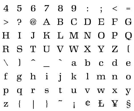
hrant> You have not seen Antikva Margaret I take it... have a look at this image I pulled from another thread.

Sqarish yet organic... not mechanical. Is it just me or does that lowercase 'g' rock?

Mikey

Sergej> Although I'm not a type designer I know what you mean.

gthompson> Now you go me jealous. You have THE actual VGC catalog! I wish I had that puppy. Umm... sorry but I only have the regular and no italic. :-/
Speaking of public sightings... there's a concrete bus stop in my city and you know what?... the inscriptions are set in Margaret.

Thanks....
Mikey

PS... York is the actual name to Georg Sultan's typeface. New York is the font standard on macs by Font Bureau. Not to be picking-nits but I just don't want anyone to be confused... :-)

Mikey, Ever heard of the term 'SuperEllipse'?
( Hermann Zapf + SuperEllipse )

Dav

Now that you've put up a sample, I know I'd seen Antikva Margaret, but I'd
forgotten what it looks like (and how nice it looks). It certainly has some great glyphs! The "g" though I would have given an open bottom - it's clotting a bit.

BTW, I think the famed old Czech-produced ITC catalog from the 80s
has decent samples of it, and I once made some copies from that, so...

hhp

> You have THE actual VGC catalog! I wish I had that puppy.

Gee, I thought everyone has at least one! ;-)
Which leads me to a few faces that I doubt will ever see the light of digital-day --

Though Stempel AG acquires full ownership of the type foundry Klingspor Bros., VGC had these available in Typositor fonts:
> Folkwang (H. Schardt) 1949 (which CG digitized as an experimental font manipulation exercise).
> Orplid (H. Bohn) 1929, a sans display with 3D shadow.

Also will never be digitized:
Gerstner Program type family, nice but who needs another extended grotesk :\

And, oh yeah... the missing alternates for Bauer Topic!

… there’s a concrete bus stop in my city and you know what?… the inscriptions are set in Margaret.

Hey, nice. Got any pictures?

PS… York is the actual name to Georg Sultan’s typeface. New York is the font standard on macs by Font Bureau. Not to be picking-nits but I just don’t want anyone to be confused… :-)

I finally located a phototype specimen of it in an old Total Type (defunct Chicago type house) specimen that called it New York. VGC catalog calls it York, so perhaps York was the original name and New York the knockoff name.

George
I felt sad because I had no shoes, until I met a man who had no Bodoni

I'm noticing a trend here. Its seems the most likely clients to request custom type work are: telecommunications, banking, and transportation.

http://www.teldesign.nl/opdracht/onderwijs/cito.html

You can find Cito Sans here. Super clean, very minimalist.

But my favorite, in fact one of the most successful designs, is CakeType's work for KPN. This should be released! If Myriad and Vista had a baby this is it. In fact I would say this thousnd times better than Vista! More elegant more powerful! But too exclusive :-(
Check it out:
http://www.caketype.com/custom_kpn.html

Mikey

formlos> thank you for the info... apparently Zapf was ahead of his time regarding super-ellipses in type. http://en.wikipedia.org/wiki/Superellipse

hrant> perhaps you can post some images...purty please :-)

Norbert Florendo> Unfortunately, I was at a very young age when the last VGC catalog was produced and I only started to love type when I was about 11 or 12 when I got my first Font & Function catalog. Folkwang is interesting. I have never heard of the Gerstner Program font... more info on that one please. Now Topic Rocks!!!

gthompson> I wish I could post images of that bus stop... My Minolta Dimage XT is not working either... I spilled something on it in a night club and my $69 scanner is not mac friendly. I'm just sucking right now!!!
I have an interesting observation about York I will post shortly in another thread.

Thanks guys,

Mikey

Augereau by George Abrams

Does anyone have any comments about a comparison of this with Adobe's Premier Pro Garamond?

Antikva Margaret is in Rookledge, no punctuation though.
Tim

DanGayle> Augereau is lovely but I'm sold on Adobe its also cheaper and OpenType savy.

timd> I saw that too but again not digitization in site.... :-(

Mikey

Top on my list are Christian Schwartz's Addison, Guardian, Stag, and Caslon Egyptian; and Font Bureau's Readability Series including the brand new Quiosco.

Mikey - if you like CakeType's KPN you might like Fred Smeijers' Fresco Informal Sans.

Dan - Abrams' Augureau and Venetian are available at MyFonts.

I love FB's recent news faces - top-shelf stuff. Pushy but so competent.
But somehow their names seem a bit like... gringo tourists in Ensenada.

hhp

Stephen Coles> Caslon Egyptian is wonderful- it like Bau and Futura.

But Our Type is too expensive. I like their stuff but I would rather give my money to another more resonably priced designer... FontFont anyone?

Hrant> Si Senor! I love FB too.

Mikey

$48/style is $20 more than Linotype, but only $8-13 more than FontFont and E+F. As always, you pay for what you get. The experience of them Dutch fellas is worth the slight premium.

Besides, if PDfs are important to you, the OurType EULA is very user friendly, allowing the creation of PDFs with editable embedding.

Thanks for the compliments about the typeface I designed for KPN. I also did the Cito Sans typeface (still not used).

Pieter

Hee-hee. Luxury is hilarious. So tongue-in-cheek.
That Textaxis stuff looks an awful lot like DTL Prokyon.

The latest on Luxury coming soon to a CPU near you...

1. Dick Dooijes' Mercator Light from Amsterdam Type Foundry.
2. A decent Swiss grotesque with all the bells and whistles.

Hmm… There are so many.
It came to my mind Inga, designed by Lennart Hansson and published by Mecanorma France (I think it existed just as a transferable type). I have it in a book Lennart sent me years ago. It's really a typeface I could use.
And then Andromeda by Aldo Novarese (existing probably in phototypesetting format only). It could be considered a sort of display companion to his own Mixage.
See if you can find samples of those two online…
Too tired to do a scan…

Pieter van Rosmalen> I LOVE LOVE LOVE your work for KPN! When I sell my house in LA I plan I on commisioning a custom typeface for myself... we will be in touch for sure!!!

Nice Try> I like Luxury too. I'm glad House put on their website a section for their up an coming creations!!!
Mercator??? I was unable to find anything than on that design...do you have something? And you are right about having a swiss sans that has all the opentype feature you can shake a stick at. I still love Helvetica no matter what though :-)

piccic> Inga? Do you have images to share? I would love to see it. Also I have heard of Aldo Novarese's Andromeda too- and he be so prominant in history- I find it strange no has has done a digitization.

Mikey

Hello SuperUltraFabulous,

Thanks for the compliment.

Pieter

Martha Stewart's fonts - nearly all of them. Love the script, especially.

I love the Nokia typefaces, I almost want a new Nokia phone, just so I can see text messages arrive in the bitmap font. I like Miles Newlyn's faces for the Three network. And I miss seeing Miller in the Guardian, so that's another I'd like to have around me but can't.

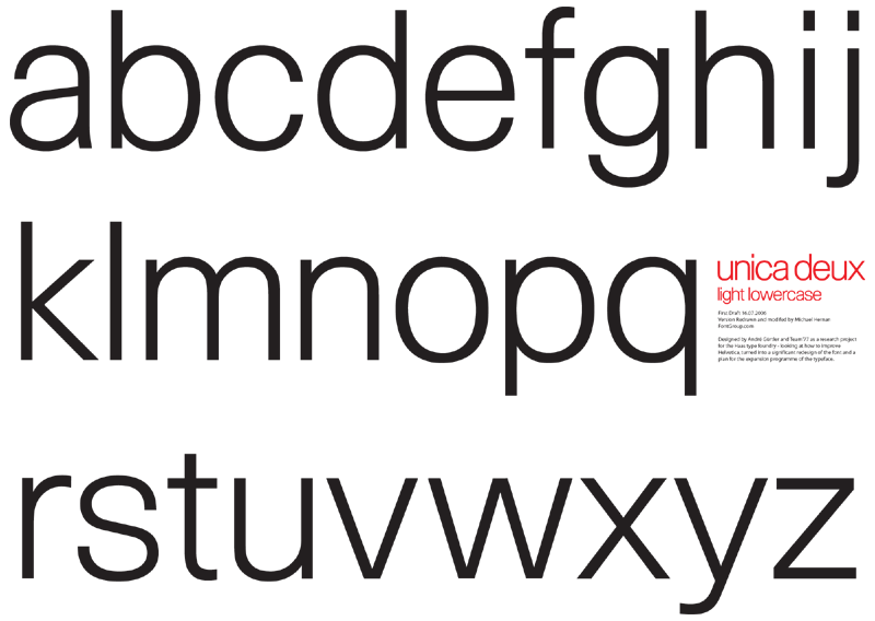
Unica Light Lowercase.
Redrawn from scratch with some modifications to suit my purposes.
Shown: 1st Draft.

I was unable to arrange to buy font/licence at this time from Elsner&Flake (due to naming copyright issues in Europe) so redrew for use on a logotype project in progress.

I won't go into the modifications unless anyone is interested but I can tell you being a lover of Swiss sans serif the exercise has been an eye opener into the creation of the forms and optical considerations.

Thanks to hrant for putting me onto special Unica edition of Typografische Monatsblätter which I was able to use as a basis.

hernan

hernan: I'm loving this Unica Deaux face you are working on. Previously you had mentioned that you like a good swiss sans with all the bells and whistles.... any special features you plan on adding to this baby?

Mikey

It is NiceTry who wants the bells and Whistles. I was wondering what was meant by this as-well! Perhaps double s, alternative ampersands, Sans-serif fist?

Unica Deux (because is closest to an archetypal form) is a development platform for me - so I'm using it to learn and try out ideas. My next task is to try out versions of the Cap R. This still bugs me. Even though the original is undoubtedly the correct way - there's no harm in trying alternatives and see if any do the trick.

I also like Mercator - I have just ordered a type specimen to have a better look at it, as I have only ever seen it as its own title in a Berthold type specimen book form the 80's with no setting or character set. (ill drop a scan when I get it).

Mercator really gives off 60's vibe and is really direct. Great for massive one word Poster headings. The cap M is really broad. Nice.

My wish for what I want but cant have starts with Adonis by Stephenson Blake. It is a grotesk type which was made by filing off the serifs of a copperplate style font. The result is intriguing. Looking a bit like akzidenz buch extended but with something else??? I first saw an example when I was studying at Manchester, where there was a beautiful Purple and Blue specimen sheet. I should have xeroxed it! I have since found another sample, which I will put here in the future.

I've always hoped for a complete set of Serif Gothic, with all the alternates as seen in this great movie title.

Archer is no longer an exclusive font:

http://www.typography.com/fonts/font_overview.php?productLineID=100033

Mikey :-)

SuperUltra: I just saw again this thread.
If you are still curious to see how Inga looks, I could do a scan.
I think Lennart has a digital version (I have not asked him), however, although it seems it is no
t available from the Mecanorma catalogs of digital type from distributors.
This happens with many faces…

About Novarese: you can't imagine how much of his typefaces do not exist in digital forms.

I should add to the two entries above, Richler by Nick Shinn (a custom typeface).
From what I recall, I really could use it.

Fot the big brown bag / Bloomingdale's I have a similar font, almost identical, you can even have the crossed double O placed in: { or } keys. STRICTLY FOR PERSONAL USE.. Called it Bloomies, a mix of SF New Republic and ITC Gothic Avant Guard MD and some other fonts. For the small w I jsut reversed the m from S.F.N.R, rotated the c and e from SF and some other stuff...

http://www.mediafire.com/download.php?3y5zy5jtnmz

Mike, this is embarassing: here is where I'm still stuck in my thinking in 2008–2009, and I never even drove a Volvo :)

Image Club Graphics produced a version of Antikva Margaret copyright 1992. The copy I have is only a regular and italic. I know from my old VGC catalogs that a Light and Bold was issued at one point.

BellSlim comes to mind. So does Telenor.

I always enjoyed this one:

Michael (userone), what's your status on the Unica Deux?
(But I guess you'd have to keep it to yourself anyway right…)

Even if he won't want to release it he might be able to
provide (including for payment) EPS settings from it.

hhp

Hey Nina, I came back and looked at this the other day and saw I had kind of put a shopping list of "desires" together with @NiceTry's inspiration. As I have had a couple of goes at small caps now - this would make sense. I might try to do this without looking at the Unica Capitals and see where they end up. (Overlay was used for the lowercase). Actually I believe it is good practice to work on the more challenging small caps first (perhaps caps and small caps play off each other). I can't put a time scale on this yet as I have pressing matters to attend to like finish the MA thesis: 'Compact Typography: The design of typefaces conceived for small size applications.'

Luckily Unica is timeless so waiting another bit longer won't hurt...

Anyway. A while back I saw this in real life which I think someone mentioned in another thread:

A&L Art and Language

Close up it is not as true as I had hoped and there is a bold use of a dot on the i which kind of bugged me but is the style if the designers (whom I forget but I think are Swiss). Respect though - because the concept is perfect: offering typographic neutrality when discussing art (without perceived bias)!

Well if three people want it (including me) - then it *shall* be created.

In the meantime @hrants eps setting idea is a good one. Perhaps it works in the same way a Licence would and also would entitle you to the font when it was finished?

Remember no caps yet.

"Luckily Unica is timeless so waiting another bit longer won’t hurt..."
For those of us who don't have Unica, it hurts every day.
(Insert dramatic music here)
Seriously, thanks for the update. The EPS idea sounds reasonable.
I don't actually have a project at hand for which I'd need it at the moment – it's more like a General Desire To Have Unica… :-)  But if a chance pops up I'll let you know.

> if three people want it

Are you kidding? I get a "Where can I buy Unica?" email like
every three months (the latest on 8/14), and I don't even sell it.

hhp

Where can I by Unica?

Don't know - might be worth holding on for the release of 'Uniform'.
I have been developing this in tandem with re-branding of Uniform Wares.
http://www.uniformwares.com
We are using 2 of the planned 12 weights.
It has small caps (used for the watch back etchings) and various special touches like 'Sentence Capitals'. [New Concept]

Hmm… so what are 'Sentence Capitals'? :)

Michael, you might consider straightening out the flap of the "1" a bit, it's a little too cute at the moment.

Won't hijack this super thread any further.

Nina - I am opening up the concept here Typophile node 73153
Thanks for the nudge.

Nick - Thanks - I will work some more on this. (and might start a critique page to focus my progress).

Does anyone know where to get the Augereau font? I can't find it anywhere... and it's so expensive...

If you know the price, you probably know where to get it...
(We don't promote font piracy here.)

hhp

At least Williams Caslon Text is now generally available. (And there's also Imprint, and many people might already have that or Bitstream's Dutch 766.)

As noted in another thread, not only Haas Unica, but also the Rail Alphabet, are not generally available. (But we have Akzidenz Grotesk, Helvetica, and Helvetica Neue to choose from, at least.)

Cool how this thread has changed from the best fonts you can't have- to the Best fonts you CAN have!
Gotta say - Augereau is really NICE.

Woooohooo :-)

And you probably know that Lumene script has been available for a while now from FontShop as Suomi Hand Script.

I might add the Vodafone font to this list (from Dalton Maag... and yes, I know it's a modified version of Interface!)

http://www.daltonmaag.com/about/modification/case_studies/vodafone.html

Captured from web.archive.org on 24 Apr 2015. view this capture