Typophile

Miss dem ol' swash & alternates

Norbert Florendo

I was just leafing through some of my old pre-Postscript specimen books and got nostalgic about some of the swash and alternate characters that got dropped during the initial conversions to Postscript.

With OpenType advanced features, many typefaces are becoming available with for use with alternates. Just thought I’d show you a few of the alternates that have been stash in the vaults... maybe they will make their way back.

All of these faces are currently available in digital format in one form or another. Please excuse some slight distortions as they were scanned from thickly bound books.

Thought some of you might have some fun just trying to identify their parent typefaces. (Samples added below)

1)

2)

3)

4)

5)

6)

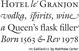
1) ITC Galliard. Alts available in the Carter & Cone version.

From the (now out-of-print) Newstoday Typecase:

With its sculpted majuscules and sparkling contrast, Matthew Carter’s ITC Galliard is commonly regarded as the king of elegant text faces. But many are unaware of the Carter & Cone version which expounds on the baroque beauty, adding flourished alternates to both roman and italic.

3) Goudy
5) Times (eww, I hope I’m wrong)

Naw, 5 can’t be Times. Terms are wrong.

> 1) ITC Galliard.
Yup... you’re right Stephen. Ain’t they gorgeous!

> 3) Goudy
Right, Tiffany!

> 5) Times (eww, I hope I’m wrong)
Right, you’re wrong, Tiffany.

Talk about nostalgia, we’re heading off right now to see Peter, Paul & Mary in concert. So I won’t be able to respond to IDs until early Saturday. Would you like some guesses, ’cause some are a little tough.

Hints...

2) Sherlock versus the Fishman.

4) This one’s a bear.

5) Is it Tom, Dick or Harry?

6) An old metal revival craftily done.

4. Kabel. Not sure how the bear comes in.

> 4. Kabel. Not sure how the bear comes in.

Nope... and believe me, the bear does come in! ;-)

More hints…

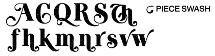
2) Based on forms in Book of Kells and named after a town in the Emerald Isles.

4) This one’s still a bear.

5) It can only be Tom, Dick or Harry!

6) An artsy old face.

Ta-ta for now... off to the Peter, Paul & Mary concert. Now where’s my hammer?

4. Koch?

5) Tom’s Roman

Stewf I think you are right about (4) being Kabel. Bear, as in Kabel Black or a Black bear.

5. ITC Grizzly (Stephen, you were this close!)

6. Artcraft

(I should probably be disqualified for my age.)

2. looks familiar, but I don’t know it off the top of my head.

:^P Sheesh I was really reaching.

I think you meant (4) Mark.

See, I said I should probably be disqualified for my age. ;-)

Oh, I remember now. It’s gotta be:

2. Shannon

It was on the tip of my tongue. Sneaky of you to throw in an old CG font, Norbert.

Nice samples, Norbert.

ITC Grizzly

Except in Typophile’s Type Battles, I don’t think I had ever seen a sans with swashes... ;-) There is always new stuff to learn.

:-)

Yup... all identified.

1) Matthew Carter’s ITC Galliard
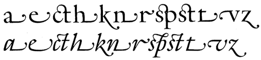
2) Shannon, a CG exclusive by Kris Holmes and Janice Prescott Fishman. The initial forms were based on the Book of Kells and expanded in several weights using IKARUS (now from URW++) interpolations.
3) Goudy
4) ITC Grizzly (I told you it was a bear) by Tom Carnase and Ronne Bonder.
5) Tom’s Roman also by Tom Carnase and Ronne Bonder.
6) Artcraft... yes, it helps to be “old” to remember this one.

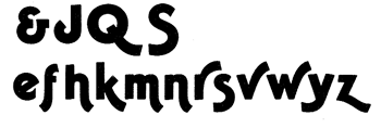
One of my personal favorite type families (because of its eccentric qualities) is Goudy Sans, which at one point had more swash and alternate characters than ITC Avant Garde Gothic. Somewhere in my dusty vault I have specimens, but these characters were “axed” long ago when CG first licensed Goudy Sans to ITC, then subsequently Monotype took claim of licensing. Not sure if the lost alternates will ever be released again :-(

Did CG do any marketing of Goudy Sans before it was licensed to ITC? I’m wondering if there may have been ads in, say, U&lc. that would show the lost characters. I’ve got nearly every issue.

Norbert, I went through a phase of loving Goudy Sans. Then I decided I didn’t like it because it was too feminine and couldn’t be used for more than very specific jobs. However, a few years ago I saw a letterpressed invitation which used it. It was gorgeous. Now I’ve been waiting for the opportunity to use it again.

I’d love to see the swashes I hope you can find the specimens.

(I should add that I think it was the fact that it was letterpressed that gave it new life for me.)

I quite like Goudy Sans, myself.

Didn’t Monotype essentially merge with Compugraphic when Agfa acquired Monotype? I wonder if MT still has the rights to the CG stuff now that they’re a separate company from Agfa. They certainly have the ITC rights. It could be that everything needed is all in one place. Mind you, Goudy Sans doesn’t seem to be terribly popular, so I don’t know how worthwhile it would be for them.

Regards,

T

Not sure if the lost alternates will ever be released again :-(

i’m sure you will!!! and fairly soon, i’d wager.

> i’m sure you will!!! and fairly soon, i’d wager.

Promises, promises... Paul.

Right now I’m going ballistic since I’m having trouble copying sample files on Goudy Sans off one of my old Macs which is not connected to the network. Disk and zip drives coughing, no email, what a dinosaur!

I’ve written a brief summary of Goudy Sans alternates with a few samples if I can get the images off this old Mac.

> Goudy Sans doesn’t seem to be terribly popular
It’s really an odd face with few applications, and I’ve hardly ever used it myself despite my affection for it. But it has been very visible here in the Northeast and has been used for POP store displays and table cards for a large coffee franchise.

From what I recall (strictly from memory... somewhere, sometime I’ll find my old notes if I didn’t trash them), between 1982—1986 Compugraphic launched a major push to improve its digital library to support the high-end MCS Digital Imagesetters. This included significant cleanup of the older “CG-lookalike” faces in favor of licensing from originating foundries, release of exclusive designs like Shannon, Garth Graphic, Pasquale and a whole series of revivals which included Goudy Sans, Albertus, Hadriano, Schneidler (these previous four families were release between 1982-83) and more.

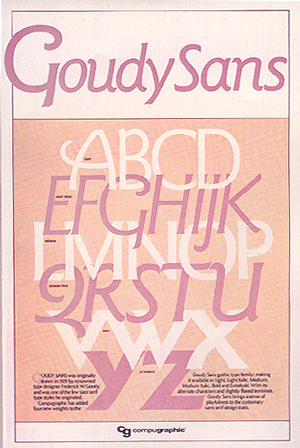
In 1982 we also launched an aggressive ad campaign and produced a special series of 11 x 17 “Type Release” posters for what we felt were high-profile families, in fact, twenty in all. I remember when doing the Goudy Sans poster (the backs had full character specimen samples) that I was amazed by all the cap swash alternates. The family was comprised of six faces — Light, Light Italic, Medium, Medium Italic, Bold and Extrabold.


All I can find so far is a smaller repro of only the front of the original Goudy Sans poster (shown above). On the back of the original poster there was full specimen showings of all available characters, though there may have been sample showings in a mid-eighties CG big type book.

During the mid-to-late eighties, I got the word to “retire” the CG version of Goudy Sans, to be replaced by ITC Goudy Sans. This version had no alternates, and from what is written in the huge 1994 Agfa Type Reference Book for PostScript Users is “Designed by Fredric [Frederic] Goudy in 1929 and released by Elsener [Elsner] and Flake in 1986.” Though on the Elsner+Flake site, they attribute it to the ITC Design Staff. The ITC version had four weights with corresponding italics — Book & Italics, Medium & Italics, Bold & Italics, and Black & Italics.

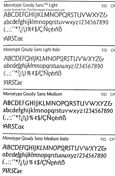
By the late eighties, CG and Monotype had established a relationship, and many more CG faces were “retired” and replaced by licensed versions directly from Monotype. You can see from the specimens shown below (from 1990 Agfa Type Book) that Goudy Sans retained a few alternates. (Thick book hard to flatten on scanner.)

I think the ITC Goudy Sans Black Italic is especially beautiful - was this part of Goudy’s original family, or a later addition?

Norbert, do you have a poster or something else that shows swashes for ITC Tiffany? My old ITC brochure doesn’t show them, but I know they existed...once.

Christopher —
from what I can see in the 1980 ITC Typeface Collection (Big Black Book), Tiffany did not have many alternates. The 1980 Letraset Type Catalog also bears this out, showing the same alternates:

Lowercase e and k
Uppercase J, K and R

Each of which only shows the exclusion of the definitive Tiffany spurs pictured below.

Captured from web.archive.org on 19 Jan 2008. view this capture