Typophile

Catalogue in Italian, English and Cyrillic: help choosing a font?

BERGMAN

Hi masters of typography,
I’m quite a typo-fan, and a heavy user: now I have this brand new problem: a big fashion catalogue to be made in three languages, part in the italian office, and part in the moscow office. I choosed the “neosans, neotech” fonts from Monotype, but it does not have cyrillic fonts and even lacks of some accents used in the italian language.

Have anybody of you just had the same problem: can you suggest me some fonts which could fit my needs? Anyway, if my english has been understandable (I think I have to practice!) please, can you help me with some advice?

Thank you in advance,

BERGMAN

Check out Paratype.com

You are more likely to find type that has multiple language support if it is in the Opentype format. If you look at type at Myfonts.com, there is the option to select language and script support to see if the type will work for you.

I wish my Italian were as good as your English:-)

ChrisL

FontShop has an entire area dedicated to non-lating fonts.

Thanks folks,you’ve been very kind. And surprisingly quick.
I just checked Paratype.com, but Fontshop was a new suggestion.
I think I’ll choose a classic helvetica (or something like that) but I feel like the Fontshop (or the Myfonts) shops have just a limited offer of cyrillic fonts, a sort of “cyrillic fonts for tourists”, cause I’ve been recently in Russia and you can find there many and many fonts on magazines which resembles to western original (for example on “Esquire Russia”, or on “L’Optimum” which is much like the american man oriented “Details”) and a rich offer of graphic design. It simply does not communicates with us, unless we don’t speak russian.
Any clue about any forum like this, driven by russian graphics (but hopefully english speaking)? Or any russian graphic on the forum? Or elsewhere?

I think this problem will increase in the near future for any western graphic designer. Maybe a non-western section could be a fine extention to this beloved website.

Greetings from Italy

BERGMAN

>>for example on “Esquire Russia”, or on “L’Optimum”

They use custom designed fonts, not commercially available.

>> forum like this, driven by russian graphics (but hopefully english speaking)

Many people do undestand/speak english here:
http://community.livejournal.com/ru_typography/

Thanks suntory,
are you a russian graphic designer?

Hi Alessandro,
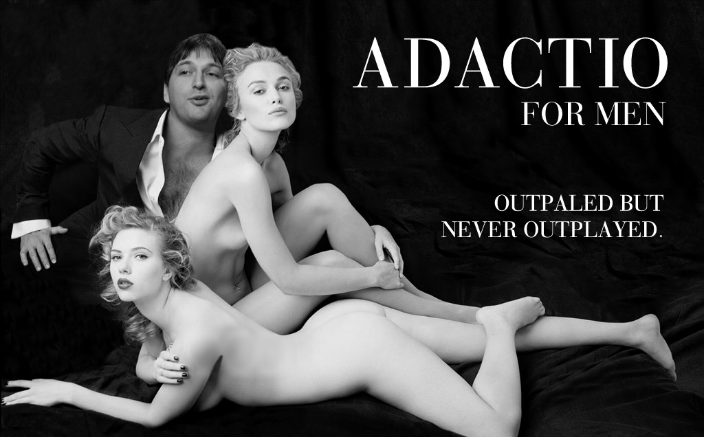
funny pic. I just did not understand who’s the Tom Ford replacement.
Have you suggestions about my italian-russian task?

Ciao e buon lavoro

BERGMAN

Minion from Adobe has an excellent Cyrillic extension. Also see Linotype’s Really, by Gary Munch. Adobe’s new Garamond Premier Pro has various weights and sizes in Cyrillic.

Of Adobe’s faces, the light weight of Myriad might be useful.

> Or any russian graphic on the forum? Or elsewhere?

Right here. And elsewhere.

ps: What’s cooking on viale Antonio Gramsci these days?

What, fonts from Monotype lack of some accents used in Italian ?

Check:
Alexandr Tarbev’s DenHaag, Isay Slutsker’s Humanist 531Cyrillic, Robert Slimbach’s Minion Pro and Myriad Pro Cyrillic, Gary Munch’s Really Cyrillic, ITC Kabel Cyrillic.

I think in Viale Antonio Gramsci they are cooking winderful piadina & sangiovese !

Ops, I meant “wonderful”, but it might be windy day today.
Or you could use that funny bodoni, it’s very winderful.

Hi Bergman,
I live in Moscow. I’m a graphic designer. My English is as yours, I hope.
I can help you to make a choice.
danya@epmoscow.ru

Here I am again. I have to thank you for the attention you gave to my question, and I’m honored to talk to such experienced type lovers.

- to Maxim Zhukov: Here on viale Gramsci we have many recipes on the way to our oven: we usually work on brand and retail projects, but recently we focused on this graphic design project in Moscow. My recipes always involve gestalt theories, so you can find gestalt almost anywhere, like garlic in italian cuisine! I’d like to put some of my garlic in russian recipes too (I hope It works).
Working with russians I could compare cultures and see differences, but mostly I found unexpected human and professional qualities, I’ve seen a country which is growing rapidly and which is consciuous of It’s value. I often travel for work, and I worked on each side of the planet, but with Russia it’s been love at first sight.

- to Alessandro Segalini: I don’t know what were they thinking when they create the Neo font, but it really lacks accents for normal use in italian (you can’t write “è la mia città”), in french, and so on.
Thanks for your font suggestions, but the client likes Neo, so I should work on this font. I found that many publishers use their customized version of Neo, and I’m thinking to walk that way. Thank you (I suppose we can talk in italian, but It could not be fair for the community here on typophile).

- to Danya: I’m taking Russian language lessons but fortunately I can rely on translators when I am in Moscow, cause I’m in a ridicolous early stage of learning! I’ll contact you. Thank you very much.

When deciding on a Cyrillic to nicely match a Latin, the one thing I would recommend (not least because virtually nobody else will) is to end up with a setup where the Cyrillic “x-height” is slightly larger than the Latin x-height. This is anti-conventional, but to me critical (at least in running text, although not in display) since it helps equalize the apparent sizes (because Cyrillic has far fewer extenders). One problem though is that you generally can’t simply use a difference in point sizes (within most any “canned” Latin+Cyrillic family) to do this, since the color balance will shift. (Yet another reason to wish MM were still alive.)

—

Danya: killer logo.

hhp

An interesting point.
Another tactic to deal with this imbalance of Latin/Cyrillic would be to reduce the leading of the Russian slightly — which you may end up doing anyway if the Russian text runs longer.

where the Cyrillic “x-height” is slightly larger than the Latin x-height ... since it helps equalize the apparent sizes (because Cyrillic has far fewer extenders)

I did some tests of this theory (with a sans face) and it does seem to work, but only when the typeface has a small x-height in general.

Otherwise, the Cyrillic tends to look very “cappy” and extender-less in comparison with the Latin.

But as there are not any typefaces like this available, ones that have a large x-height seem to minimize the “extender gap” between the two scripts, as the extenders don’t play such a strong role as they do in faces with a small x-height.

> only when the typeface has a small x-height

Convenient, since this applies to text fonts (not display).

hhp

Captured from web.archive.org on 11 Aug 2007. view this capture