Hi. :)
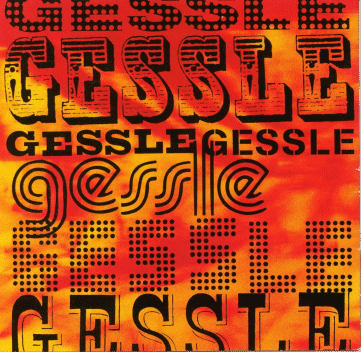
I’ve been looking to identify the fonts used in the image attached, yet with very little success so far, and I’d very much appreciate any further help...
Then again, this particular case isn’t quite that of asking about one font in one thread, still I’m hoping it’s ok to post the entire original picture with the various fonts in one single thread (?), also because some fonts are superimposed to eachother, and then the entire picture does “work as a whole” so to speak, thus I believe it’s just more practical to post the picture entire, also for later tracking... (If not though, and should I be required to cut the picture to isolate each of the individual fonts and ask about each of them in new individual threads, please do advise, and thank you for your understanding, if by posting the picture entire I chose to do things the wrong way from the start.)
Also, one more note, regarding the types which are cut off (the 1st and the 7th), unfortunatelly that is actually really the whole of the original image, thus I can’t provide it any different, I’m sorry... :/ (If still there’s any chance to get to an identification of also those fonts, I thank you for any help.)
(I have also previously asked about in other font identification forums, therefore a similar post may have been seen elsewhere. No conclusive id has been reached, though, in neither of those forums, that’s why I thought I’d ultimately share my request for help also here.)
(From my own research, this is what I have so far:)
I have (thanks to Mike Yanega’s most useful “Bauhaus-Style” Font Identification Guide :)) identified (I believe that correctly?) the 5th font (starting from top, left to right) as Pump Triline.
Then I’ve come to (maybe) Giza FiveSeven and AG Book Stencil BQ for the 3rd and 4th fonts respectively, although I’m not completely certain about these?... (AG Book Stencil looks somewhat “less widened” than the actual font, and as for Giza, I’m also not 100% sure even whether FiveSeven would be the weight to best match the font used?...)
(From helpers at other forums, this is what I have so far:)
Then, for the font in the bottom line (the 7th in the image), it’s been hinted at another forum that it is like P.T. Barnum, but with a shadow, and yes, as I replied then too, indeed, P.T. Barnum does come rather close to it, however, the side of the “G” looks a bit more curved, whereas in the actual font it looks more flat... So I don’t know?...
Also, at yet another forum, for the 6th font, PizzaDude’s free font Balls on the Rampage has been suggested, which, yes, also comes close, yet, the actual font in the image looks as it isn’t so “boldened”, having more space between each of the dots which makes each of them to be perfectly individualized, whereas in Balls on the Rampage the dots seem as they’re all “connected” to eachother, which results in a distinct less sharpened/clean pattern... Then again, and in regards to dotted fonts, I have also been told about the possibility of filling a solid font with dots, something which I actually wasn’t aware of, thus I wonder then if this might even be the case here (and even also for the 1st font), and then which originally solid fonts would those be?...
If anyone can please give any further help, again, I’d be most appreciated, thank you so much already! :)