
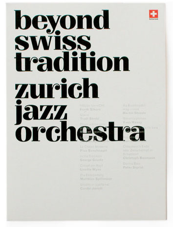
My guess is something custom. It’s Carousel with Walbaum serifs. Or Didot with ball terminals. It’s lovely. And what about those wiggidywack ’s’s?

i agree. what a lovely-looking typeface.
Fluxism, do you know who did it?
haha, I was going to name this “walbaumy carousel” but thought it would look like nonsense
it’s from this portfolio site:
somebody on newstoday already emailed her, I believe

This is pretty. Someone needs to start a Ball Terminals wiki entry.
i found it! (:
Very niiice find, Claes.
Even designed by Aldo Novarese. :)
Dav
many thanks—superior work
Nice find!
It reminded me of the slightly more stylish cousin of Fenice. :^P

Designed by Aldo Novarese. Beautiful font!
I don’t think the digital version does it any justice though.
I don’t think the digital version does it any justice though.
but if it was designed in 1989, shouldn’t that mean it’s always been digital?
:^P I was being a brat.
d’oh!
what do you think of the lighter weights?
Captured from web.archive.org on 14 Mar 2008. view this capture