Typophile

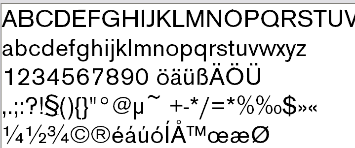
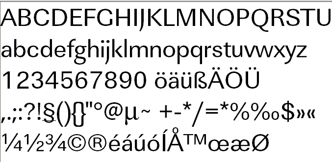
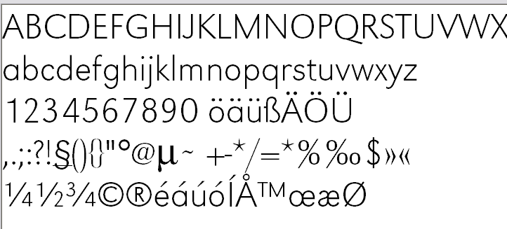
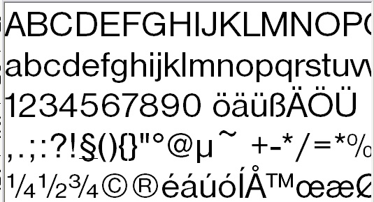
(x) Nimbus (Helvetica), URW Grotesk (Futura), Modern Sans (Akzidenz-Grotesk), Linear (Univers) {Geoff, Brad, John McH}

fontplayer

I was just going through my URW collection to see what extended sets came with it. And I was wondering what these might equate to in famous equivalents. I’m guessing some of you could do this with one eye tied behind your back.
: )
There are three I like. Nibus has the most versions.
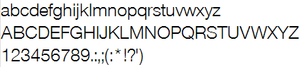
Grotesk
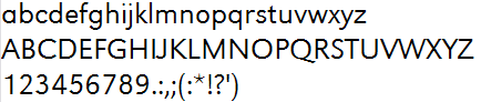
Modern Sans
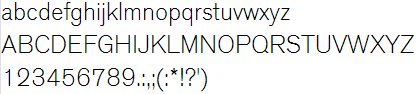
Helvetica, Avenir and Akzidenz-Grotesk?

You need to provide us with some un-pixelated samples... ;^P

Cleartype is a b#tch.

The middle one isn’t Avenir—Avenir has a two-story “a”. It looks more like Avenir’s uppercase with Futura lower case and Myriad numerals.

It’s actually URW Grotesk by Hermann Zapf, it’s not really derivative like Nimbus Sans (Helvetica). Futura and Avenir would be more than suitable as an alternative, not as a “equivalent”.

Here are the PS versions, would that help? I guess my eyes aren’t good enough to spot that kind of thing.

Modern

Also found this one: Linear

Grotesk

Nimbus

Dennis, thanks for the effort to provide us with better samples. :^)

What exactly is your motive? If you’re looking for suggestions for an alternative to these fonts, perhaps you could take this to the Design forum?

It’s actually URW Grotesk by Hermann Zapf,

I think this is my favorite of the bunch. It has a fairly large set.

What exactly is your motive?

Just to better put into context some of the comments I see when people are recommending things. Since I don’t have many of the fonts you guys do, I wanted to know if I had anything close. Sort of future reference, I guess.

Modern: Akzidenz, FF Bau

Linear: Univers, Zurich

Grotesk: AG Schoolbook

Nimbus: Folio

Captured from web.archive.org on 8 Feb 2008. view this capture