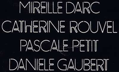
Must be a well-known font,
but I'm missing its name…
Thank you.
Must be a well-known font,
but I'm missing its name…
Thank you.

Doesn't look like a well-known font to me, but what do I know. :^P
Checked both Rookledge's and a whole bunch of neon fonts on MyFonts, but came up with nada.
Too bad…
I'm doing the same thing from my side,
but in an "analogic" way : with some Letraset catalogs and so on…
with no results at all.
Still searching…

There is a similar font by a greek foundry (Cannibal fonts)
The font is named Caou.
George Triantafyllakos - backpacker.gr
... and another one (with a more contemporary look) here
The font is called BPneon.
George Triantafyllakos - backpacker.gr

Can you show us the entire poster? This is from a movie poster, French I am guessing. If we knew the movie we would know the date and we could, perhaps, help more.

Based on Eggo Mania (solotype)

I just checked the filmography of Catherine Rouvel (well known French actress) and I couldn't find a movie that she appeared in with all the cast listed in your poster (not that the filmography is totally complete).
She did star along with Daneille Darc in the famous 1970 film Borsalino, and the 1974 sequel Borsalino and co.
My feeling is that the movie titles were constructed from actual neon signs, therefore not a font at all, but derived from actual neon tubing.
Is the poster in color? Are they actually neon lights?
Lest not we forget that many typefaces were actually "inspired" by handpainted signs and letterforms, architecturally sculpted forms, and yes, bright lights and neon!
Throughout the ages, type designers have inspired sign crafters and vice versa... mutual love for letterforms and invention.

This is not typical for neonlettering — it looks more like the kind of lettering obtained by using a pen and a plastic 'sjablone', the kind that architects used for lettering. I still have some of these lying around (DIN-type). My Rotring-pens are all clogged up, so making a sample is out of the question ; ).
Sheesh. Talk about stating the obvious. Sorry about totally ignoring your thread title. I'd still be curious to see the entire poster.
Tiff, I changed the thread title after your comment, so it wasn't stating the obvious at all. :^P
I Googled the combination of the four actors' names and came up with nothing. :^/
A-ha! Maybe I'm not going crazy after all. :^P

> A-ha! Maybe I’m not going crazy after all. :^P
Keep telling yourself that. (It's working for me)
This scan came in fact from an old "Lui" (a playboy-like magazine in France).
Approx. release : 1975.
Some more information are coming soon…
So stay tune for more happy fonts !
Here is the original document.

You could always recreate this with 4 or 5 different shapes. Or, you could edit and tweak something like Picadilly.


The central 'Neon' isn't THE Neon (ITC) we usually see. I started hunting in the Photo-Lettering catalogs and found this one is called 'Stan Staneon'. The T and the A are both quite un-Neon-like.
The other typeface looks more like some of the Paperclip styles, but I couldn't find an exact match.
- Mike Yanega
Now I understand why I didn't find any movie starring those four actresses -- this is the title page of a nudie feature in Lui! Hah! :^D
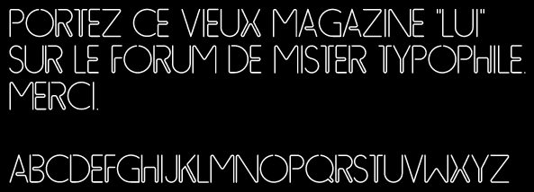
We've re-draw this font and made a rough version.
Kerning is not sharp, but we're able to use it.
Hehehe, nice one! :^)
Captured from web.archive.org on 22 Mar 2015. view this capture