
I threw this together as a placeholder logo four years ago:
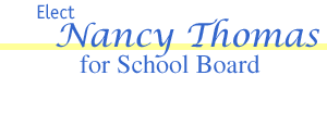
My mother-in-law was elected to the school board in 2002 and they used this logo for much of the campaign materials.
Now it’s time to get the re-election going, so I’d like to make an improved logo for the effort. Here’s what I’ve done so far:
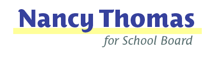
Blue and yellow are the preferred colors. I started with PTF’s Costa, since I’ve already got it and it seems friendly and approachable. Clarendon’s also been suggested, but I can’t really tell which one is the best. Linotype’s spacing looks more consistent, the EF version bothers me for some reason.
You’ve probably all seen the hideous local election signs around town, now’s your chance to help make at least one of them in one little town a little better. Thanks for any advice you have to offer.


