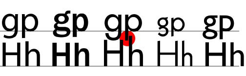
One of the unnoticed aspects of type is that regardless of size and internal proportions—Cap height, x-height, and descender depth—when characters of different fonts are set they share the same baseline. I know a bit of the history baseline standards. What I am curious about is what governs that standard in path defined digital type.
I have noticed that when set solid most fonts behave as you would expect. However, some fonts seem to have had a “size” standard imposed upon them that is incompatible with the actual size of the characters. Futura is a case in point. The image below was prepared in Adobe Illustrator CS. They fonts are Myriad, Futura, ITC Franklin Gothic, Kabel, and Gill Sans. All are Adobe Type 1 format fonts and all were set 72/72. The horizontal lines indicate the baselines and the red circle the problem. What gives?