Dear typophiles,
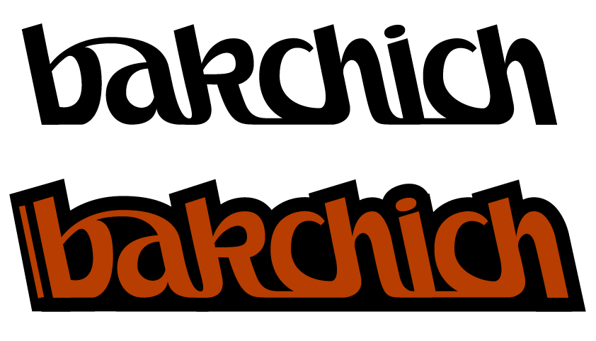
i asked for your help months ago about fonts for a satirical journal about Africa and Maghreb. A lot of things happened but let's say it's kind of the same project, the Middle-East added in the focused areas. The word bakchich is the french for baksheesh (the funny thing is we decided to name it when i was searching fonts, and felt on the T26 baksheesh which doesn't really fit the journal but had that fine name)
Other than giving a causual and friendly look, the idea of this big ligature was somewhat to give an arabian look, without going on a fake arabic. Using only western script letters but bounding them in a way which could relate to oriental scriptures.
It's supposed to be finished, and already used on some things, but i guess it may need some little changes, so your critics are more than welcomed.
The stick aside the b on the horribly stroked 2nd pic will be replaced by the website address of the journal.