Typophile

Texty Font for [Argentine] Sommelier

Hrant H Papazian

I've roughed out the following logo prototype for a sommelier by the
name of Maxim who's decided to call his venture "Maximus Vinum":
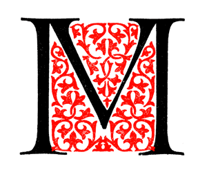
(FYI, I'll probably have a non-floriated, or perhaps
a more coarsely floriated, version for small sizes).

Now I'm looking for a texty (some paragraphs of text, but not
too much) font to use. Something that matches the spirit of the
logo (which I assume/hope is discernible in the first place) but is
not too mannered. For example Hollandse Mediaeval* is probably
a bit too much, although its somewhat anachronistic yet classy
feel is close to what I think I want. The ideal candidate would
work as a heading font as well.

* Referred to in this thread: http://typophile.com/node/19096

Specific suggestions (or wanton brain dumps) highly welcome.

hhp

DTL Van Den Keere Italic would be lovely.

Esta?
Tim

Doves?? Perhaps with the i fixed.

I think the Doves one comes closest so far to what I need.
Something not as rough, but even a bit more archaic, or
maybe a bit mannered like an old continental gentleman
might be ideal, no? What about one of those recent fauve
Latinoamericano designs, considering?

hhp

Erasmus? Schiller Antiqua RR? I think there needs to be a de Roos-style type that isn't horrible, I just don't know whether there is one. Maybe one of Goudy's more obscure text types.

By George :-) I think Erasmus is it! It's both more
tame and more elegant than Hollandse Mediaeval.
But I'll wait for more suggestions. And -predictably-
I've started to also consider an old friend: Octavian.

BTW, De Roos had a really superb (especially in
the Italic) eponymous design, but I think it has
yet to be digitized.

hhp

What about argentinian Fontana Andralis?

For full resonance, you would have to use a version of Jenson that had the "extra" serifs on the M -- Adobe snipped them off in the default version of Adobe Jenson, but the proper version is in the alt characters.

My Jenson, Goodchild, has the full serifs.

Stone's Arepo has a similar quality to your logo, so Cycles could be good, and comes in optical scaling, handy for the back label on wine bottles -- I hate squinting at 6pt Snell to figure out what I'm supposed to be drinking the wine with.

BTW, brilliant design!

btw. the logo looks like an initial from the MISSALE ROMANUM from the Bremer Presse 1928-32. The book was set in a typeface called LITURGICA - a very dark and wide roman typeface. The Erasmus type has not a very proper g, but could work.

--astype.de--

Bingo. I was going to tell Nick "thanks, and the idea was mine (including the floriation*) but this (preliminary) execution wasn't". It's funny how things just fall in your lap sometimes: I had decided to try a "V" nestled inside an "M", and at the same time I was researching Wiegand**, then I turned that page in that book and thought I was dreaming! I put together the plain "M" with the floariation of the "V" (and had to do some distortions to the floriation), but I'm going to redraw it when the client pays up.

* Although I wanted grapevines, and might
still splice in a bundle of grapes in there.

** Thanks to your reference in another thread. I have something
interesting (relating to the Emerson face) to report on that btw...

So what do you think about the Bremer text face paired up with those initials? I like it, but it's too butch and too German to work here, no? He's a sommelier after all, not a beer connoisseur. :-)

OK, catching up for real now...

Alejandro, what about Borges?

Nick, good point about the full serifs up top.
BTW, this guy doesn't produce wine (although he did work at a vinery in Mendoza for some months), he tells people what wine to have, so any small type he sets will probably be limited to legal disclaimers concerning drunk driving and such. :-) Plus Cycles is wonderful, but maybe too clean? I'd like a font with just a little bit of grape residue at the bottom. :-)

hhp

Captured from web.archive.org on 28 Dec 2013. view this capture