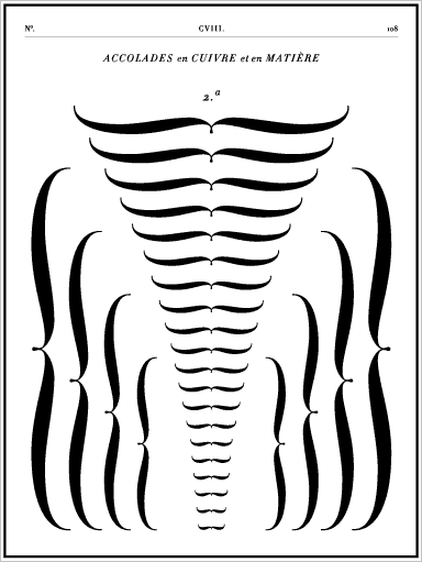
Which typeface(s) do you think have the most gorgeous and curvaceous brackets?
Which typeface(s) do you think have the most gorgeous and curvaceous brackets?

You could check out Bill's Brackets. Might not be the most curvaceous but there are alot to choose from.
Unfortunately I can't find a sample easily on line and have to run out the door.

Porchez Typofonderie's Ambroise has some beautiful brackets.

Emigre fonts often have pretty brackets, most notably, in my humble opinion Democratica and Suburban.
Yes. Very nice!
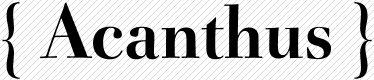
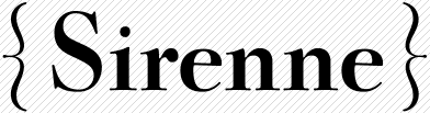
Ah. Oui. Braces. I have Didot. Lurvely!!!
here are some fonts with interesting brackets:
Gandy Dance NF
Inglenook Corner NF
Kynges X NF
Ransom Clearcut NF
Space Toaster
Carol
Savoy
Diana

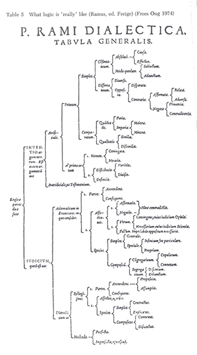
Historical perspective: If you check into Ramus' "Logic" (various translations are out there) and similar "logics" of the 16th c,, you'll find "braces" used not so much as type but as drawing elements.

Braces, (ORIGIN from Old French bracier ‘embrace’, from brace ‘two arms’, from Latin bracchium ‘arm’) – {curly}
Brackets – [square]
Parentheses – (rounded)
However, as with so many terms in type setting, there is crossover and confusion, these are just definitions that I have learned.
Tim
Tim-- I think your definitions make sense. If you look at the Ramus illustration, which is part of an academic text that was written in Latin and certainly heavily influenced by the Latin conventions, the curly guys do look (a) fairly consistent and formalized, and (b) like arms "embracing" a cluster of terms, which is exactly what Ramus' taxonomical stuff was meant to do-- traditional Aristotelian analysis of phenomena into types, such that a particular category X "embraces" a set of sub-categories. I really need to look into this more!
from what i understand, all the [] () {} and <> are called brackets, and then there are individual names for each type.

It's silly to include Braces as a standard-encoding digital font character, because they are not used on the same line as other characters, and would be put in a separate text box if used at all. So an all-braces font makes a lot of sense.
Braces are all too heavy in digital fonts, and I include my own, but I'm just following precedent to match their weight to that of the square brackets and parentheses, as sort of an ornate alternative to the square bracket, in fact.
Whenever I have had to set braced material, I have always used the component-system that's part of the Symbol font.
>It’s silly to include Braces as a standard-encoding digital font character
I see what you're saying, but lots of scripting and programming languages use them as standard glyphs. Ok, maybe that doesn't seem to matter much from the perspective of artful typography, except there are often times when you want to include a snippet in some document you're writing. Like if I want to define a style in CSS and explain how, I'd be writing...
.style {
color=blue
}
That's just the standard syntax. For large braces, such as those use in mathematics, I agree that you need a different kind of tool. To some extent, LaTex provides that as part of its raison d'etre.
- J
lots of scripting and programming languages use them as standard glyphs.
Point taken. It's a question of priorities and power -- although 99% of typefaces would never be used for programming, the character had to be there (along with a bunch of higher math characters), because programmers called the shots for the basic character set. Glyphs that are typographically useful in a great many more fonts -- the f ligatures -- were excluded.
>Glyphs that are typographically useful in a great many more fonts — the f ligatures — were excluded.
And point taken here, in return. In fact, once I discovered the whole world of typography (not that long ago actually) and got my hands on InDesign, I became frustrated that so few ligatures and alternates are to be found. I suspect that as time goes on, though, there may be some equalization-- more and more fonts will come with the serious type options as standard components. And someday brackets, arrows, lines, etc.-- all the sort of 'metatypographical' stuff that is so important-- may become built in such that "inline" type arrangement in programs like InDesign will be useful enough to make workarounds like separate drawings and text-boxes less necessary. Pipe dream, mayb.

The curly braces are my favorite glyphs in Eason Inline and Display. I think it's fun to give character to glyphs that are often just a checkbox on the road to completion:
@ Randy: Gorgeous!
@ Claes: Do you have more information on that?

i love randy's curly braces. he uses the same form in Olduvai. it's always great to see a fresh twist on something that can be otherwise so mundane.

ROFLMAO!!!!!!
Tiffany,
Check out the Wikipedia link I posted.. that should be more informative than anything I could tell you, especially since English isn't even my primary language.
Claes, I think for general vocabulary you are right, my post was based more on a typesetting vocabulary and even then they aren't consistent, I have also been asked to use curly brackets, square brackets etc.
Tim
Captured from web.archive.org on 5 Mar 2015. view this capture