Typophile

Typography t-shirts

Baskerville

Check out this typo based t-shirt on Threadless.com

if enought people vote well for it, then you'll be able to buy it online.

There may also be a 'Typographers' version coming soon!

http://www.threadless.com/submission/71643/Graphic_designers_do_it_anally.

tell your friends to vote too!

thanks,

B

I'm sorry, but you have got to be kidding!

:^/

3 days too late :-P

Although in fairness the image was posted on March 31st.

Cheers, Si

please could you explain. Which image was posted on March 31st?

Ah, I woudn't buy it or wear it if it were given to me for free.

ChrisL

oh come on, typographers are the most anal bunch of all the design disciplines.

Erik Spiekermann agreed with me when he gave a talk here in london last week.

lighten up :o)

Dear Mr Baskerville, you have been exhumed (yet again) at a most
opportune time: this year marks the 300th anniversary of your birth!
But I must make you aware that public proclamations of sexual mores
continue to be taboo. Yes, even after Mr Gill.

hhp

There is a difference in being anal retentive--as you may have meant in your discussion with Eric.

My comment also reflects my opinion that the shirt is ugly as well as not funny.

ChrisL

The t-shirt's first message is that graphic designers (and typographers) are 'anally retentive'
http://en.wikipedia.org/wiki/Anally_retentive

You know, using grids, detailing text etc.

Therefore 'graphic designers do it anally' (their job that is).

Anything else you read into that is based on your specific thought processes.

As for Eric Gill. Well he like it in a lot more ways than anally. Agnully maybe? (agnus)

John, sorry I took the posting as an ill-timed April fools joke.

>Erik Spiekermann agreed with me when he gave a talk here in london last week.

If you can convince him to wear the shirt then you might be able to sell a few.

>You know, using grids, detailing text etc.

If you have to explain the joke...

To be anal, the second line looks a bit off, you should nudge it slightly to the right... optics.

:^)

tee hee! I love typographers

It's a rubbish squashed gif of the design.

The actual design is fixed to a tight grid and believe me everthing lines up at 6400% in illustrator!

>You know, using grids, detailing text etc.

If you have to explain the joke…

doesn't normally need explaining. You can tell a lot about a person by their reaction to the design ;o)

> tight grid

Tight polar coordinates would have been a better... fit.

hhp

I swear I posted in here, oh well. Anyhow hrant's Gill comment made me laugh. And I would not wear that shirt, agreeing with Chris up above.

dude, that is freekin hilarious. i was offended for about .5 seconds when i realized the pun!

i think everyone just needs to lighten up!

------

btw
maybe my reaction has to do with the fact that i spent this weekend at the Y conference in san diego and the theme was "play". it made me realize that we frequently take ourselves way to serious…

Oh, I got it right away, but I was still put off by it.

that's unfortunate…

------

I got it right away too. God knows I have been known to make maybe a pun or two in my life. I guess for a shirt which professes to be about designers, I would expect to see good design.

ChrisL

Reminds me of the time I saw some guy walking around Disneyland in a tanktop that read "PERVERT" and had the number "69" on the front and back.

I don't know if "lighten up!" is a good defense for a bad tee. But I suppose good taste is subjective.

Don't the Simonson-scripty Typophile tees often get read as "Pedophile"? That's unfortunate because that tee is awesome.

The bad design is not the problem I have with it.

Dan, you reminded me of when Prince Willem-Alexander of The Netherlands married Máxima Zorreguieta Cerruti and somebody made and sold soccer jerseys that said MAXIMA, #69.

hhp

Poor design, poor joke -- the "(insert profession here) do it (insert position or manner related to aforementioned profession)" lines are sooo incredibly tired. :^/

Offensive Tees I'd wear in a heart beat would be "Ligature Slut", the classic "Your font sucks" or Zara Evens' "Kern this, bitch". I think we can come up with more good ones.

I just bought a few type t-shirts from Threadless.

Quick Brown Fox
Para-Normal US
My favorite, Canada Owes Me

Someone please make me a "Kern this, bitch" shirt. I will wear it proudly.

Damn straight, Zara, pure rock'n'roll: nerdy and cool all rolled into one. :^)

typo t idea: font audit arrows that read "this curve is flat"

Quick Type ID Pop Quiz -- what is the main type used on Threadless? :^D

The clock is ticking!

Yves, that is what I strive to become: nerdy and cool. I've got the rock n' roll part covered. :)

A Slab Serif

What about "Ligature Groupie"?

Quick Type ID Pop Quiz — what is the main type used on Threadless?

Apex Serif

Do I get my prize now? I choose door number #3. :)

Veer does a KERN hoodie, but a "kern this, bitch!" would be kind of fun as well. Time to do some new shirts?

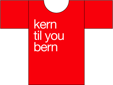
OK, here is my instant "international Style" poke at 60s Swiss Modernism JUST IN HRANT'S size :-)

ChrisL

My hrant, what. big arms you have

/little red ridding hood

The shape of that shirt made me LOL.

I'd buy this one,

>Veer does a KERN hoodie

Urban myth - it's a KERN zip up.

I have a good friend from Bern named Peter who apprenticed with Muller-Brockman. He always talked about the famous Swiss 3 x 4 grid. The proportions of my T-shirt design are on a perfect 3 x 4 grid. Being an anal retentive Swiss modernist (and a very good designer) my friend Peter could not violate "das grid" (to quote Hrant). Therefore, I could not violate the grid either when I designed ths shirt :-)

ChrisL

sii: my bad. I've never Looked closely at it.

Chris, I'm so envious you know a graphic designer who is clearly a quite gifted scarecrow.

hhp

You can't beat the shirts on engrish.com - typography at its (cough) best.

If you want offensive and subtle, there's my Have a Nice Day shirts. Good for when clients ask you to bend over backwards.

"...so envious you know a graphic designer who is clearly a quite gifted scarecrow."

LOL!!!
If I only had a brain :-)

ChrisL

If you get the Veer catalogues, you'll notice this month if you buy an image CD you get the KERN zip-up for free.

Gee, I already bought the KERN zip, do I now get the image CD for free? :-)

ChrisL

Cool Vincent! but shouldn't it also be upsidedown to read like lead type?

ChrisL

but honestly, the typo tee i really Really REALLY want is a "Obey Hrant" Tee. Now that's hecka cool! >^P

See next page.

[nevermind]

but back to the original design... i would have preferred one that said "Typographers do it with flair" set in Mark Simonson's Courier Flair.

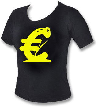
Save Euri the Euro!!!

http://typophile.com/node/19064

LOL!!!
Looks like Euri has been impaled by two pontoons :-)

ChrisL

I would like to have a Crime Scene tee set in Leslie Cabargas Bad Type.

Damn! The Emigre shirt is only available in XL!

Mark Simonson has a whole series of typo-tees.

http://www.cafepress.com/marksimonson

i just submitted a type based t-shirt on threadless,:
http://www.threadless.com/submission/71906/LOATHE
feel free to vote for me! 8^)

Hey wurst wasn't that based on the Love mark logo made in the 60s

yes, did you read the comments?

keeping it real

LoveHate, ya gotta love it:-)

ChrisL

Vincent,
Is that shirt to imply that those who wear it are not surgically enhanced? :-)

ChrisL

wurst: nice idea, but for this particular one you have to get the font exactly right. Your 'O' in particular is too much of a superellipse, which is a pretty big deal considering the way the letter is rotated. I don't know if this stuff is a actual font, or just Indiana's interpretation of the big Bodoni-ish style (hey, if it is custom and not a real font, there's a great idea for a font right there!). On this board, really-close-but-not-quite isn't gonna cut it :)

yeah, robert indiana didn't use a real font...it's really similar to clarendon, which i used. i've seen other parodies of his sculpture that use fonts that are way more off...bodoni is actually one that i've seen but the serifs are way different.

i debated drawing the letters from scratch but i didn't have time outside of my "real work". if i was designing the shirt for typophile i definitely would have been more precise. most people on threadless don't even know the difference between serifs and sans.

LOL!!! even better Vincent!

ChrisL

Horunge, that shirt must go over well at the PTA meetings :-)

ChrisL


hmmm.... rednecks love their italics.... or slanty uprights.


...or linespace for that matter

In honor of Knoxville and Red Hickey (Red rocks!)

p.s. I'd never ride one of those fat things.. you might just drive a car since you can't get between cars and that through city traffic.

Good one Brad!

ChrisL

Yeah, good one. And what about "I've kerned for less."

hhp

Where I live (the sticks) "Kern" is sometimes heard as a first name for men - always old men. (insert hillbilly joke here)

Would that be "Kern" for Kernal as in Colonel? I am an old fart myself but have not heard that as a name before. (insert geezer joke here)

:-)

ChrisL

Kern is sometimes seen as a last or place name (Jerome Kern, Kern County) outside the sticks. And last names often get turned into first names, which I'm guessing is the case here. There are no Hints in my neighborhood though.

i have an great-uncle named kern. and i thought i was going to name all my children after herbs (rosemary, parsnip, &c). i may hafta rethink that scheme. >^P

"Mind the Gap" reminds me of one that said "Not Everything in Kansas is Flat!"

> i have an great-uncle named kern. and i thought i was going to name all my children after herbs (rosemary, parsnip, &c). i may hafta rethink that scheme.

If you ever have twins, you could name them Arial and Helvetica, except that's favourism. ;^)

Paul, my brother-in-laws middle name is Basil, his grandfather's first name.

Also, Isn't "Mind The Gap" in reference to the London Underground? :P

This is the woman's edition. Supply is limited so order now.
: )

If I had one of these http://www.realdoll.com/ I'd definitely buy that shirt.

hhp

You qualify for a discount on my shirts.
(jftr)


Judging from that, I'd say you already stopped yourself, unless that is a calculated & sophisticated part of the joke. I guess I will try to come to grips with that.
: )

how about " not my type" in comic sans, Gedit. ha ha oh God I may switch this damn thing off.

It'll have to be big, it certainly won't be clever…

but I do intend to make my own take on the classic red typophile tee

Richard

PS: I'd give this about five minutes in Type ID Pop Quiz V2.0.2

T-Shirts? T-Shirts!
We don't need no stinking T-Shirts!!!

There is a saying in the world of ( heavy ) metal.

"keep it metal" Something could be done with that. With some lead type. I'll try to mock something up.

Is that like "keepin' it real" for people with an even bigger reality disconnect?

peace

> We don’t need no stinking T-Shirts!!!

I found this quote on another node, and it struck me it must be a timeless quote.

Richard - looks like the official LT corporate face rather than either of the commercial versions. Did you see ITC Johnston all over "V for Vendetta". I bet you are seeing lots of "V" t-shirts in London these days.

Brad, you're right about the type. I'd better not wear it into London. They are very hot on misuse. Have you seen all the fuss about the map here?

I'm not really a comic book kind of guy, so I hadn't paid much attention to Vendetta. I had seen the red V logo and put it down as a Zorro ripoff.

I just had a mooch around the website. Some of the faux 50s screen print posters look good, although I don't know why, but the Futura doesn't quite fit to me.

Richard

Richard, you're unlikely to see any t-shirts in Johnston I guess since it was the "bad guy" font in "V". I'm not a comic booker either but I have a 17-yr old. The guy at the referenced link was asking for trouble. He posted for public download a copy of LT's New Johnston Book.

Now that's a goddam good idea.
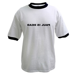
Langdon should be making such reflectograms.

hhp

That mirrored image is the BEST!!! Amazing how well it works.

ChrisL

> Graphic_designers_do_it_anally.

Oh yeah, if I was a graphic designer, that would be the shirt I'd want to wear. How about adding "in a big pool of phlegm while gargling vomit" for some additional classiness - Yeah, that's the ticket.

^
now i'm offended…

If the first one didn't offend you, I don't see how the product of two other natural body functions would do the trick. Unless you were joking...but you forgot the smiley.
: )

I just realized something...I have to apologize, since in part my response was made because I was a bit irked that the original poster was again asking us to vote for his shirt, not realizing that the original post is at the top of every new page.

Never-the-less, I do think I was onto something, in that he was obviously going for shock value, and if you're gonna do that, why not go for it? That's the trend these days.

It occurred to me if you could also throw in something about dead babies, you probably couldn't keep the shirts on the shelf. What rebellious teenager wouldn't want one? It would probably breed a new generation of twisted graphic designers. And kind of like the "for Dummies" books, it would then spread to other professions. And we could say we knew him when he was just a struggling artist.

http://www.veer.com/offers/kernzip/

This offer is in the latest veer newsletter :)

I have a T-shirt, ripe for auction, that says, simply,
"ABC
DEF
UCK"
Do I hear $1?

“ABC
DEF
UCK”
Do I hear $1?

10 dollars.

do I hear $15!

If you autograph it.

hhp

Maybe I should get Amy Papaelias's version of it :-)

ChrisL

What color and size is the t-shirt? And most importantly, what font does it use? ;-)

these are some nice typography based shirts and accesoires and whatnot, by dutch illustrator piet parra.

http://shop.rockwellclothing.com/

yo, i love this stuff for real. this illustrator rocks for real !!

White, Large, Helvetica, Signed. Do I hear $25

You lost me with the Helvetica.
It's a matter of principle.

hhp

I'm with Hrant. Shame...

Maybe with Chester's Shmelvetica :-)

ChrisL

Don't get me started on French Connection…

Is that legit or moody? it certainly doesn't look right.

This is the most f*#~ing beautiful Ä that I ever saw ; )

http://3dsupply.de/3d/img/produkte/00001227.jpg

Talking of Äs..

Why bother with a t-shirt when you can have a tattoo

in the picture the Finnish media personality Wallu Valpio with his ÄITI (Mother) tattoo

stupid tee idea: "who fonted?"

That's brilliant Paul. I can make it for you if you promise to wear it. : )

i can't really take all the credit for such a bad pun:
http://orchestrareal.com/whofonted/

aaack! and it seems they already have t-shirts!
http://www.cafepress.com/whofonted

Oh well, there goes the illusion, Paul. ; )
(they even have fonting buttons and magnets...)

Did you notice that the fonting person is female? Double AACK!

"Did you notice that the fonting person is female?"

My wife assures me that it is impossible for women to do that--only disgusting guys can air out a room :-) I guess women don't add enough leading to air out the font :-)

ChrisL

You could have a T-shirt saying "Face the Music" and depict a trombone made out of glyphs?
It would take a lot of brass to wear it though :-)

ChrisL

Almost all trombone players are goofy enough to wear it.
; )

"It would take a lot of brass to wear it though"

Gah, Chris... you are soooo punny, aren't you?! You are the king of pun around here!

Threadless has a new category now of just type tees.

Eric, add a number, like "50,000", at the beginning.

hhp

"Someone please make me a “Kern this, bitch” shirt. I will wear it proudly."

I absolutely, absolutely want one!!!

Chris, shouldn't the kerning be all off on that? : )
Brad, that's beautiful - where's that from?

Oh, very nice! I *really* like the "Stop me before I kern again" - that's brilliant!

Great shirt. Though it's a damn shame we have
no women of color type designers whatsoever. :-(

hhp

I had little girly shirt that said SMALL CAPS (in small caps) across the chest but thought the better of it - my wife wouldn't have liked it.

heh.

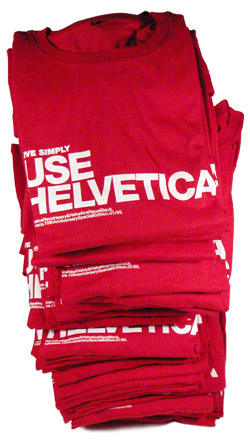
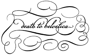
We've just launched The Typography Shop: http://typographyshop.com and have had quite a hit on our hands in one week with this one: http://typographyshop.com/helvetica_t-shirt.html

Thanks to Zeldman and Josh Spear and a dozen or so design bloggers we're off to a great start. Designers are digging this and I'm flattered.

It's not typo centric, but I love the font.
http://rumplo.com/tees/tee/2024-sorry-im-late

Captured from web.archive.org on 19 Sep 2013. view this capture