Typophile

'Latin' Typeface?

Dav (formlos)

My first such request, but sure an important, personal one.
( Ooh, And, 'Sorry' for the almost nameless thread title. )

Dear fellow Typophiles,
What would be your first choices, typeface wise, for / in setting a classic Latin phrase? ( Think 'One Sentence Poetry'. Think 'Slightly Smelling Leather Books'. :) Think 'Vintage'. )

I am thankful, as ever, for every single suggestion and hint.

Thanks,
Dav

I suppose Trajan would be far too obvious. Remember - no U's only Vs.

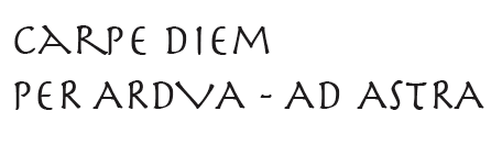
And no J's either. - PER ARDVA - AD ASTRA, BUT IN TRAIAN

http://cheiron.mcmaster.ca/~trajan/

David, all-caps or mixed case?

> no U’s only Vs

BVLGARI rvles.

BTW, the "U" in Adobe Trajan is wrong.

hhp

Hrant, Either all-caps or just lowercase.
No mixed case needed.

( And 'Trajan' is not quite 'it', I fear. :)

Lowercase would be interesting, albeit somewhat of an anachronism, as our lowercase is "Holy Roman" rather than Roman ;-)

Although, the Romans only thing Roman's wrote in big, monumental capital letters (like Trajan), were big monumental inscriptions. So I think that Trajan is totally inappropriate for Latin poetry. The Romans had their own handwriting systems that they would have used for things like that. These letters never would have been as "perfect" as Trajan.

Maybe you could used something like Trajan, but less perfect… like Trajanus or some of Goudy's faces. Although these are probably even more anachronistic…

What about Renaissance type, or Italic? During the Renaissance, they starting printing all of these texts in Latin again… Renaissance type is as close to "accurate" and "original" as you might be able to get.

Herculanum

ChrisL

Alternatives to Trajan:

Mario Feliciano's Garda;

Typophile Kris Sowersby's Karv (if he feels it is finished).

Perpetua is always very strong.

Finally, I don't know what exactly is happening with Romulus, but that would be great. It seems like Frank Blokland is doing optical sizes, and it is not released yet.

Rialto.
Or maybe a cursive-Roman (mainstreamly called "upright Italic") like Seria's.

hhp

Penumbra is pretty nice.

Captured from web.archive.org on 18 Mar 2015. view this capture