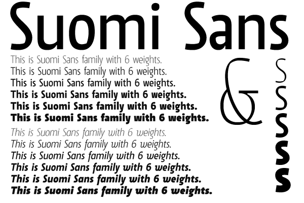
This is one of four fonts/families I'm currently working on. There are Suomi Script, Serif and Slab Serif.
This one is a fairly narrow font with a hint of calligraphic forms attached for a bit of character. I have finished the Roman and Italics ranges, and currently working with the Small Caps, OSF, and some OT features…
What do you think?