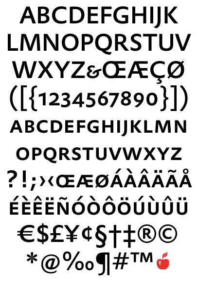
I designed a logotype for a client based on DTL Prokyon small caps. We offered several logotypes, but the Prokyon is what they want (coincidentally, the decision-makers are Dutch). To make things nice and neat, I have been exploring the possibility of using the Prokyon Pro family for the client's identity, since underneath the company name is one those descriptor lines that we all love so much. They would probably end up using the chosen type for all sorts of design-free internal projects, like presentations, and we would be using it for all collateral, signage, and so on.
Admirers of DTL all share the inevitable heartbreak of facing the prices on DTL fonts: €100 per font, per weight, per style for PS1, €250 per font, per weight, per style for OTF. Hence, these typefaces are encountered about as often as one encounters a Bugatti 57SC Atlantic. What's more, DTL fonts are sold as individual licenses, not the usual 5 CPU license, with the price decreasing by about half for each additional license.
Assuming the client balks at the exorbitant fee, which is likely and not wholly unreasonable, I will need a substitute font to match the logotype. The distinct features of the letters of Prokyon which I am using are the katana-like leg of the R, the gentle outward swelling of the counters, and a generally glyphic character. Being in small caps lends a slightly gawky-eyed, extended feel to it. Two substitutes I think may be close are Monotype Gill Sans Pro (the R is too weak) and FF Nexus, which is close but doesn't have the range of weights I would like.
Can anyone suggest some possible substitutes?
The font comes from here:
http://www.dutchtypelibrary.nl/Adres.html
And it looks like this: