hello,
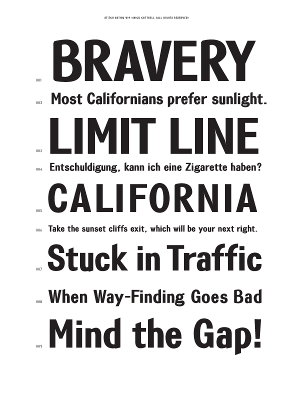
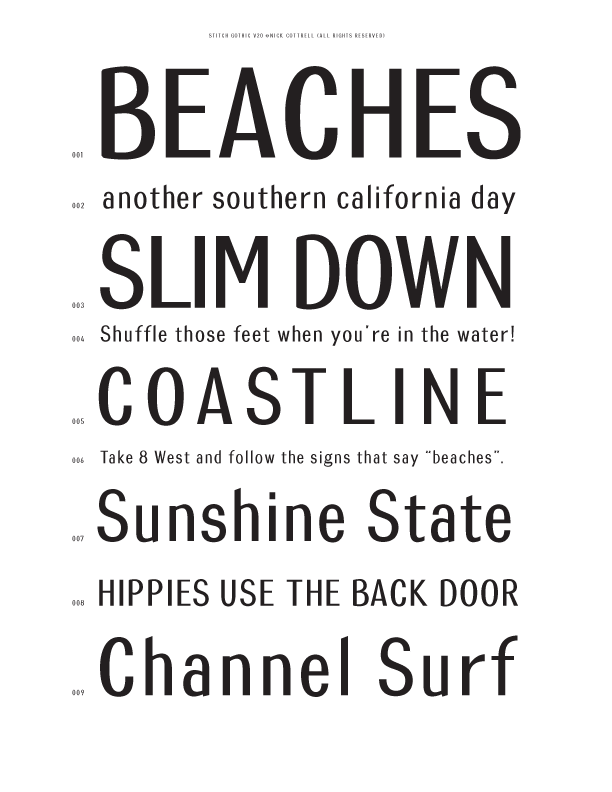
i had posted a critique thread for this type family i'm working on now code named Stitch Gothic (shameless, i know). i accidentally deleated the node when i tried to delete my previous pdfs. i had about 450 viewings but only 1 person gave me feedback. i hope it's not because it sucks…
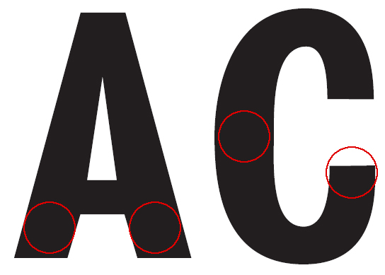
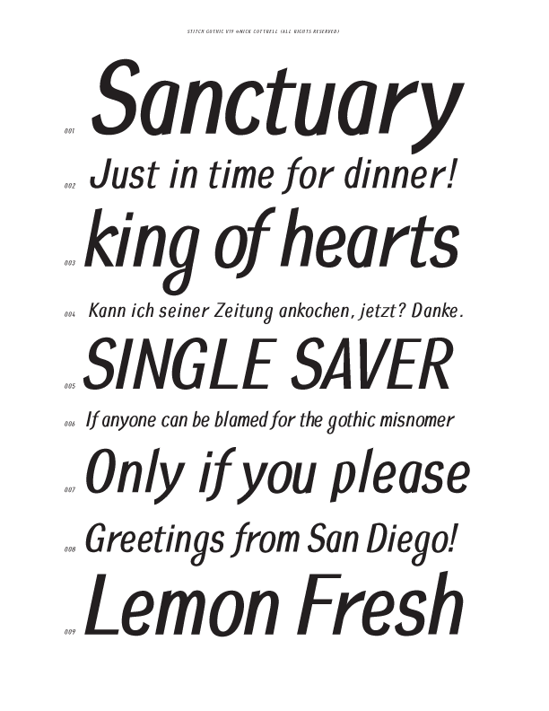
this is for display, and i want the letterforms to have an almost hand lettered quality. two typefacess that i was thinking of when i started this were Franklin Gothic and Interstate (or Highway Gothic). the figures are based on the types of numbers that are used for license plates. i also wanted to throw in an italic for a friendly, comsumer edge. there are a lot of things going on, but i want it to reflect the eclectic nature of the Southern California region.
this is my first attempt at a real typeface. i've messed around with a few other designs in order to learn Fontographer.
so, i apologize for starting a second thread about the same topic but please have a look. any feedback would be greatly appreciated. thank you.
PDF v16
[i don't know why, but i couldn't attach this file]
-------------------
nick cottrell
btw,
i want to come up with a better name when the design nears completion.