
I think it's Akzidenz Grotesque, but very happy to be proven totally stoopid!
—K
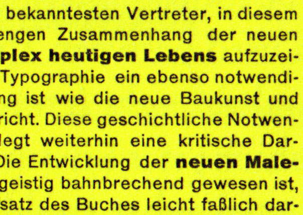
I think it's Akzidenz Grotesque, but very happy to be proven totally stoopid!
—K

Certainly looks like it. You just gotta love that Super weight.

I am sure that I read somewhere that it was set in Akzidenz Grotesque? It doesn’t reference it in the English translation does it?
Chur!
I don't think that it is mentioned in the text, although I did just blast through it.
—K

I think it's much older than Akzidenz...certainly a Grotesk, but dating from the very late 1800s into the early 1900s.

Wasn't AG released in 1896?
That "s" on the extra bold sure looks like AG to me.
ChrisL
Au contraire, mon frère…
Compare your sample and Akzidenz Grotesk BQ…
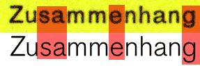
The red highlights indicate NO WAY, JOSÉ mismatches...I repeat, it's much older than Akzidenz.

You could be right... have you tried comparing the sample to AG Medium?
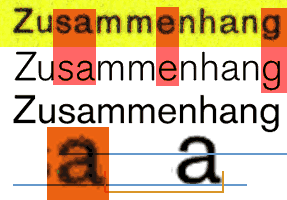
Middle sample AG Book; bottom sample AG Medium. Still not match, if you look closely...
Could it be that they are different optical sizes? You are comparing digital to metal. And we all know how many arguements that creates!
—K
In Nick's crop of your sample, the a has a tail which is usually only evident in the light, book, regular weights but the s e g looks like it's from the bolder weights (the shorter descenders, angled terminals on s and e)*. That said, the digitalised AG has many inconsistencies throughout the weights and I have no idea if the digitalisation was true to metal.
* PDF from typos.ch

As you can read in the thread Geoff quotes, there is and was no such thing as the Akzidenz Grotesk. And you certainly cannot (oldnick) compare a digital sample of AG Light with a printed one from the 20s. AG – and that's all I'll repeat from previous posts – has been through many iterations, from hot metal, where every size looked different, to photosetting, where one design had to fit all sizes, to digital where there is AG and AG Old Style.
The sample is definitely set in AG Regular and Bold (Fett). The Super weight was introduced in the 60s only, designed by GG Lange. It never existed in hot metal.

From the "Note on the book and its design" at the back of the English translation (UC Press, 1995): "Aurora Grotesk, shown in the Berthold Phototypes E1 catalog (1974), was identified as the typeface closest to that used in the original German edition." (It goes on to explain that this wasn't available digitally so others were chosen for the translation.)
The sample in this thread is from a publicity leaflet for the book, which is also reproduced in the introduction (p.xxi) of the translation.

…but on page xxx (yes, that really is three x's… i.e., the Roman numeral for "30") of that same English translation, the Robin Kinross essay at the beginning of the book states:
"The typeface used was an 'Akzidenz Grotesk': a 'jobbing sanserif,' designed anonymously, probably in the 1900s. For the reasons already outlines, he would have preferred this over any of the recently designed sanserifs, which (in the case of Futura) would hardly have been available for purchase at the time the book was being set…"
"…But, for the purpose of characterizing Tschichold's preferences, 'Akzidenz Grotesk' in a light (as against medium or regular) weight is sufficient description."
you certainly cannot (oldnick) compare a digital sample of AG Light with a printed one from the 20s
True: but, unless the particular project for which this typeface is sought is going to be set in metal and printed on a letterpress, the digital sample of whatever typeface it turns out to be is what you're going to end up with...
Well, interestingly enough I came across the answer to our inquiry here while doing some redaing during a lersiurely afternoon. I was looking back to some pages in "Paul Renner: The Art of Typography" by Christopher Blake, and came across some comments concening Tschicholds' reasoning for not setting Die Neue Typographie with Futura. Here is an excerpt:
"Jan Tschichold's book, Die Neue Typographie, could have feasibly been set in Futura, which was already on the market when the book was in preperation. Even if the typeface had not been quite ready, Renner could have secured its use for the book; instead Tschichold has it set in a grotesk (AG?). There may have been an element of personality clash in this decision; yet, when asked in 1960 why he had not used Futura for the book, Tschichold replied that he never really deemed it suitable for setting texts."
In addition, it would be impossible to compare a printed sample of Furtura produced with metal foundry to any digitally created specimen. We all know that each point size was meticulously crafted by Renner and his team to accomplish the optical precision Furutura expresses.
you know, now I feel completely silly. I guess i was just too wrapped up in the book to even realize that what I said has little to do with the original question posed. my apologies.
Insight is always welcome here, t&k -- even when occasionally misplaced.
Hello,
you talked about Aurora Grotesk here.
I am currently drawing a font inspired by this
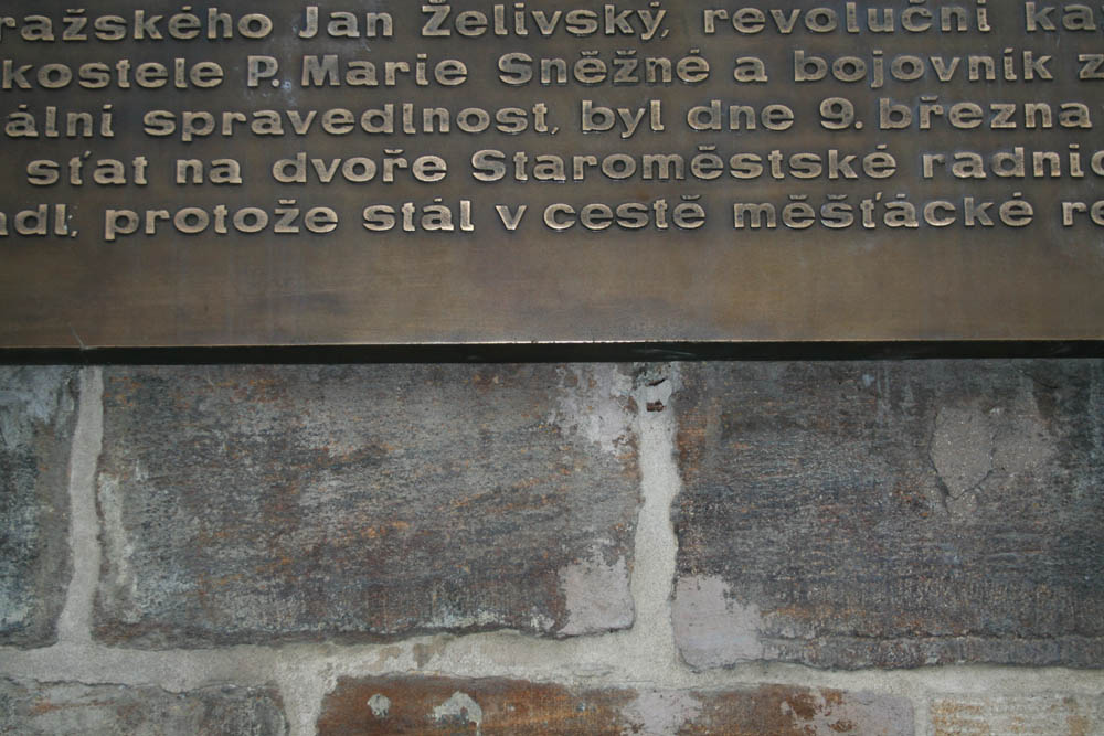
and it could be some variation of Aurora (however its absolute goofy typography).
Please can someone paste Aurora catalog or something else that could help me?
Thanks
Jan Novak
Captured from web.archive.org on 12 Aug 2011. view this capture
