*** SCROLL DOWN FOR REVISED CONCEPTS ***
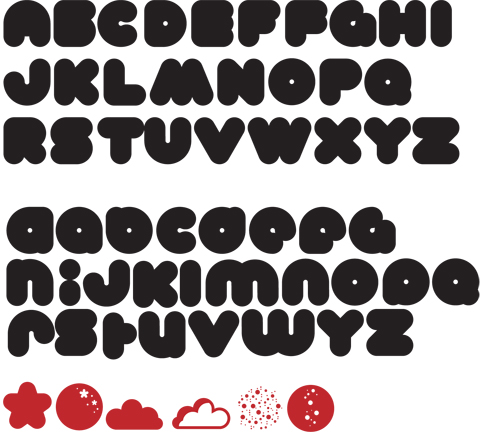
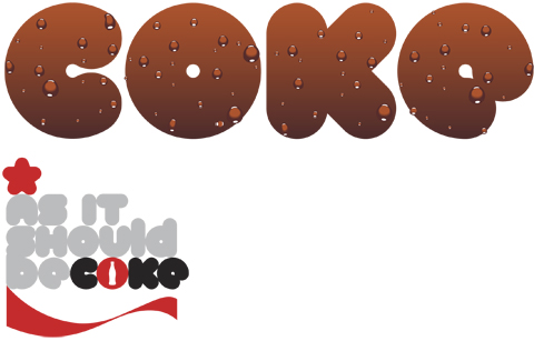
Here's another one (if the link works) I am not sure about the upper case B and a few other letters, but like the way the lower case is shaping up - it works really well in a tight configuration. Check out the examples designed for Coke - but not enacted yet.
Any feedback appreciated.
Jason.