
I am developing a typeface which is based on a set of old woodcut letters I have from Australia circa 1940? Anyway, This is the first posting any comments would be greatly appreciated.
Regards
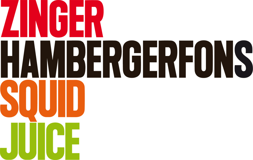
I am developing a typeface which is based on a set of old woodcut letters I have from Australia circa 1940? Anyway, This is the first posting any comments would be greatly appreciated.
Regards

I don’t see it...
Sorry the image is so big - I couldn;t upload PDF File.

Nice one.
A few comments:
R: The upper part seems odd/too squarish.
S,O,C, etc.: Your rounded letters definetely need more overshoot, if there's any at all yet?
S: seems much more rounded at the sides compared to C,O, G which have long vertical/straight sides…
A: could do with a bit opening up of the inner white space
Q: very nice, but i'd think about an alternative because it's going to be the only letter with a descender, and – presuming it's caps only – a designer would most likely want to use your face with very little line spacing, but if a line contains a Q you're in for a surprise, as your picture already illustrates. I'd think about a Q form without a Descender, which might be a hard nut to crack – maybe you could try somethiung inside the white space of the Q. And you could still have your version above supplied as an alternative. Honestly, I as a graphic designer, would want to use that one as tight as it gets both horizontally and vertically.
All in my very humble opinion of course.
I think your horizontal strokes are a bit to heavy

I think that you could try to improve the overshoots of the rounded structures. Without this optical adjusts they looks like a little smaller than the other letters. See the letter "G" in the word "ZINGER" for example.
Anyway, nice forms!
e.
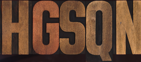
Thanks guys for your comments. The original letterforms are actually all common sizes and circular forms have squarer edges (see attached). I may supply the Squarer S as an alernate letter along with a few others.I totally understand with the overshoot fo the rounder letters and will look to improve this in my next progression. Nice comment on the Q Franz, I realise when I typeset it exactly the same problem - it looks good as a letterform on its own, but not when typeset.
Cheers
Hey Jace. Looks good and agree with most comments.
R: Appears a little flat/squashed in the bowl. As with the B too.
Z: Perhaps the leading stroke could be shorter so the fella doesn't look like he's going to topple.
I like squid juice.
Captured from commoncrawl.org on 19 Apr 2015. original URL