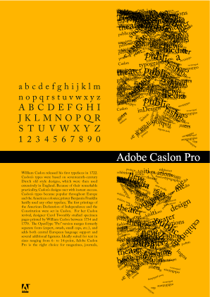
The first thing I would expect from an advertisement for a text face is to see it in use in a number of sizes and measures, that is to say I don't see the need for the text image on the right. As for the paragraph you have set it is suffering from being justified, especially the two lines starting 'Constitution were…' and '1770. The…' where the word spaces looks huge after the full stop. I think you should look at a wider measure and see if ranged left, right ragged is better, if you intend to stick with justified you could look at overhanging punctuation and hyphenation. Another point to consider is the type of numerals, I find non-aligning work better in text situations. In short I would look at presenting (at least) a line of text in 6, 8, 10, 12 and 14 point (which I don't think needs hyphenation), try setting your copy ranged left and limit the image area and try to make it more related to the product.
Tim
Hello everyone.
I have been working on a personal typographic/composition project. It is an advert for the typeset Adobe Caslon Pro. This was created in inDesign so I tried to make all the spaces typographicaly correct. All comments and critics are very welcome as I would like to add this piece to my portfolio.
Thanks.
Regards,
David
Attached is a small preview image and a pdf.
http://dache.ch/caslon.pdf
edit: Hmm while exporting I see the last sentence was cut off, hope you get the idea though, will fix later.
| Attachment | Size |
|---|---|
| caslon.png | 82.37 KB |