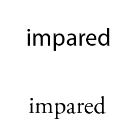
Ok designing a typeface is a small part of my thesis "Designing for Vision Problems". I just started, so I need initial crits (i figure I'll need like 20 before its done). I will post the complete set soon.
OBJECTIVES:
Open Counters and Apertures
Large X-height
Short ascenders + descenders
The name is based on Marla Runyan: an olympic, blind runner whos nothing short of amazing.
Thanks guys.
| Attachment | Size |
|---|---|
| runyan.jpg | 23.94 KB |