
Cooper Black is out - http://www.coopertires.com/us/en/default_US.asp :-(
Cooper Black is out - http://www.coopertires.com/us/en/default_US.asp :-(

"Don't give up a thing," indeed.

Ahh, good old Cooper Black :-)
The new thing now looks like a pharmacudical firm instead of tires.
ChrisL

It was bound to happen. Heaven forbid we have logos that have any sort of sense of history. If it doesn't smack of now it isn't relevent. Right!
It doesn't smack of Tires either though.
ChrisL
:^D Ah but it smacks of SPEED and INDY 500. ehehe.
Reminds me of some of the Gillette branding...
http://www.gillettem3power.com/us/home_f.asp
"The best a man can get!"
Si,
Yup, just what I want, a "Nitro" powered razor! Then I will get a real BANG out of shaving :-)
ChrisL

Oh my. A swoosh. Was that committee asleep since 1999?

It's interesting to see techno fonts used more and more int the mainstream.
This Cooper stuff seems to vibe on Fast & Furious movies, homicidal X-box games like TOCA race driver -- Bold extended font like Porsche logo, Pirelli from way back, more recently a standard on chrome auto badges.

I just sent them a nasty note.

along with your avatar, i hope. that should really scare 'em! >^P

Feeling a bit stupid asking this, but was Cooper Black created specifically for Cooper Tires?

I don't think Oswald Cooper had that specific company in mind, no.
ƒ
Just a coincidence then. Thanks
There are a handful of documented cases where designers, for fun or through laziness have picked fonts to match the project based on font names. Eg a restaurant called Mistral, or for a movie eg. http://www.cnn.com/SPECIALS/2002/grammys/interactive/bios/album/oh.broth...
The logo and site make Cooper look like a local purveyor of "IT Service Solutions."
I don't know if I would call the old Cooper Tires logo a "Classic"?
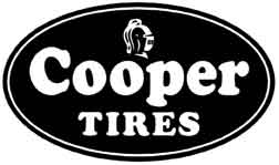
Well maybe not a classic but the best of the genre...
I kinda' like Pirelli.
ChrisL

The new Cooper logo kinda reminds me of Rollerblade's.
This was posted an another forum a couple of weeks ago. the new logo conveys nothing to me. It doesn't really say tires, or much of anything for tat matter. If their site is a reflection of their taste in design, the logo is rather fitting; ill but fitting.
Maybe it's just me but I find a number of new logo's for large companies fall far short of good identities.

@jselig:
the new logo conveys nothing to me.
The old logo said that tires were fat (Cooper Black) and that they protect your safety (the knight's helmet).
The new logo says that their tires help you go fast (the italic letters) - and the spiral logo of elliptical shape reinforces that.

You revive a 6 year old thread for that pearl?
Tim
Tim - why not? I am all for reviving old threads with new ideas.
Stephen, I am all for reviving old threads with new ideas too.
Tim
In this case the thread was "revived" by a spammer selling tires. That post was deleted. Sometimes the spammers surface interesting threads, sometimes they don't.
zzzzzzaaaap!!!!
Captured from web.archive.org on 19 Oct 2013. view this capture
