Hi Typophiles
I posted a thread before about some letterpress inspiration for my wedding invites. Here I am with this thing again but this time I’m posting a sample of the invite. I’m struggling a lot with this one and changed my typefaces quite a lot.
I first started buying “Emily” from t26 because I liked the look of that font but when I put it together it didn’t really pair well with other typefaces. So I moved on to traditional scripts like Brickhamm and others but I’ve seen this face used in so many invites (not that it’s a bad thing) but I wanted something a bit different.
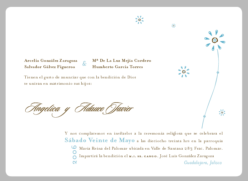
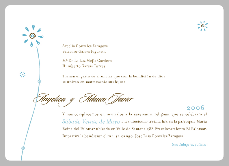
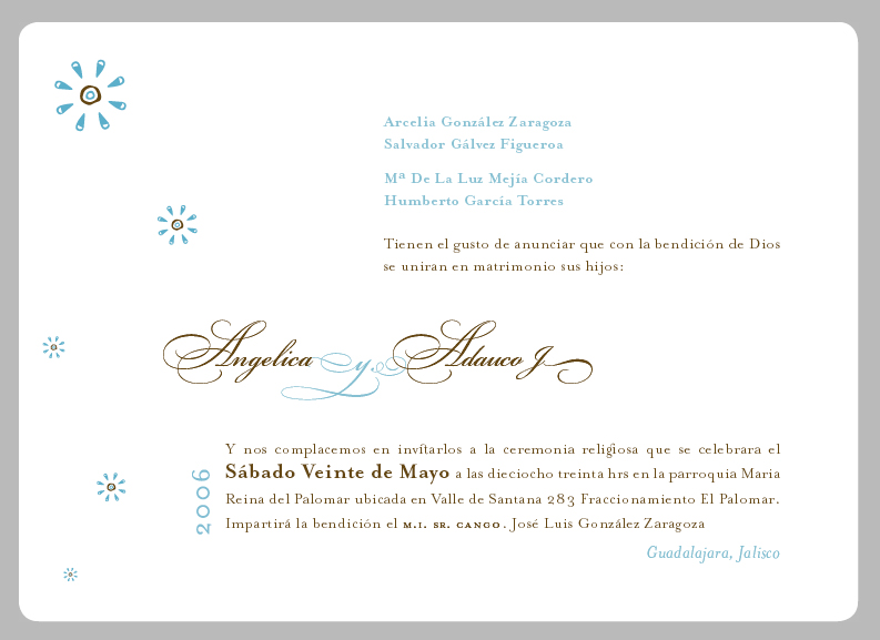
The reason why I went with what I have is because I was looking for a meaning to all of this and find out that this day in which the wedding is taken (20th) in relation to the 20th day of every month in the Aztec calendar was “xochitl” which stands for flower and its supposed to be good for spiritual related things. So I did my research on Aztec flowers and find a book called “Ancient Mexican Designs” that has a lot of this “xochitl” flowers.
Anyway not to go any deeper I really didn’t wanted to be so nationalist with this project so I made my own designs based on the flowers I saw and created my own calligraphy to give it a more human touch.
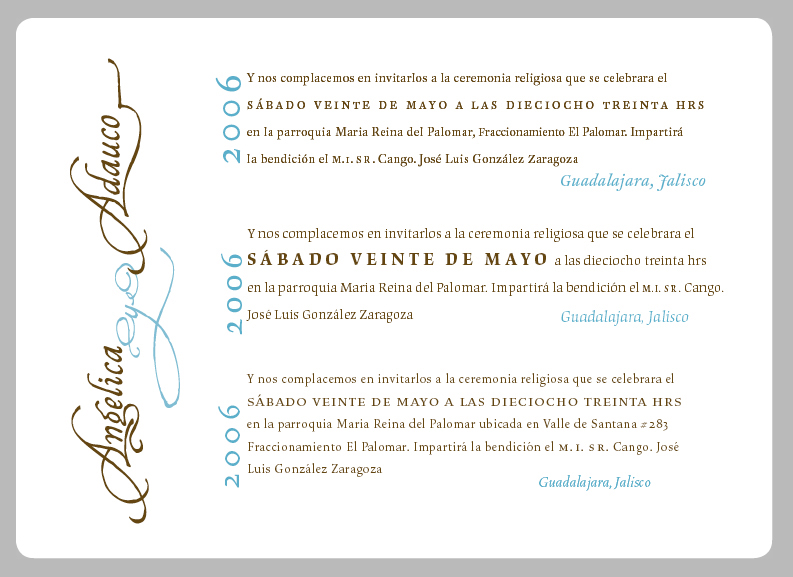
Initially I wanted to have flowers cropping off the edges but was just too crowded. Our parent names have also been a pain since I can’t get away from setting them one next to the other. I also tried justifying text to the left and also different alignments but it’s just being crazy. So to fit all this text I went with small caps spaced out and justified text. The text face is FF Clifford, I’ve also played around with Filosofia and Mrs. Eaves.
This is of course going to be letterpressed
Any crit would be gladly accepted and hope you all have fun doing it.
Thanks,
kco
| Attachment | Size |
|---|---|
| type_expl.jpg | 262.09 KB |
| InviteA.jpg | 176.22 KB |
| InviteB.jpg | 182.41 KB |
| InviteC.jpg | 175.73 KB |