Hello,
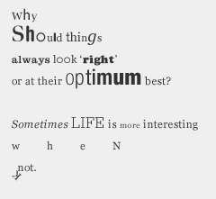
Generally I am appalled at the poor use of type. Lousy design/designers tend to hide behind the latest typographical whimsy and they date so quickly. I was around in the pre-Mac/Pc days and some designers rarely used "different" fonts. The reasons were multiple, but some of the best designers would use a particular font family or two and learn its strengths and weaknesses and exploit its quirks, and begin to bond with the fonts, the rules could be broken and the excellent design was evident, while thinking about the fonts became 2nd nature. Obviously, over time the work becomes dated, but far slower than "Fashion of the times" mentality of today.
The relationship with a typesetter/typographer was still strong, and designers relied on good input from the type shop, "we think that this would look better… we will send a sample, let us know."
I have been toying with the idea of 2 fonts for 1 year (actually two font famililes) for my personal work. Picking the right fonts is daunting, you do not want to be tied with 2 dullards or 2 whackos either. It is kind of like finding a wife or husband, which one is right for me? I think I found them too. Fonts I can afford, but are not like everybody else, URW Antiqua and URW Grotesk (both from the TypeWorks Library) are my front runners, but I also love Antique Olive family and Caslon buch (Berthold), Formata is nice but I have a hard time paring it up. I know for a fact that Univers and Bauer Bodoni work great together, but I would have directly stolen it from a great designer that I did work for, and I would feel totaly unoriginal, no brain waves, you know what I mean?
Sincerely,
Rodrigue Planck