
I can’t figure out what these fonts are
Any ideas or suggestions to something close to it? Thank you!!
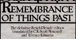
I can’t figure out what these fonts are
Any ideas or suggestions to something close to it? Thank you!!

Looks like Packhard — the only thing that doesn’t vibe is the uppercase S.
(Rookledge’s International Typefinder, Modified Serif no. 571, p. 230)
Wait! Did Yves just let slip the source of his type ID skillz? I thought the guy pored over specimen books 12 hours a day to keep his chops.

The smaller font is University Roman.
- Mike Yanega
NovelFonts made a Packard version called ’Paliard’ that has this same S. See this Invitation site sample, since I can’t post samples here any more (booh!). I think we had talked about Packard/Paliard once in the past here, but the link has vanished.
- Mike Yanega

Why can’t you post samples Mike?
> Did Yves just let slip the source of his type ID skillz?
Dude, I’m no computer! Anything that helps is fair game. :^D

Nope... Yves did not slip any ID skillz.
Yes, it is Packard (Bold) and the cap S is dead nuts to the original specimens that Compugraphic revived (in phototype) from T.J. Lyons’ archive of antique types. Later I believe it had to be “retired” from the library since I don’t see it anywhere now... but in my old CG specimen book it’s as plain as day.

See this old thread for two more Packard options.
It’s proved a little difficult finding a quality image of pre-1920 Packard Automobile ads, but here is one from 1918.
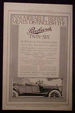
I once read about the great care that Packard Automobiles took in building their advertising image, but I can’t find any sources at the moment. Just thought it was interesting to share. I have seen earlier ads where the face looked closer to what we know as Packard Antique or Packhard.
In the old Compugraphic specimen book I have, there are two weights of Packard, the lighter is similar to the weight in the auto ad. If someone has a ready reference on the designer and origin of the face, it would be nice to add to this thread.

The smaller font is University Roman.
I was actually looking this up because I keep seeing it and I had no idea what it was. Thanks!
Captured from web.archive.org on 19 Oct 2007. view this capture