What do you all think of the National Australia Bank’s new logo?
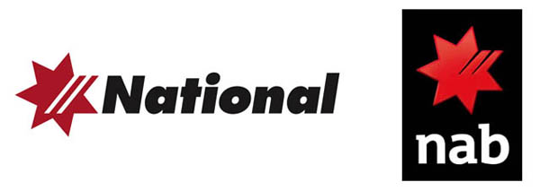
Yet another rendered 3D icon with all lowercase text. All l/c seems to be the first stop for convincing people you’re ‘friendly and approachable’ these days. Or has it always been that way? What is it about lowercase that’s so friendly? Is it just the variations in character height creating a looser feel, in the same way that ragged text creates a less formal look than justified text?
If they are trying to be more friendly, the 'friendly' type seems at odds with the strong, bold colours, and I don’t think the rendered logo and flat text fit with each other. Can’t a logo be good anymore without being all 3D?
I know the old type’s Futura, but what’s the new one?
Typographical issues aside, I find it bewildering that a bank would choose to identify itself with a word that means, ‘to take or grab suddenly’ and ‘to catch and arrest a criminal’. I mean, their candour is refreshing, but none the less surprising.