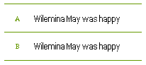
this post is more of a question, i suppose, of technique and purpose, than of a normal character set.
which of the following samples do you like better? A, or B? my eye seems to glide over B better, so even though A is slightly more sophisticated in its 'curve bending', i think i like B better, with its more consistent color.
can anyone post a quick vote one way or the other?
as for my earlier 'purpose' comment, please feel free to jump in and offer your thoughts: a pixel font such as this, is at its core, functional as opposed to decorative. as such, shouldn't i always design with readability in mind? that is to say, forego touches that i might personally like on a glyph level, in favor of flow once they are set into blocks?
| Attachment | Size |
|---|---|
| slim_question.gif | 795 bytes |